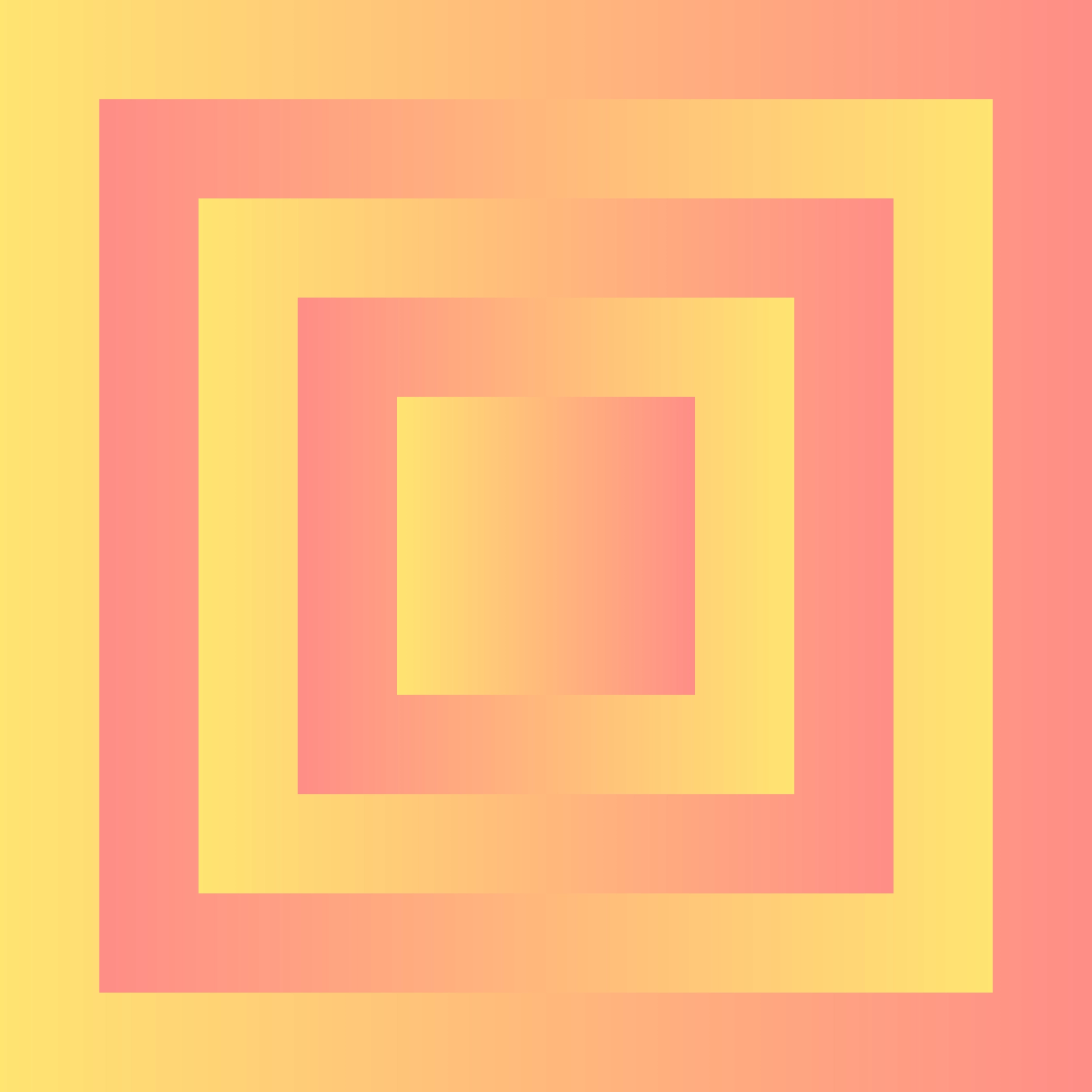
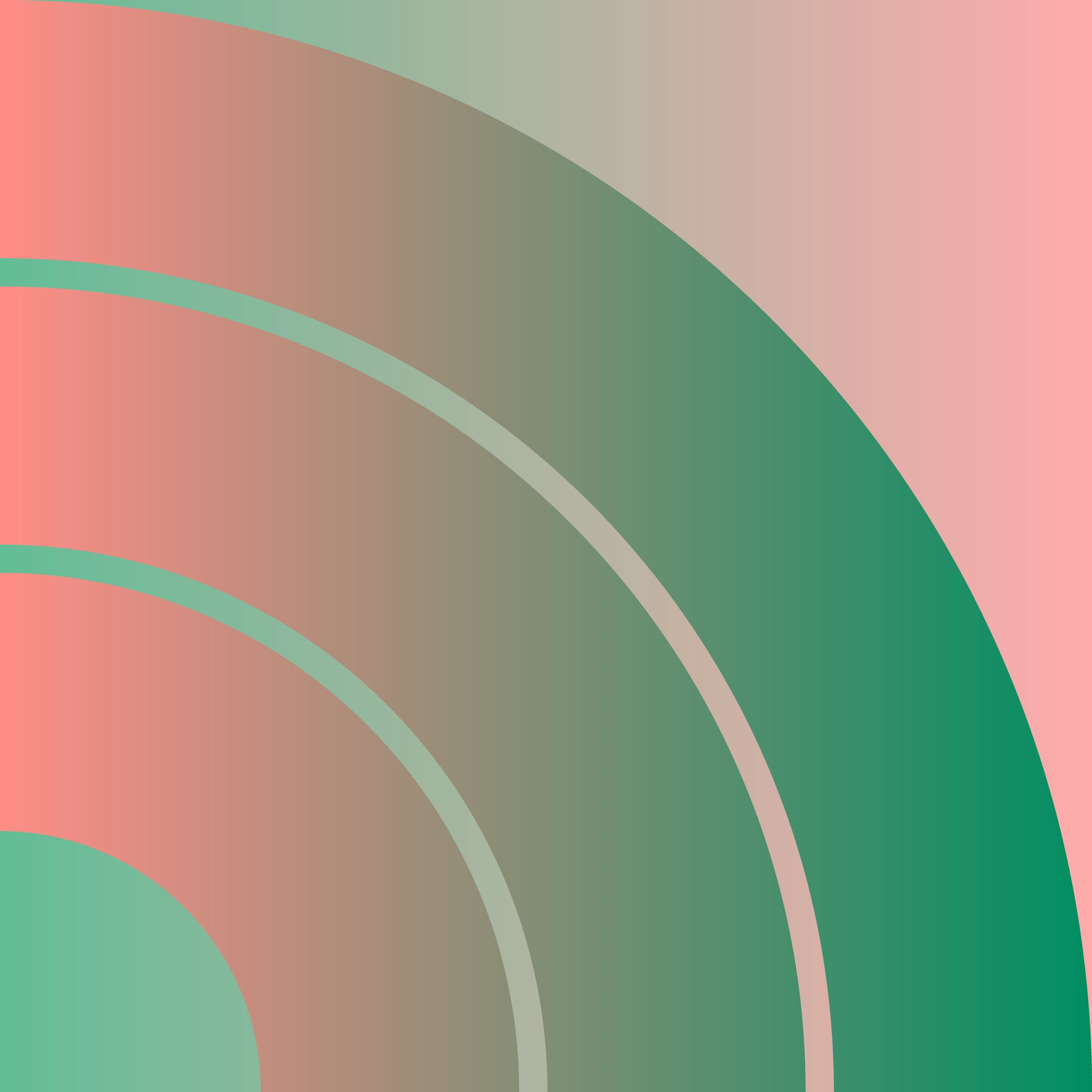
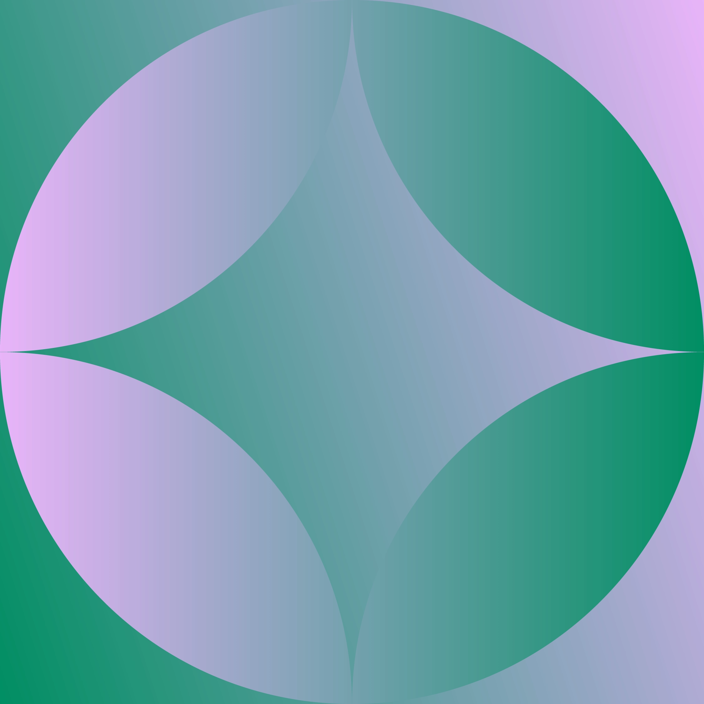
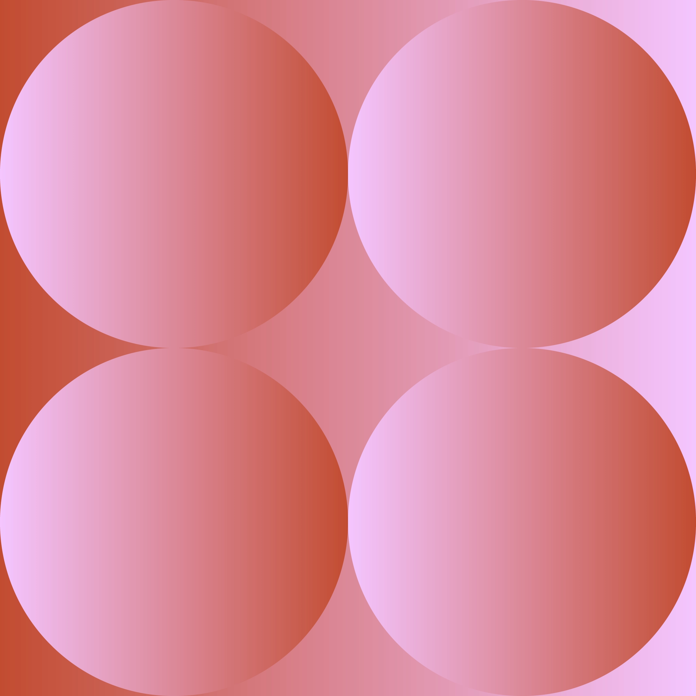
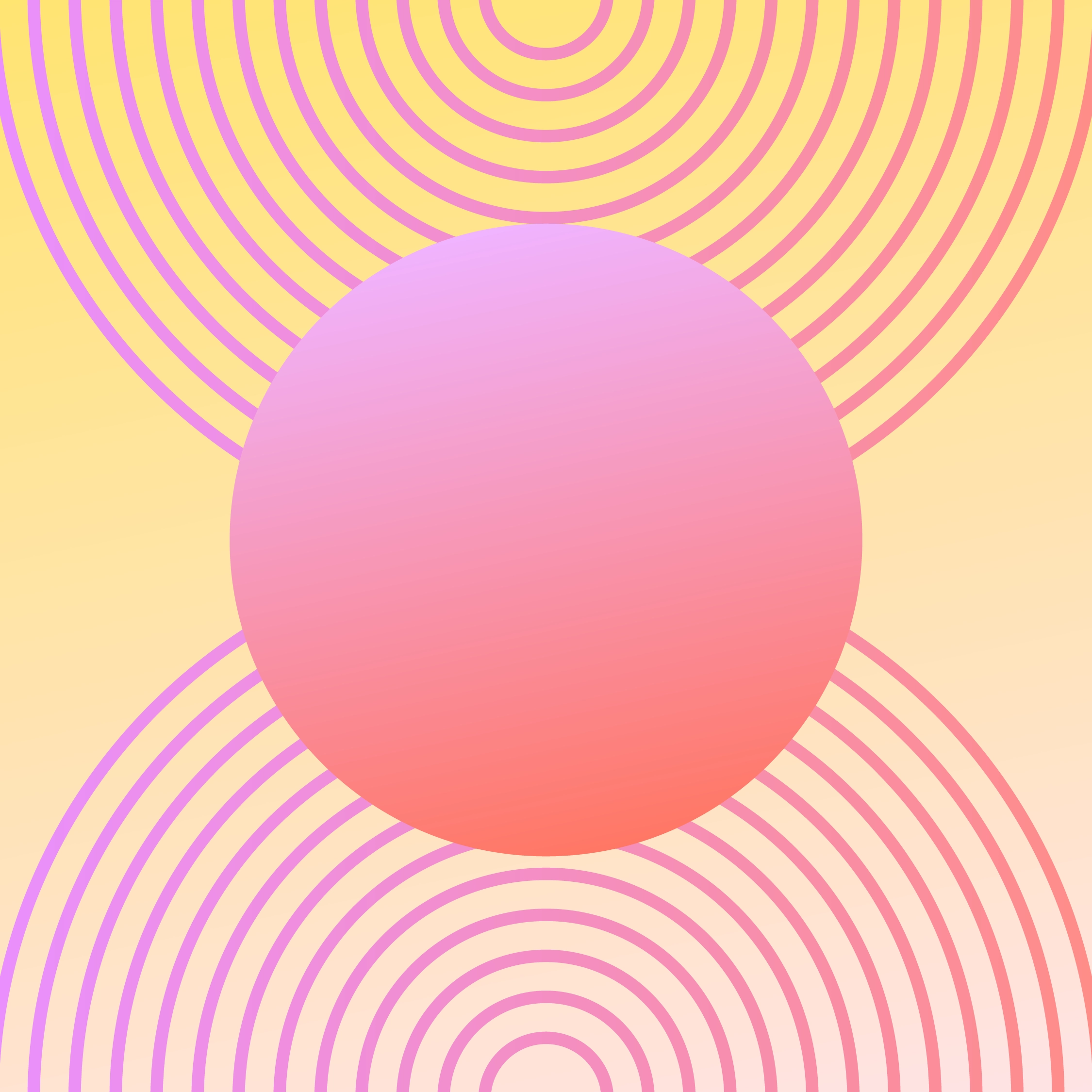
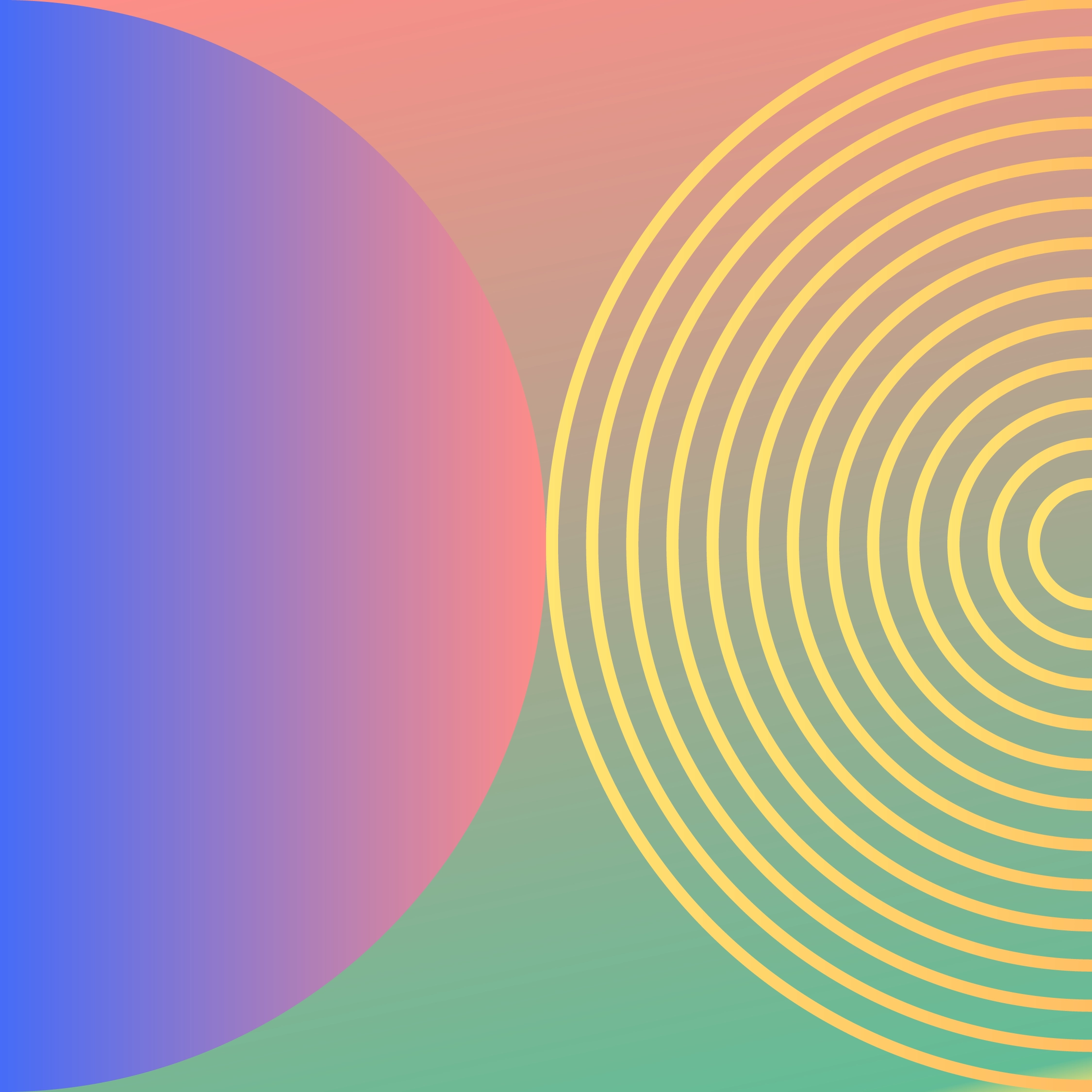
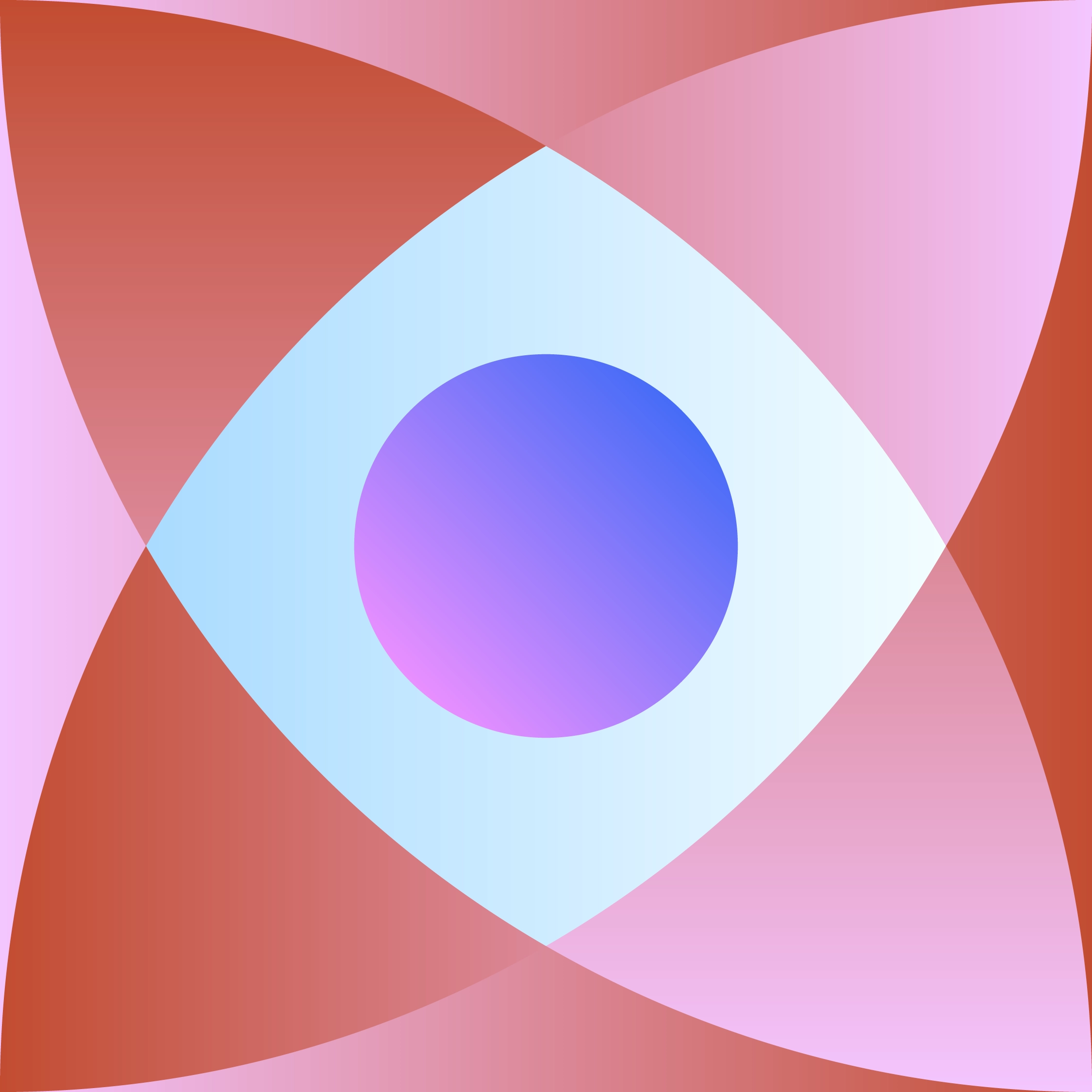
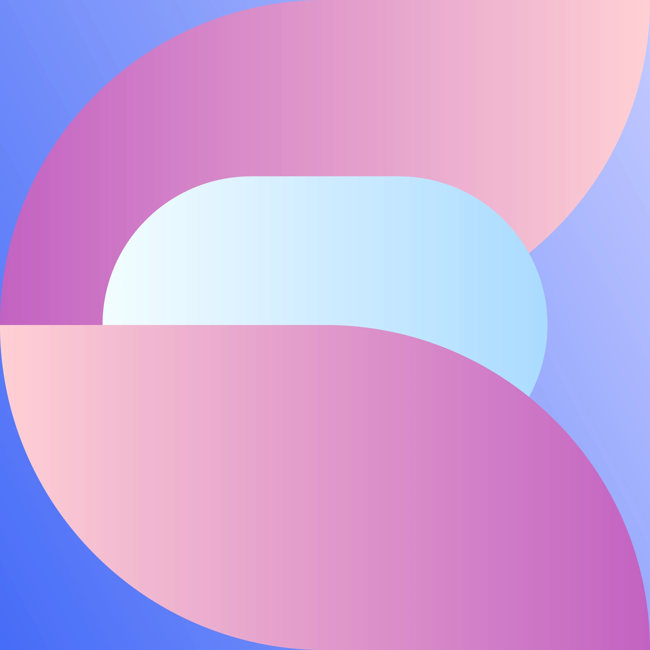
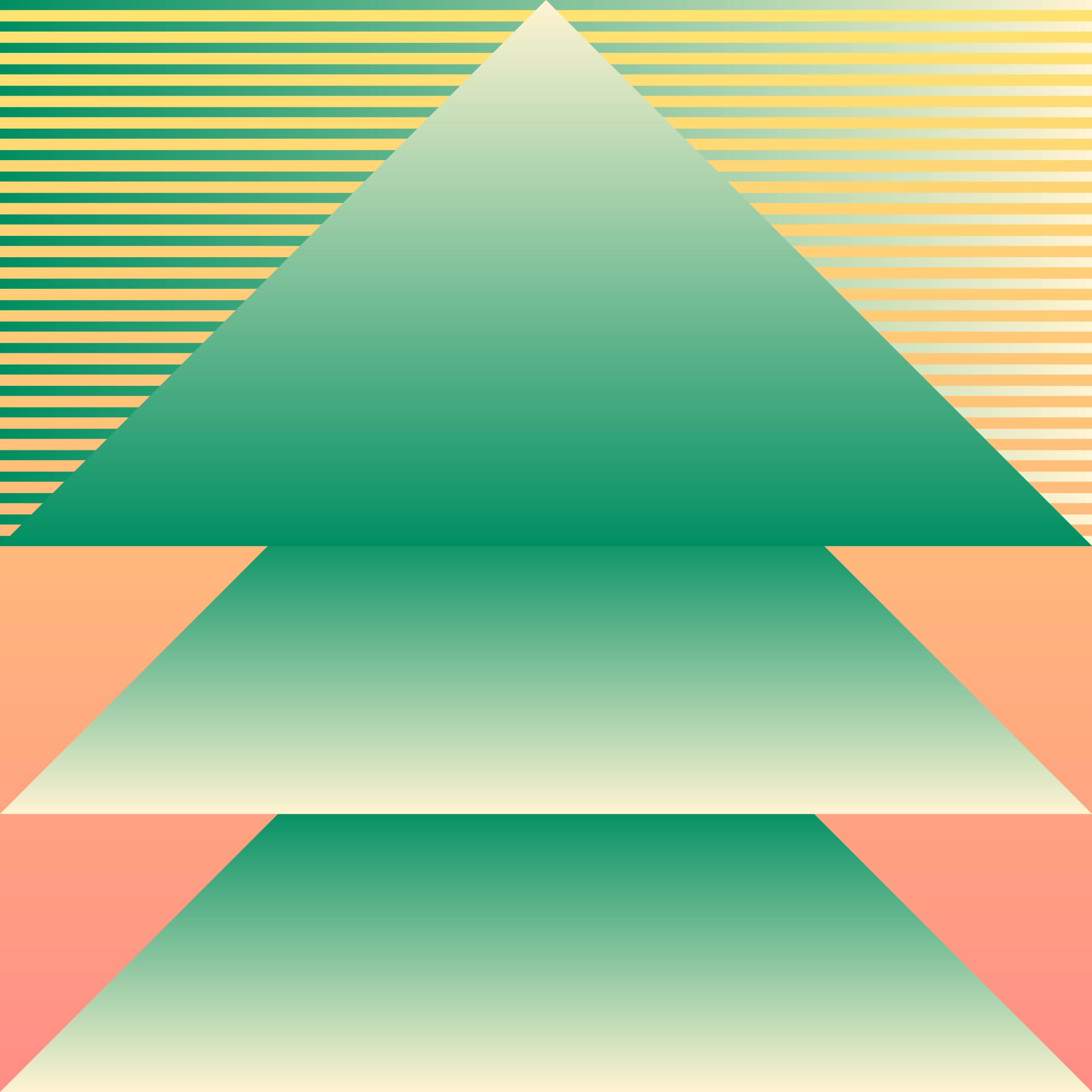
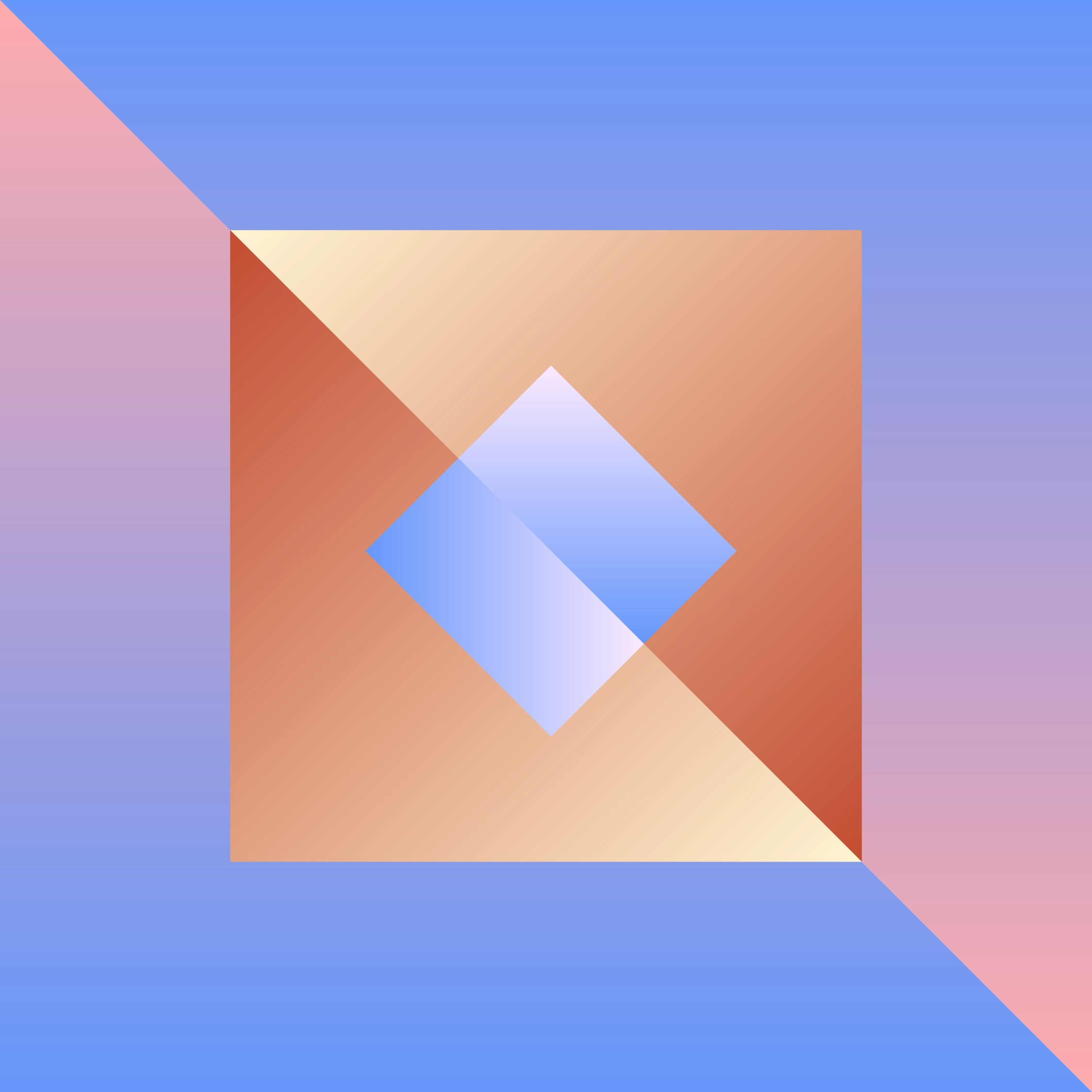
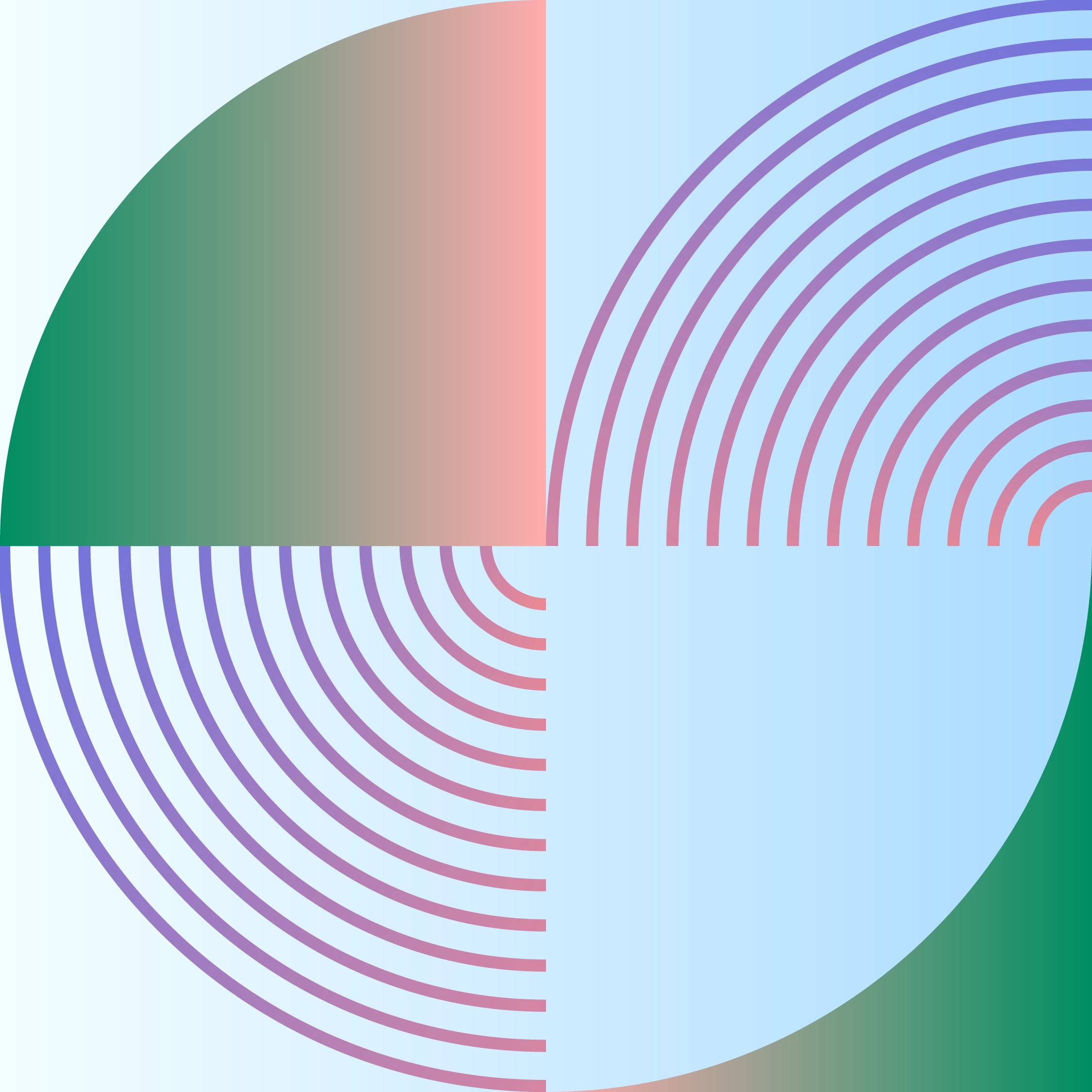
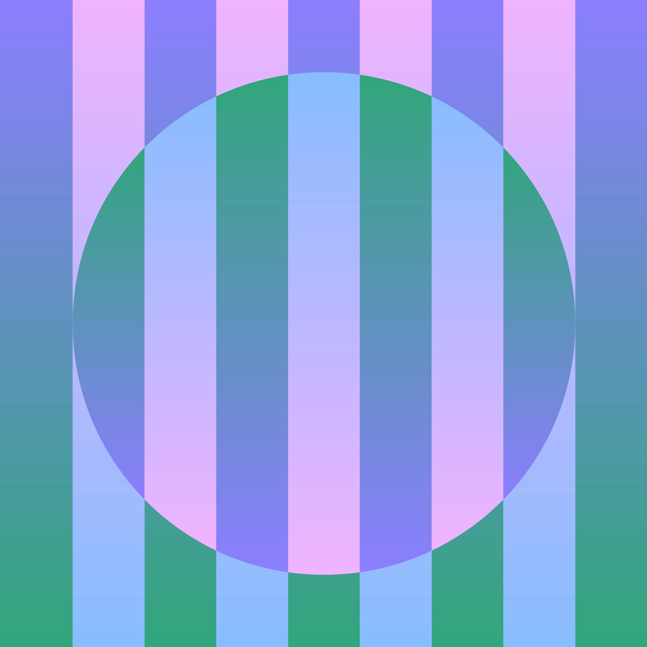
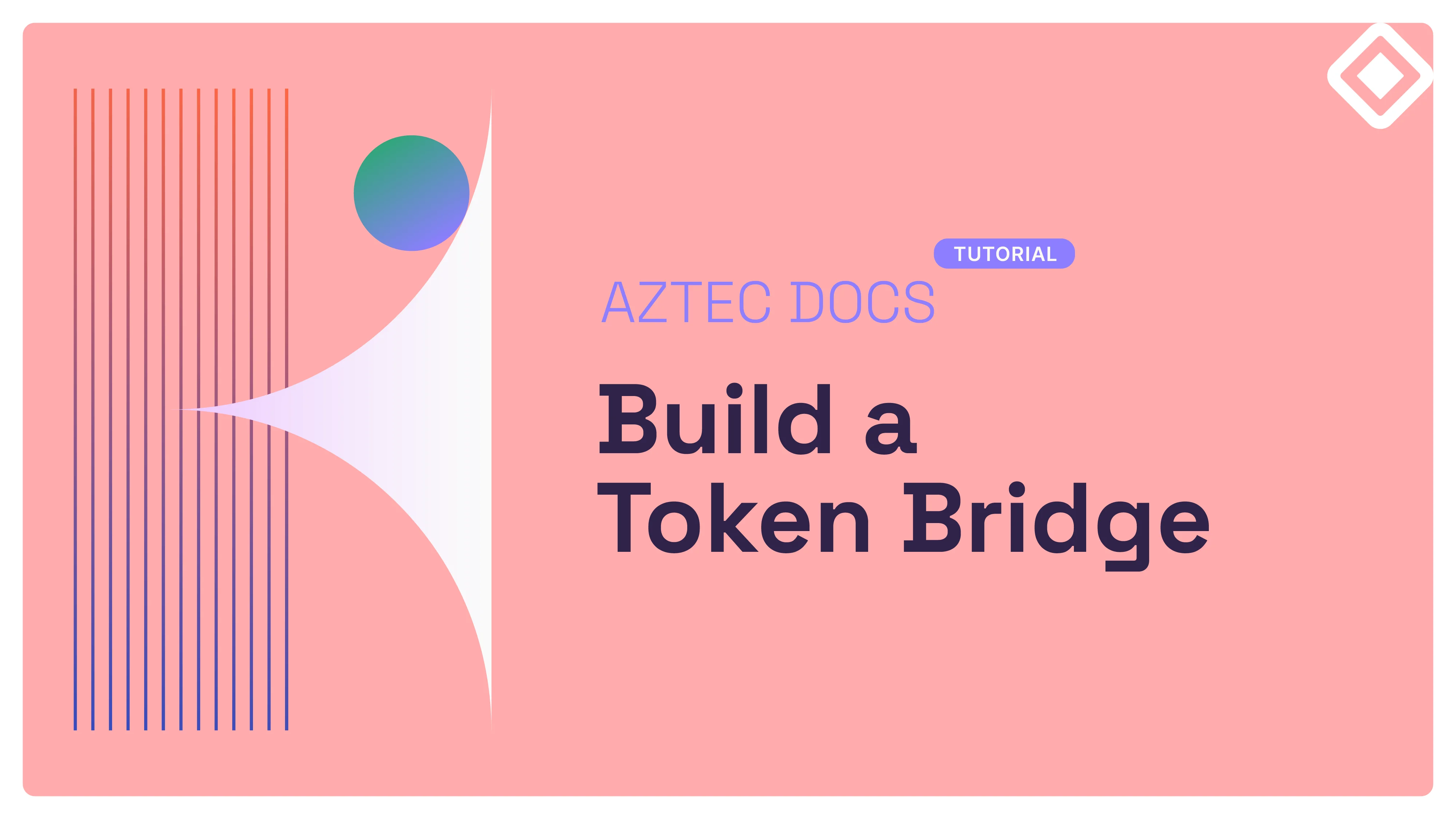
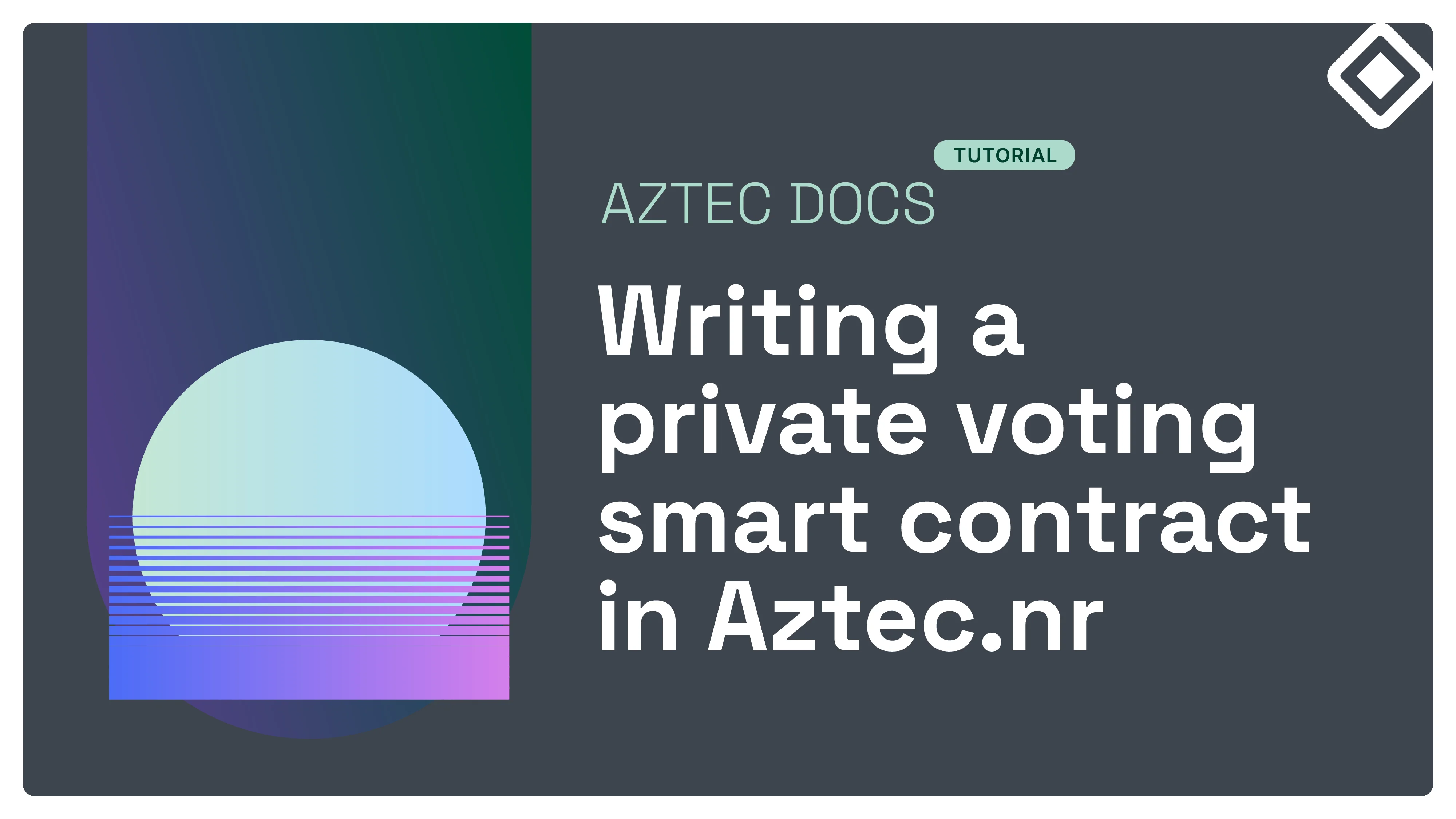
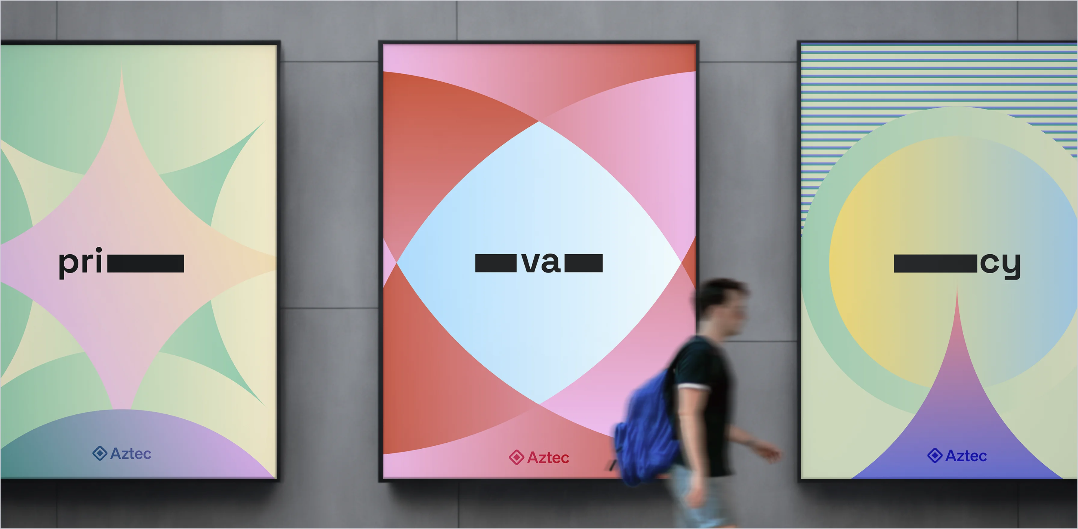
Documentation banners feature Level 2 patterns as their primary images, aiming to convey a technical aesthetic. These banners reflect Aztec's comprehensive features and its commitment to developing complex frameworks, as detailed in this patterns section.
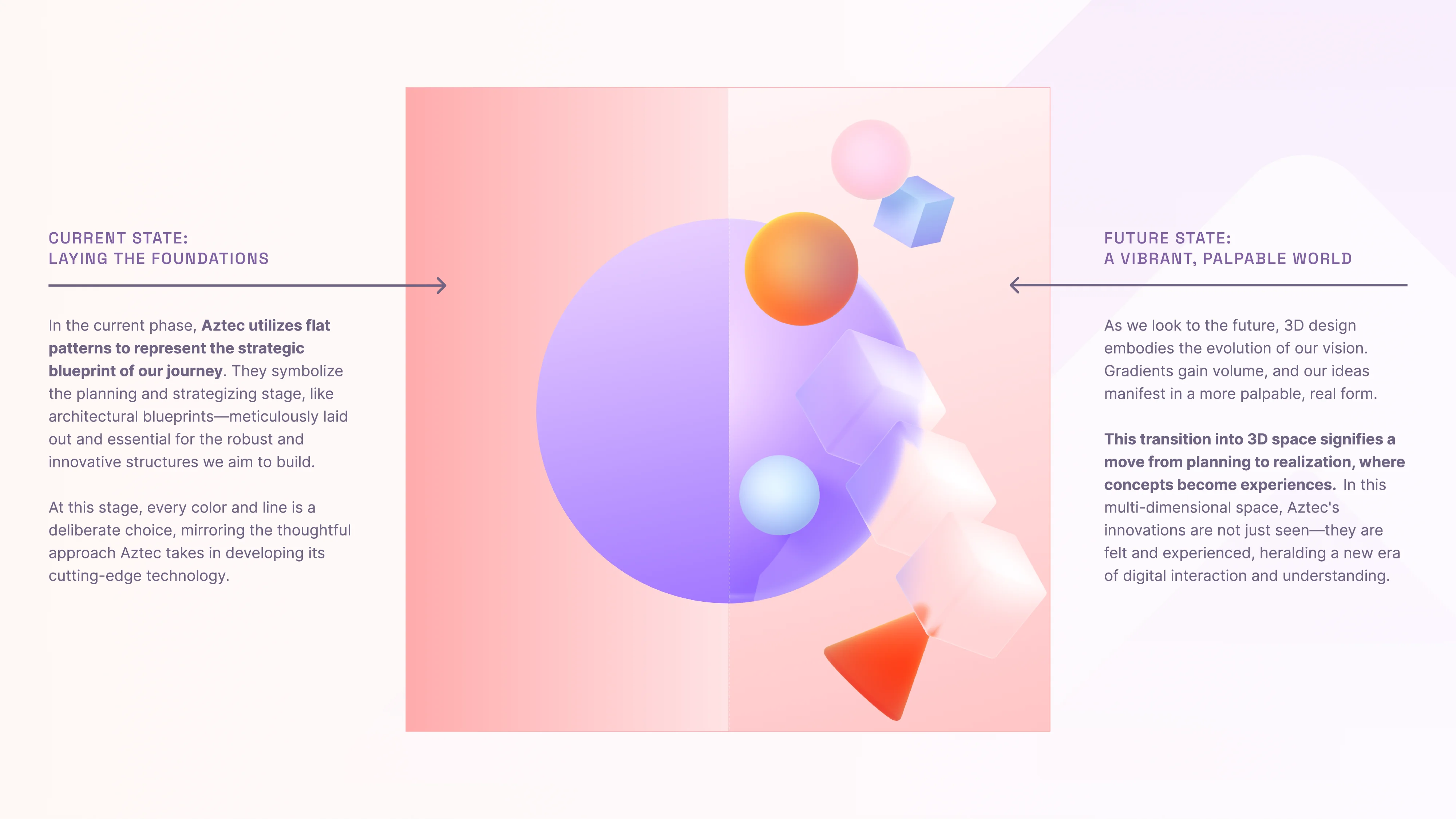
To cater to diverse needs and contexts, we have categorized diagrams into two levels, each varying in visual complexity, allowing designers to tailor technical graphics specifically to different outlets and audiences.
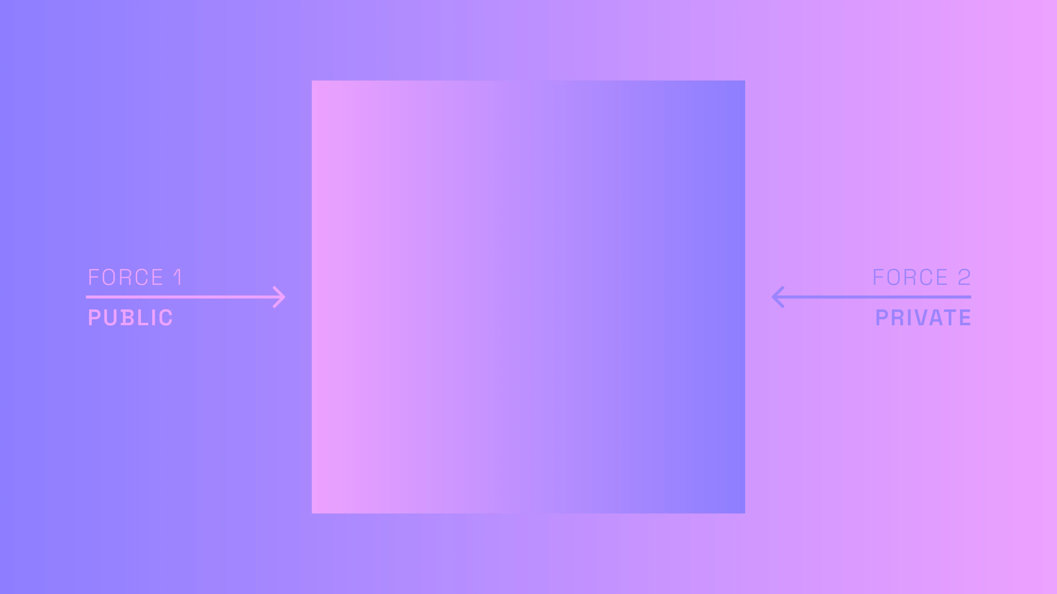
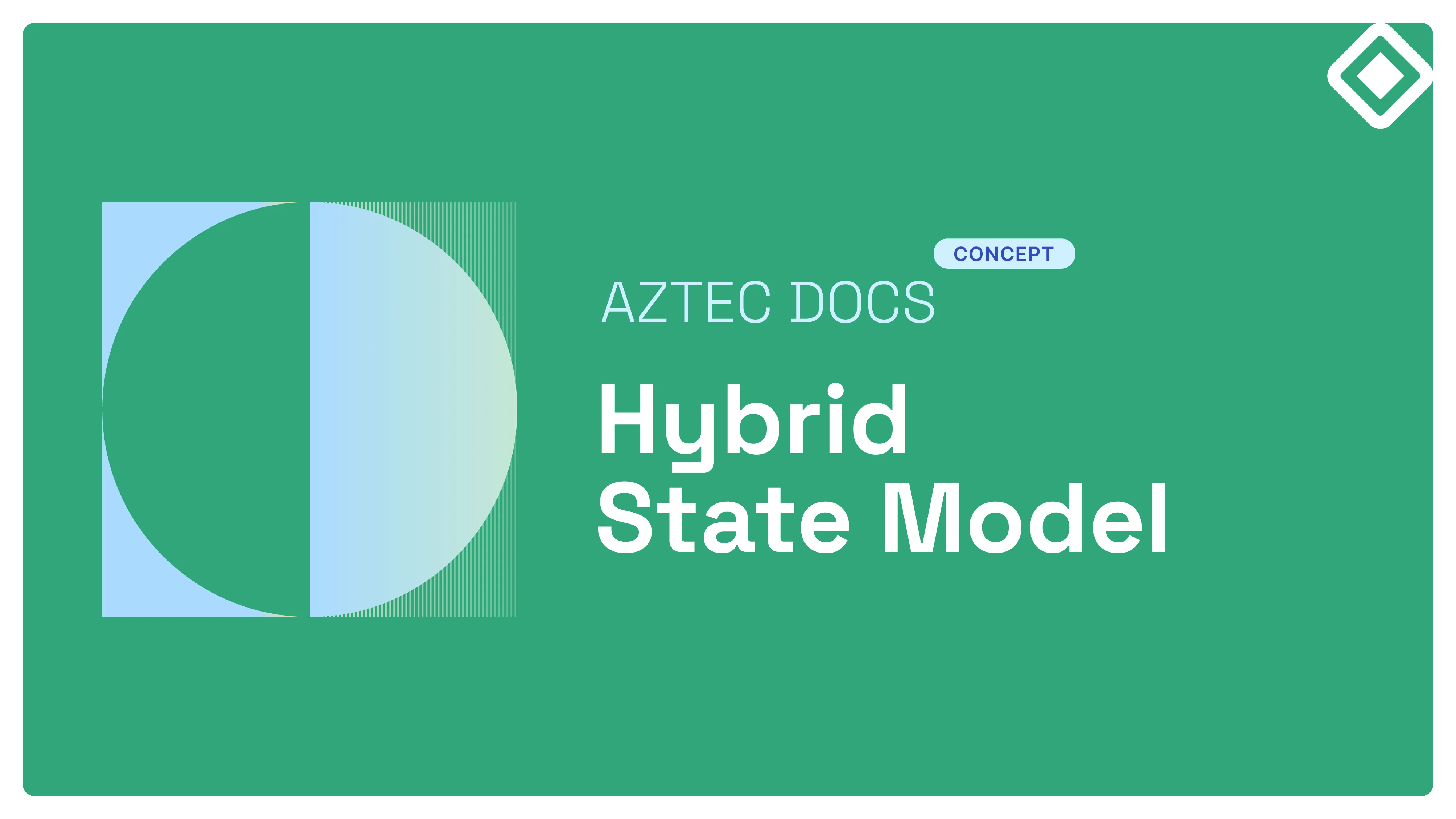
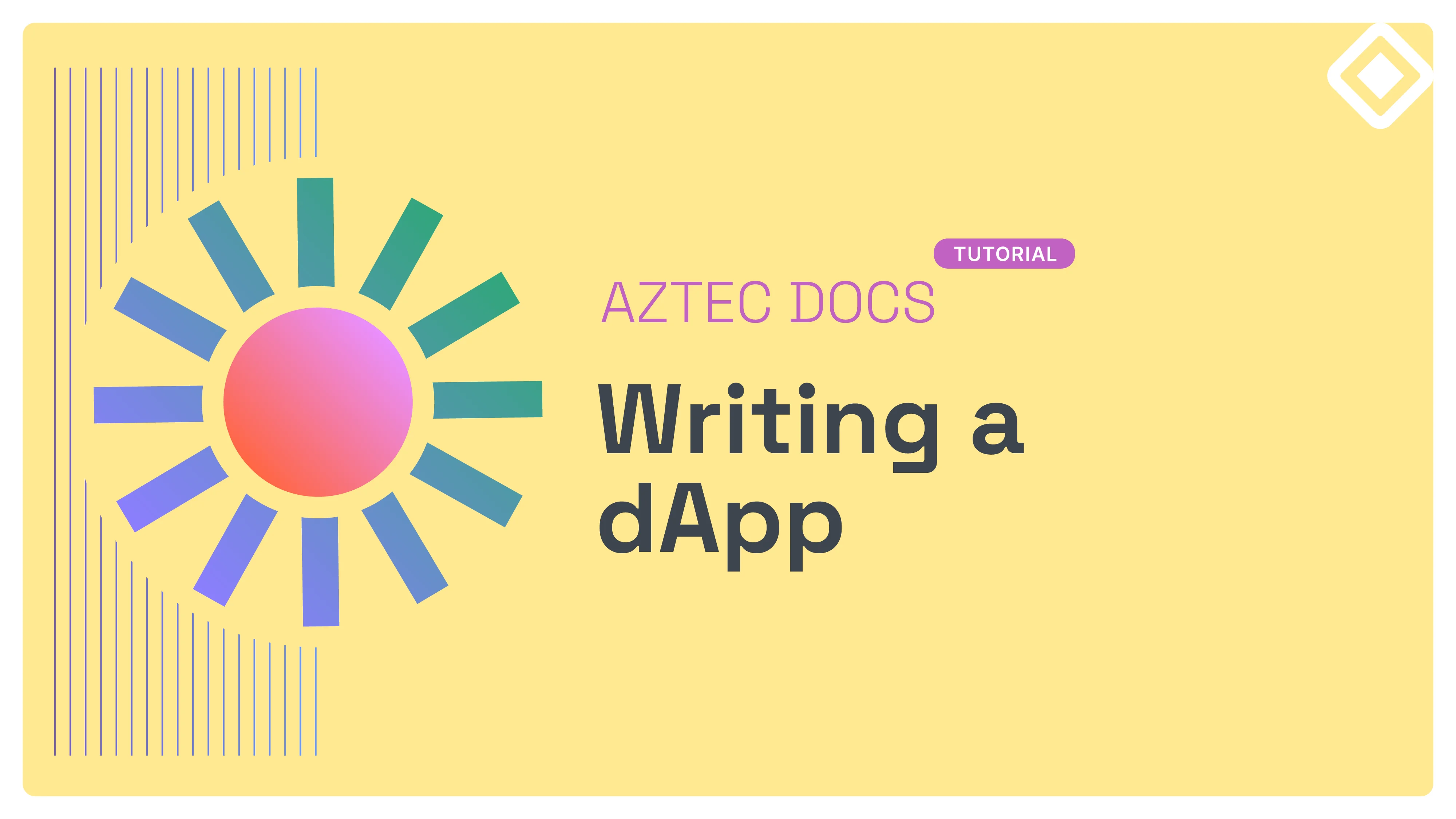
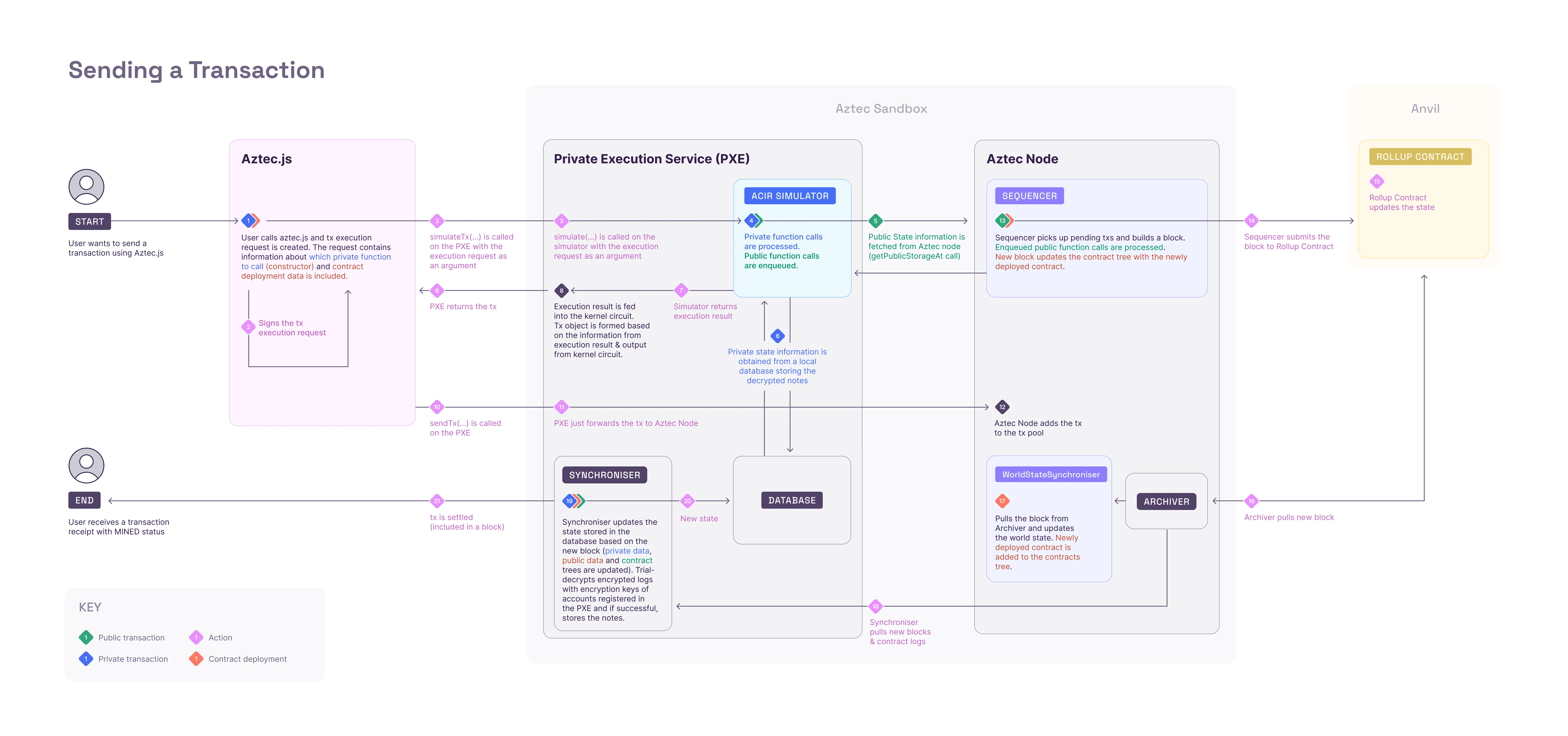
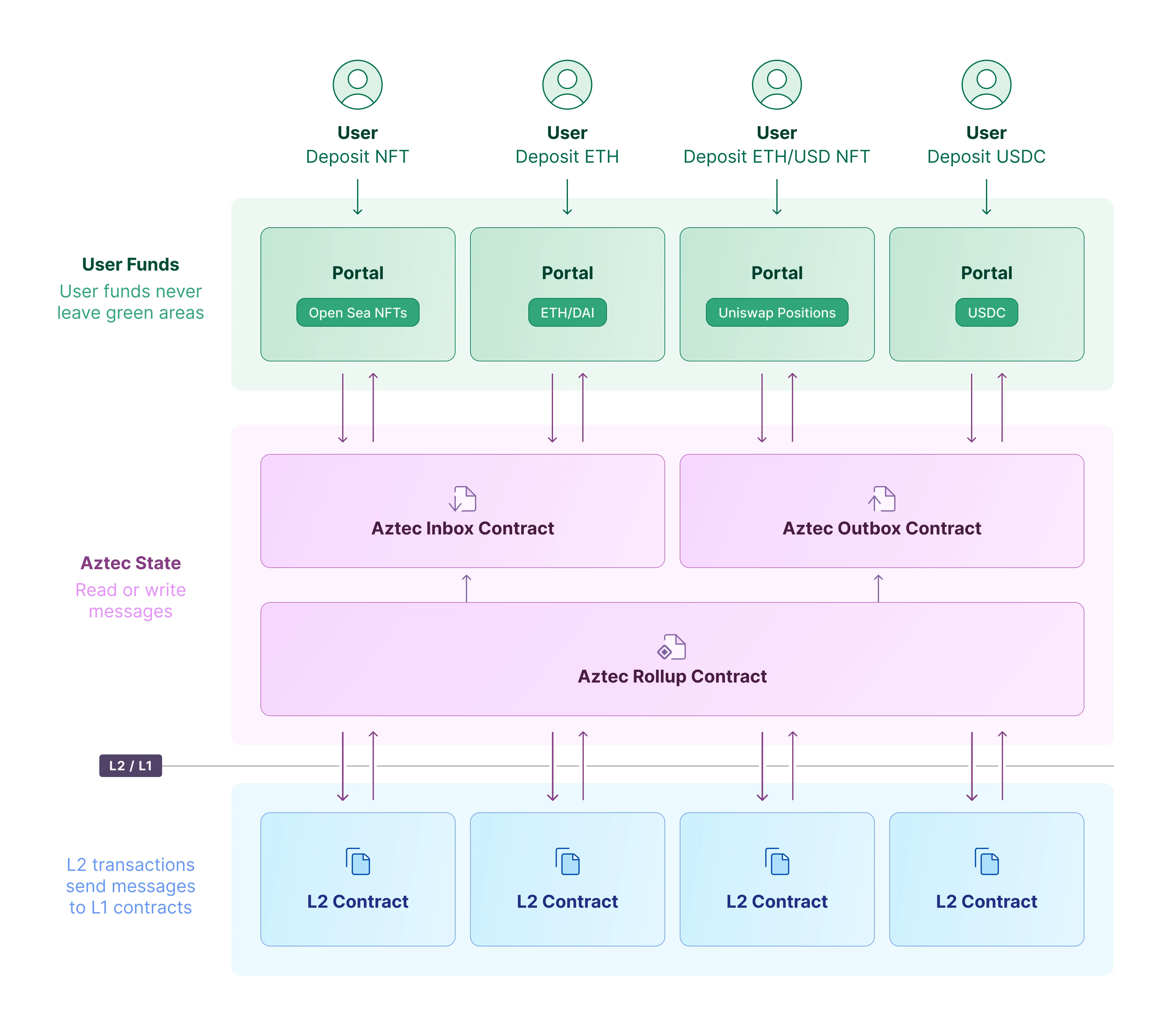
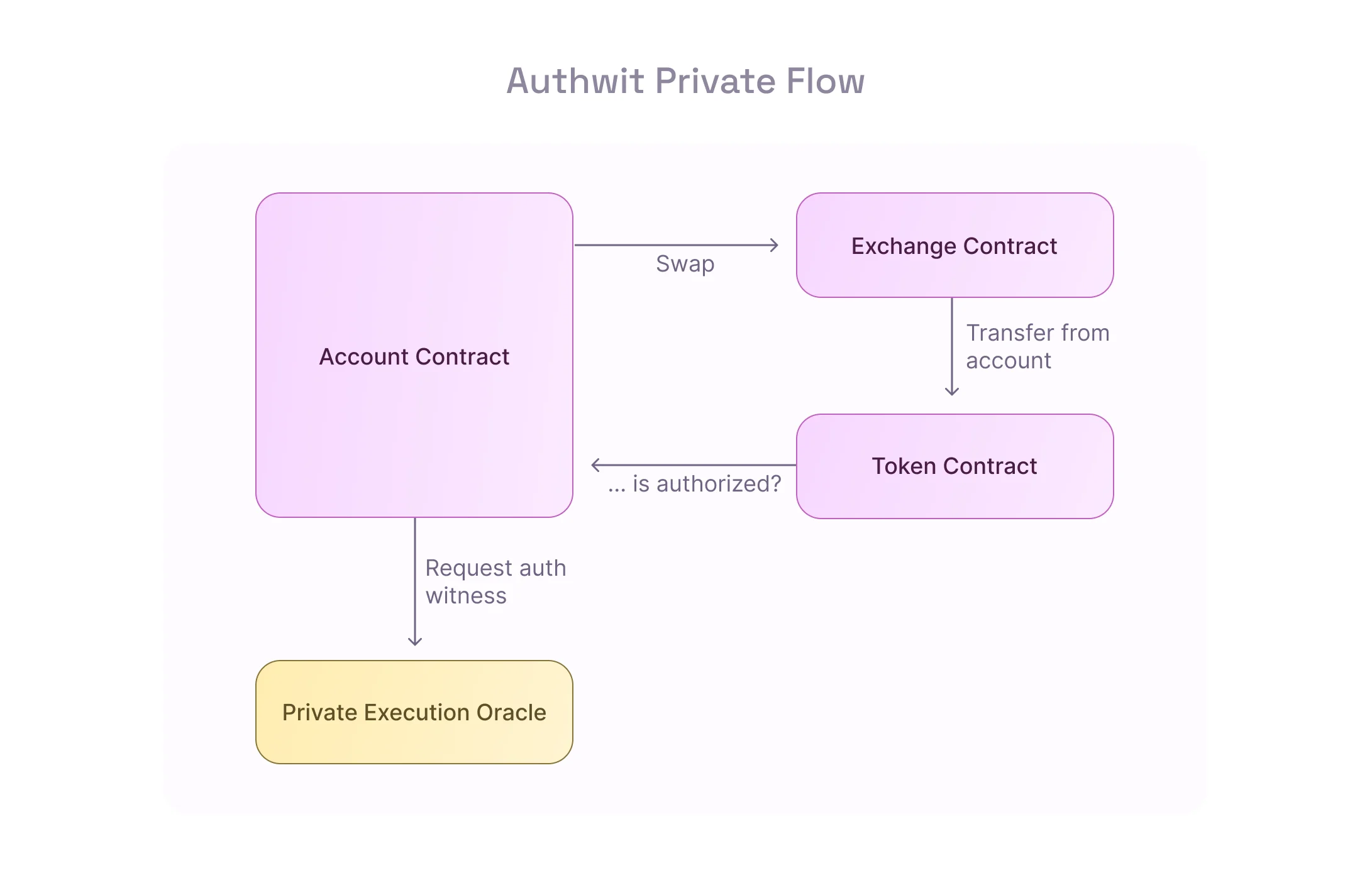
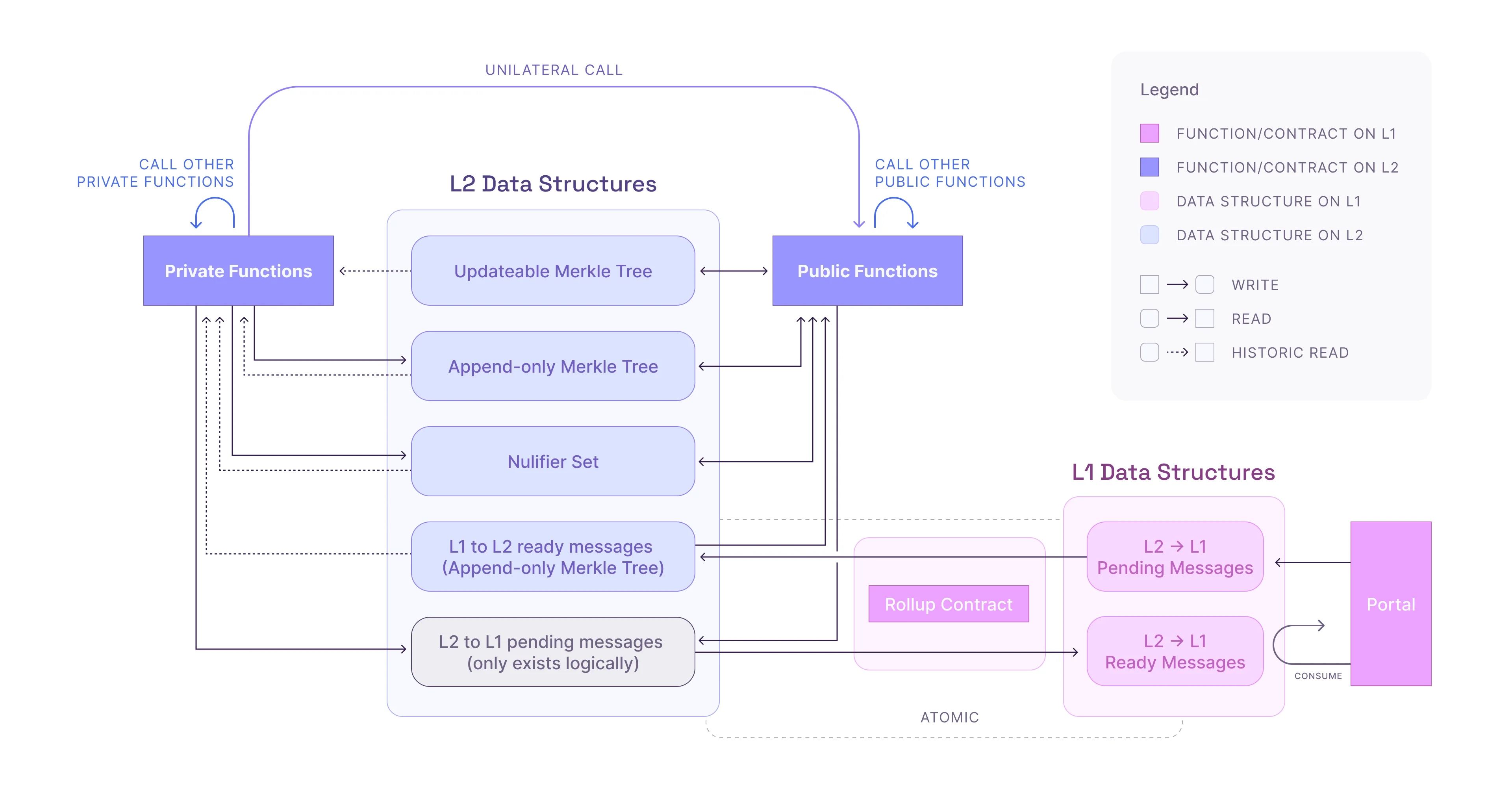
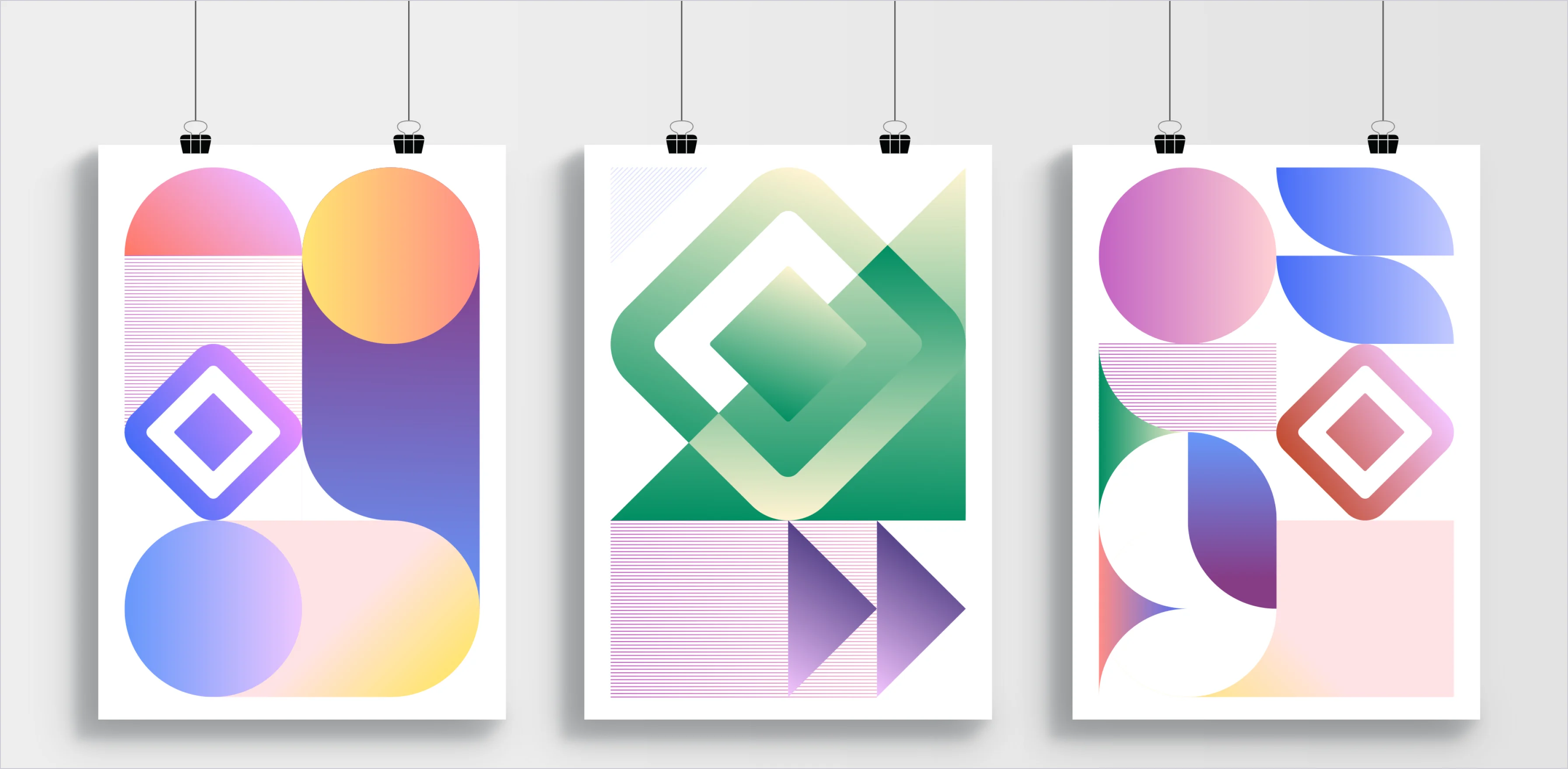
Level 1 diagrams are all about simplicity and clarity. Primarily composed of primitive components and arrows, they also leverage additional visual elements such as iconography as needed. The use of color can expand to certain tones of the color palette, but the style also admits monochromatic versions.
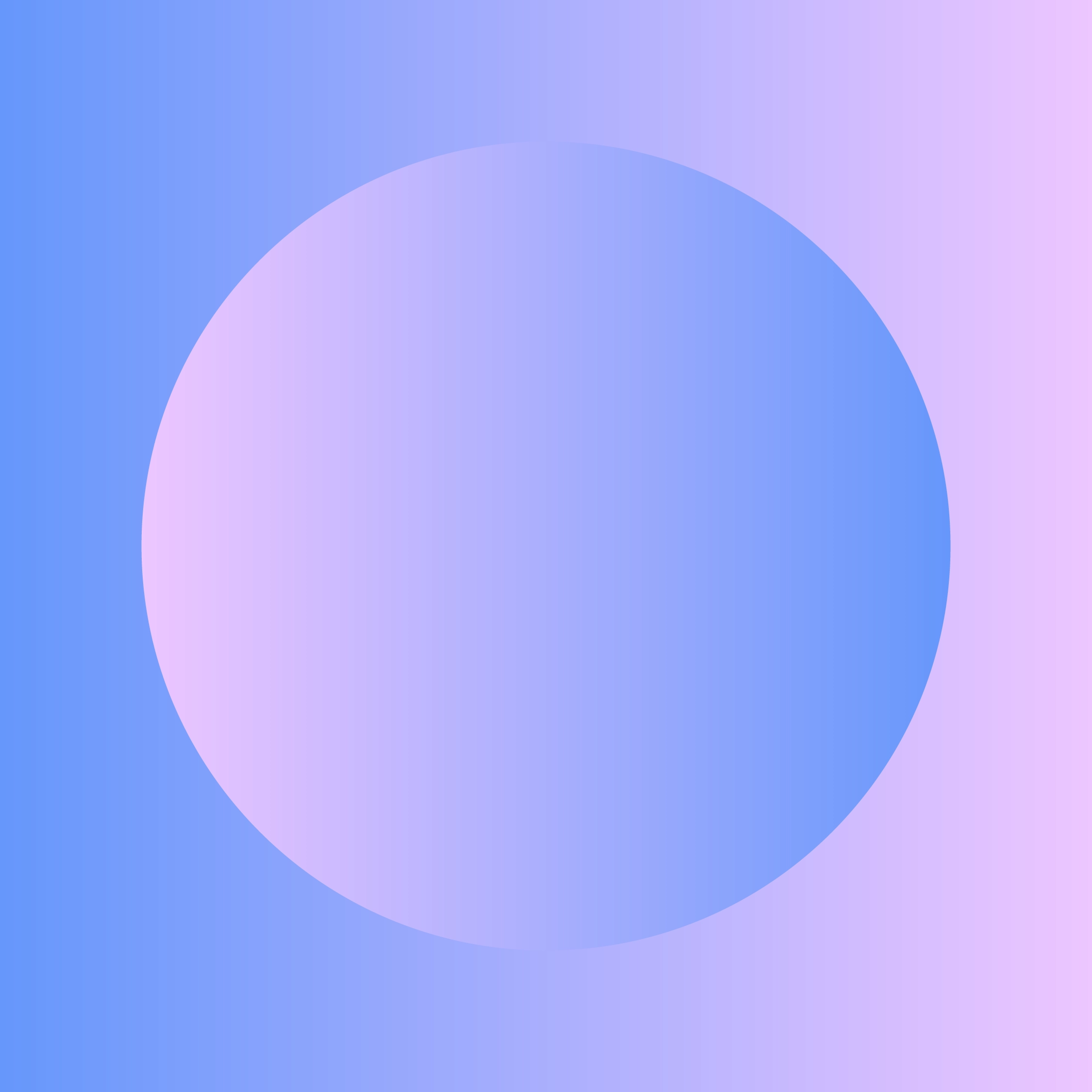
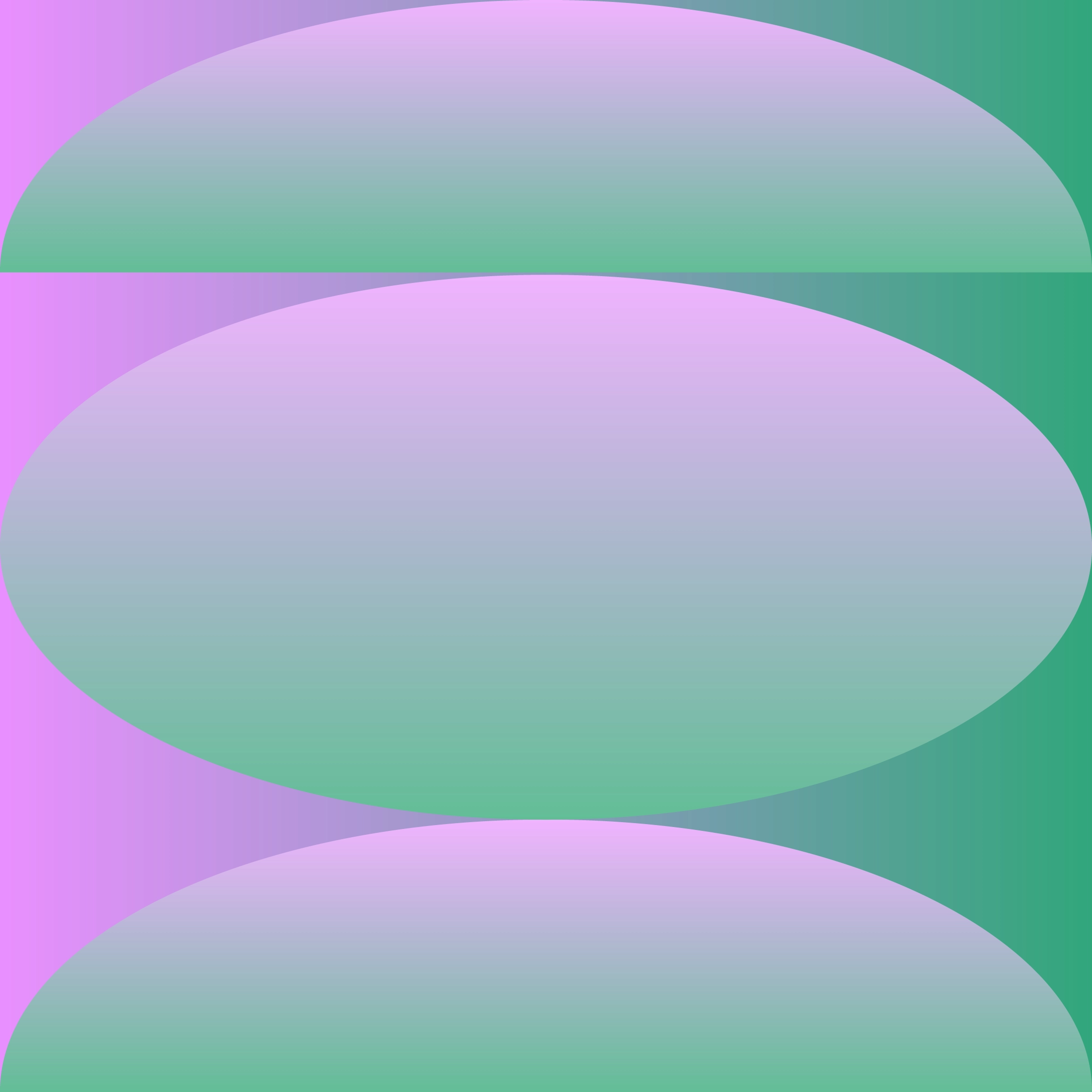
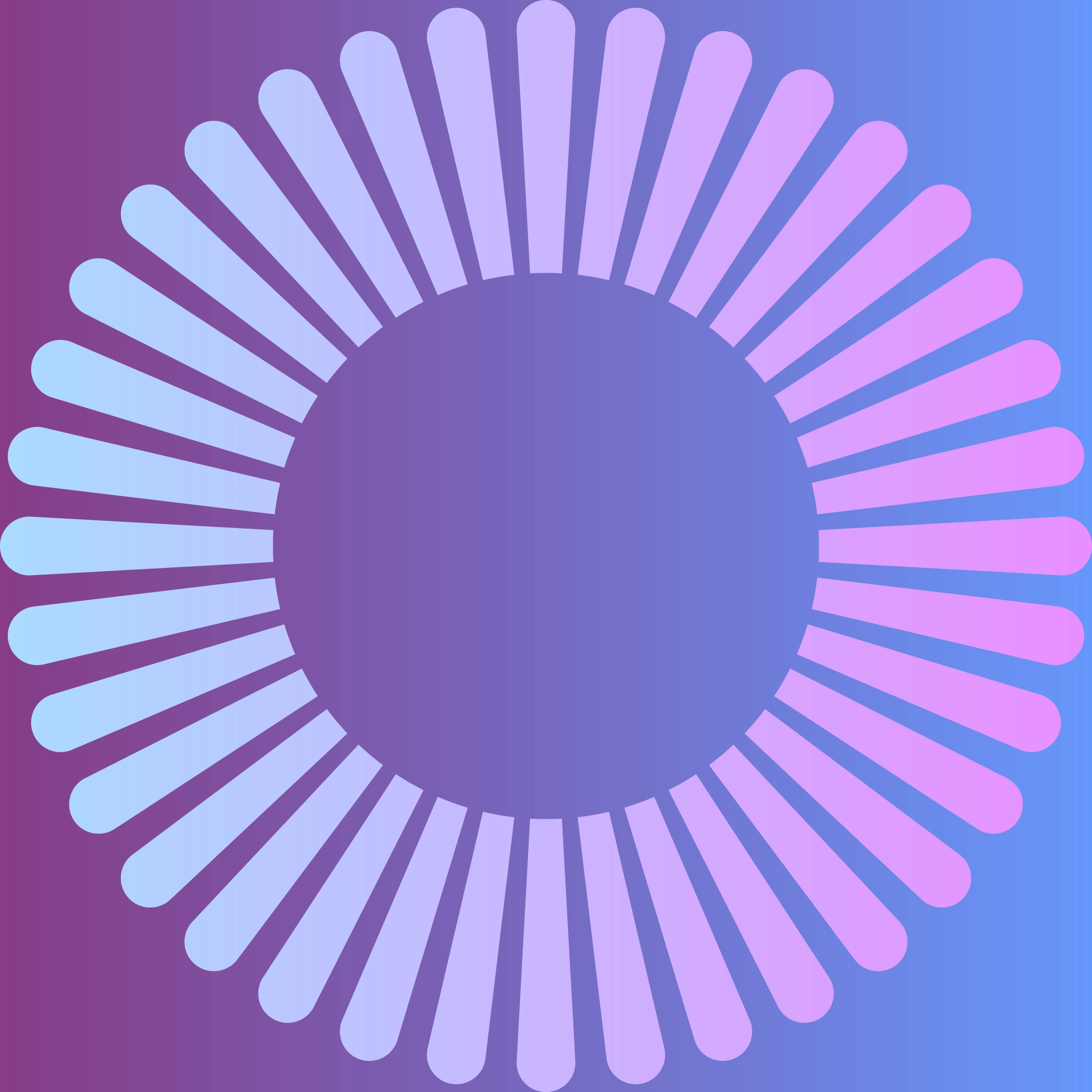
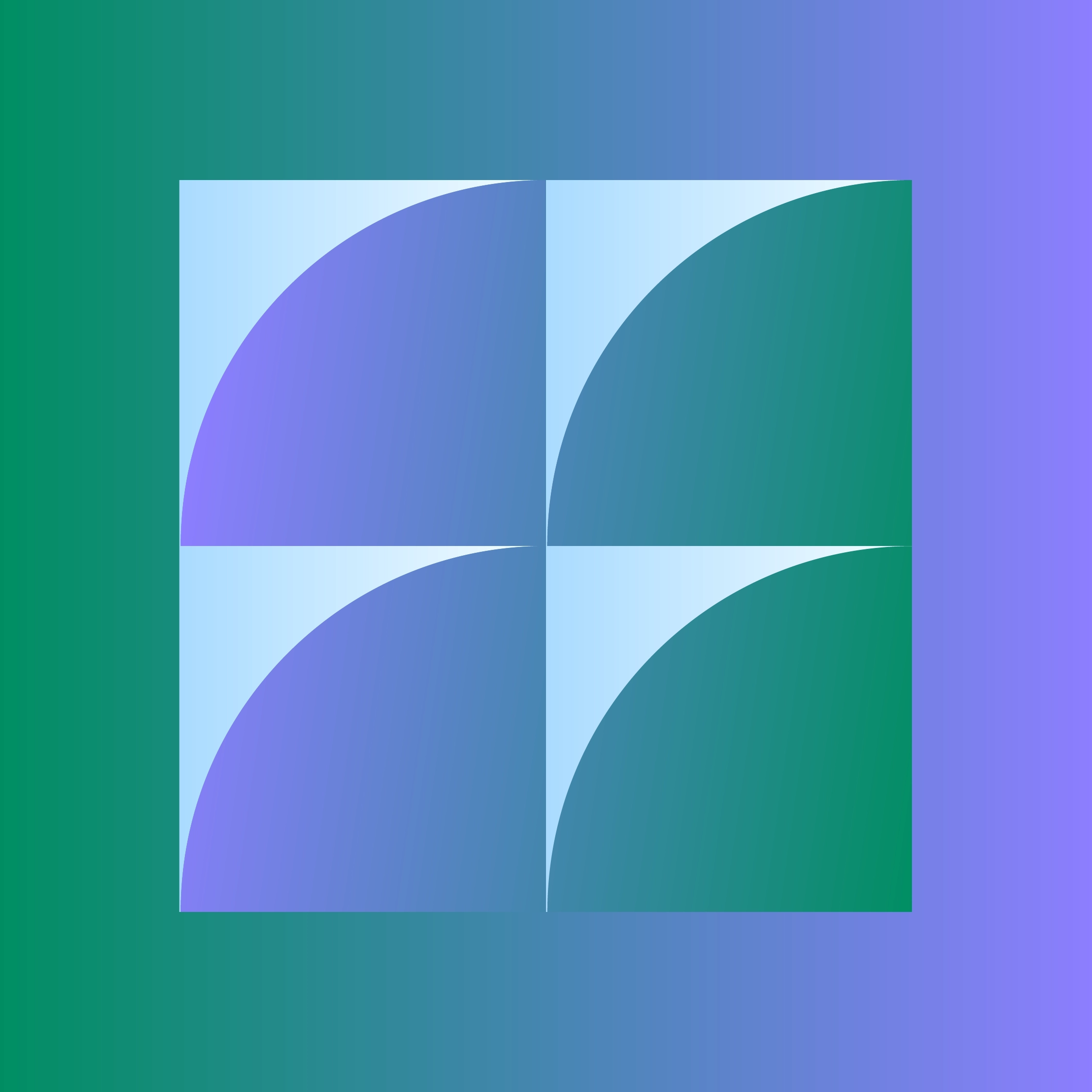
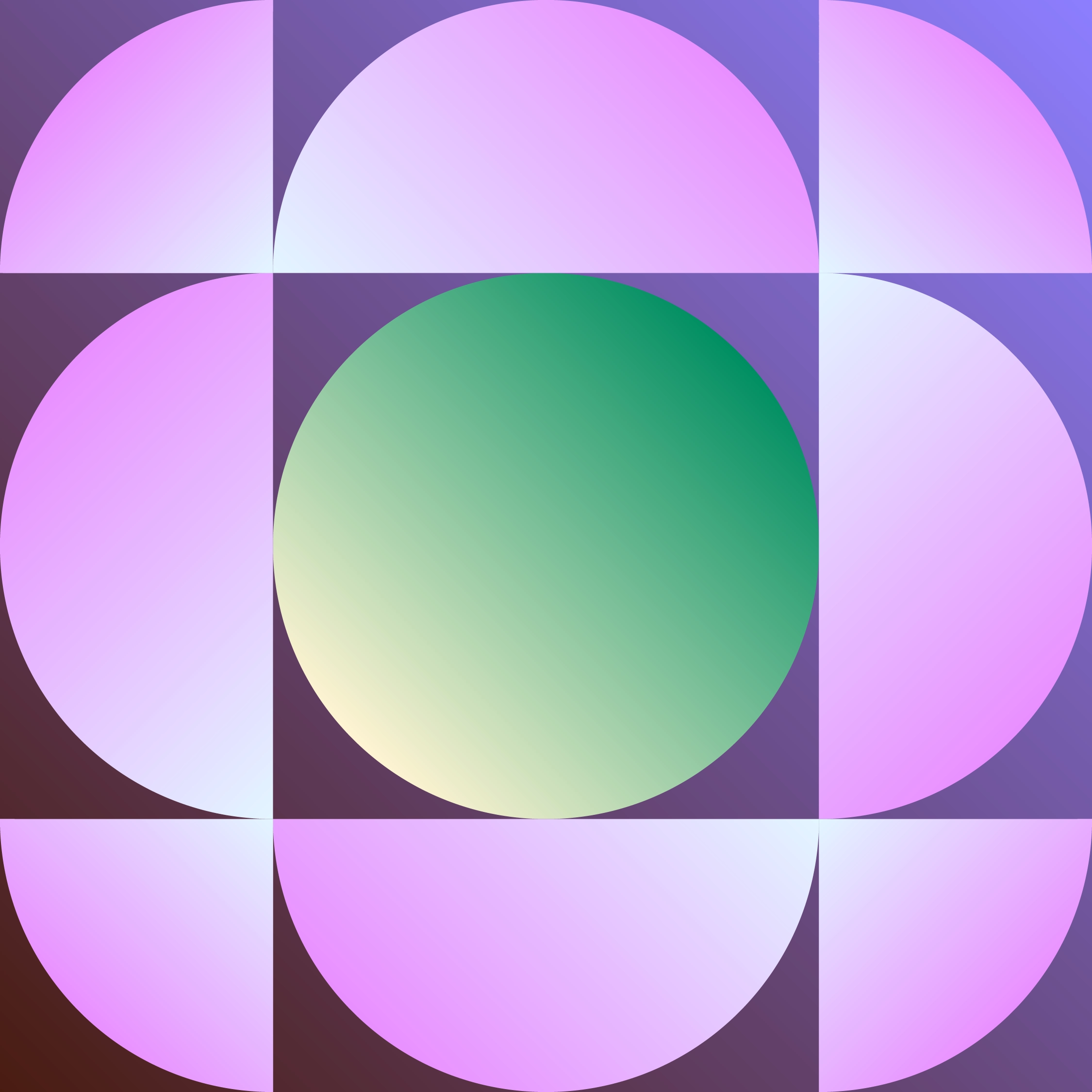
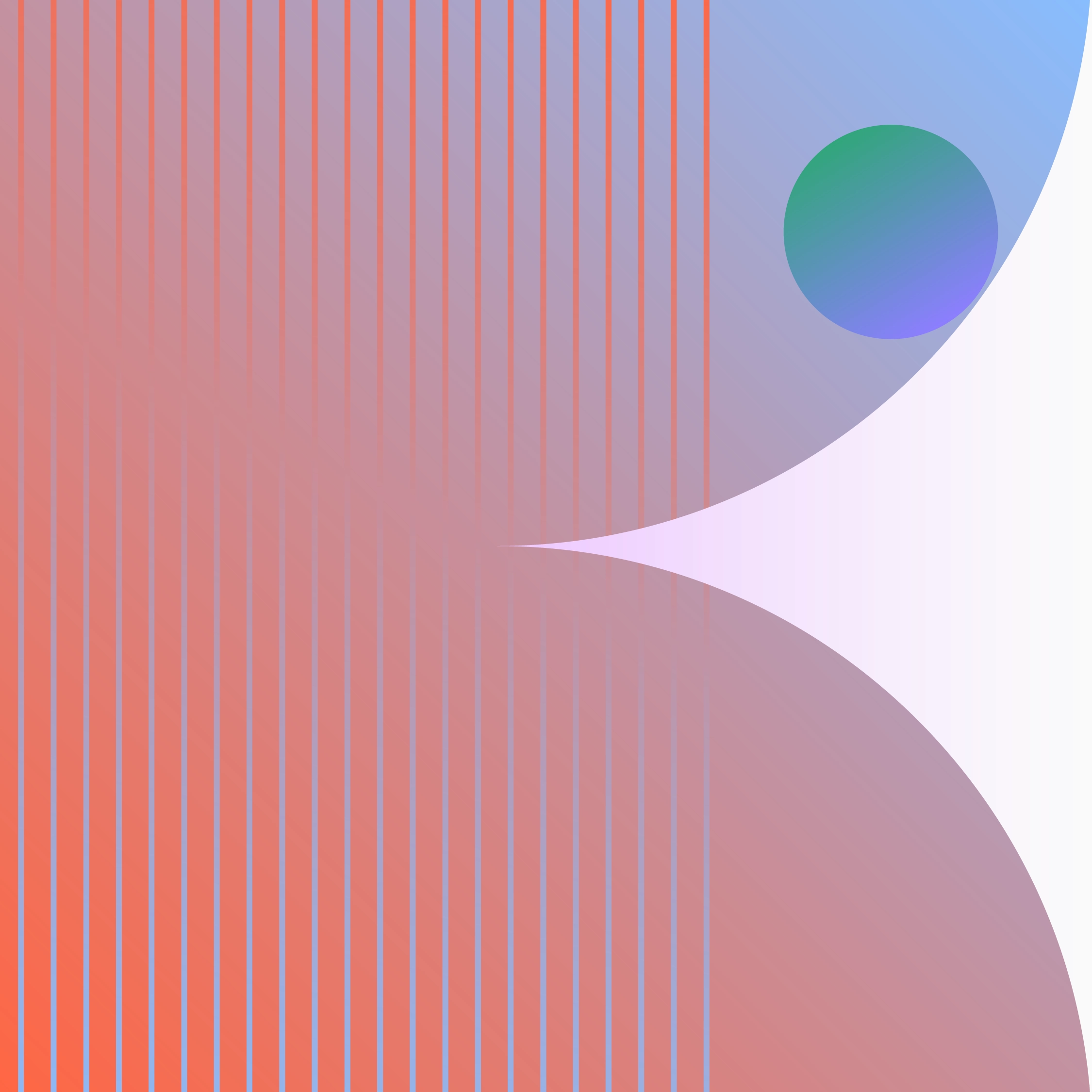
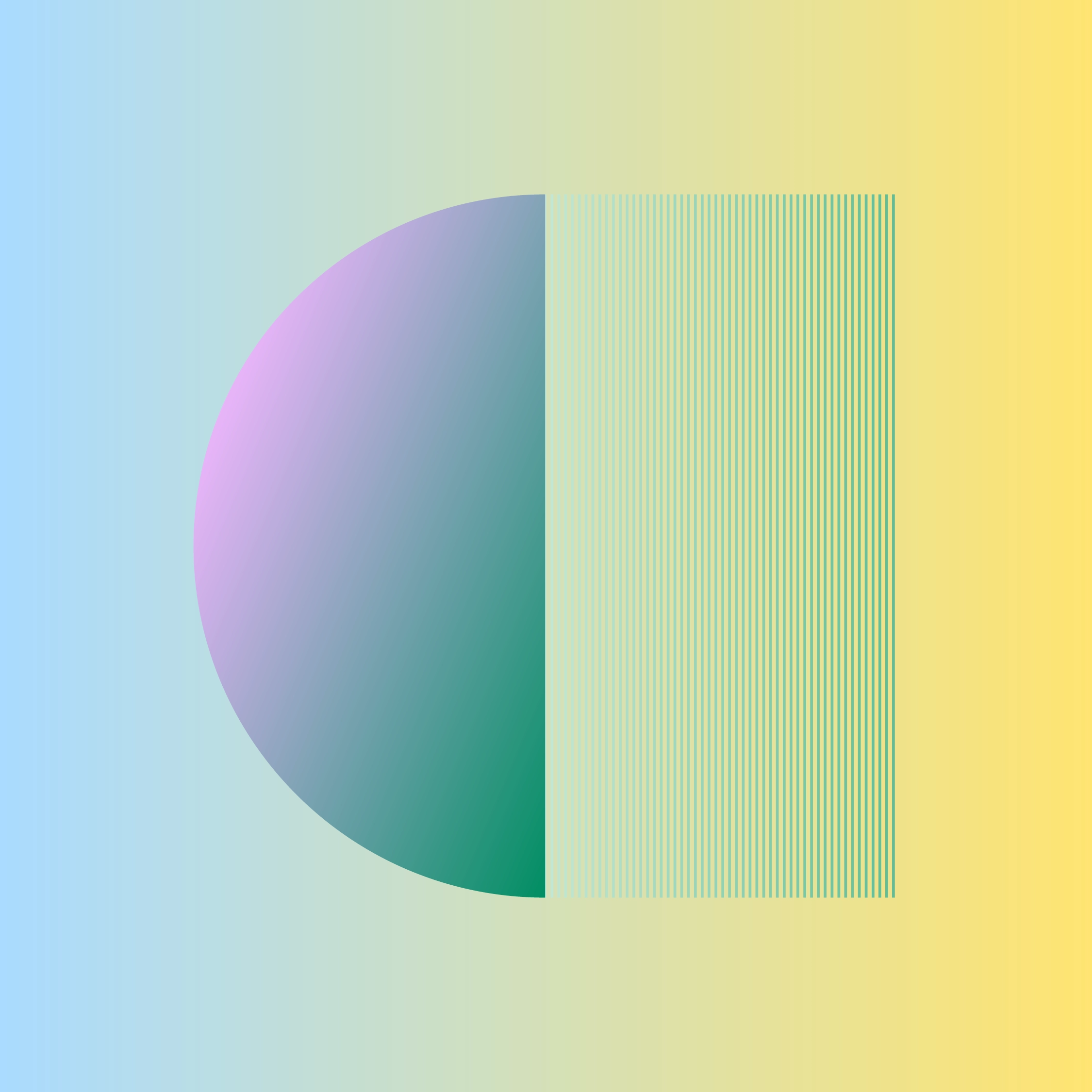
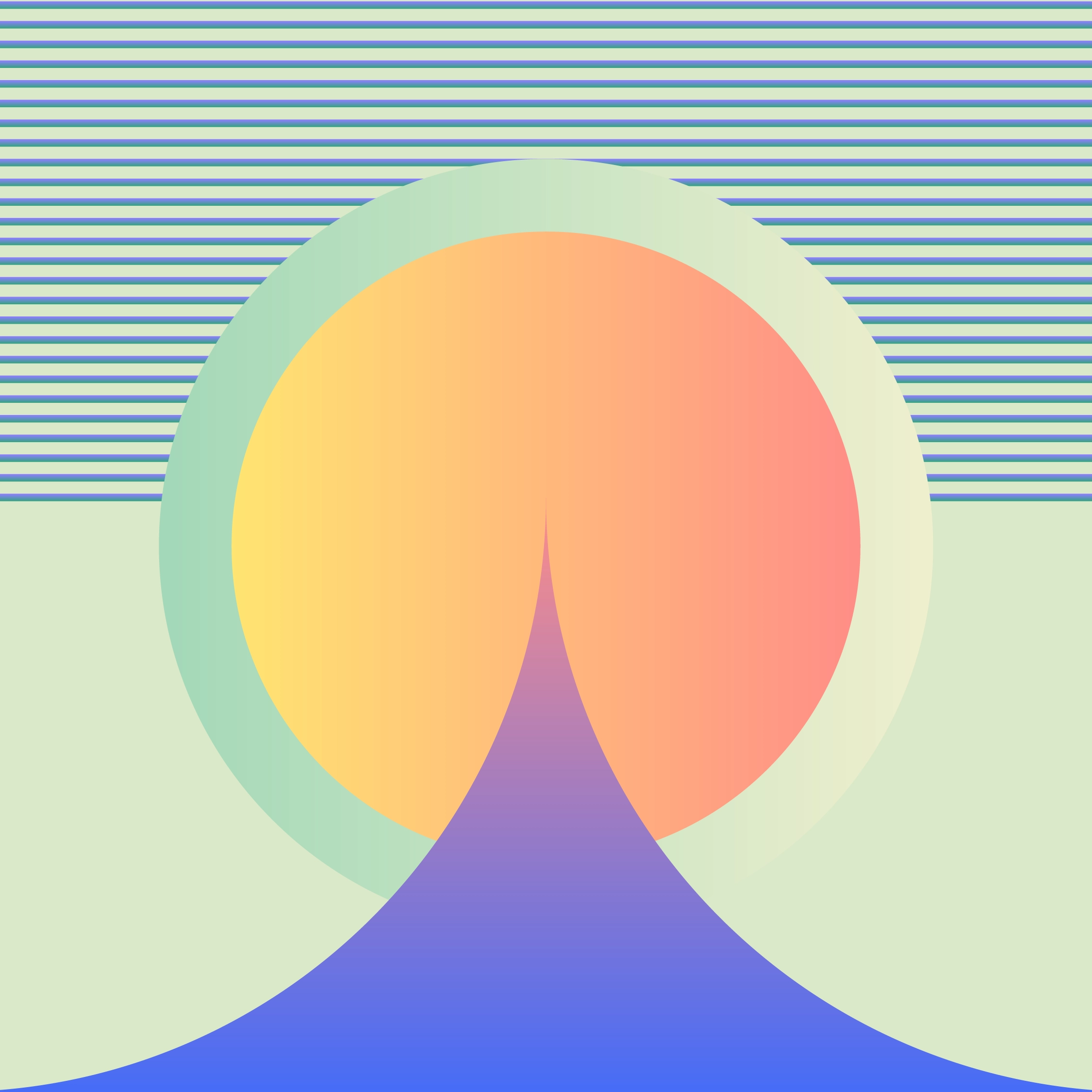
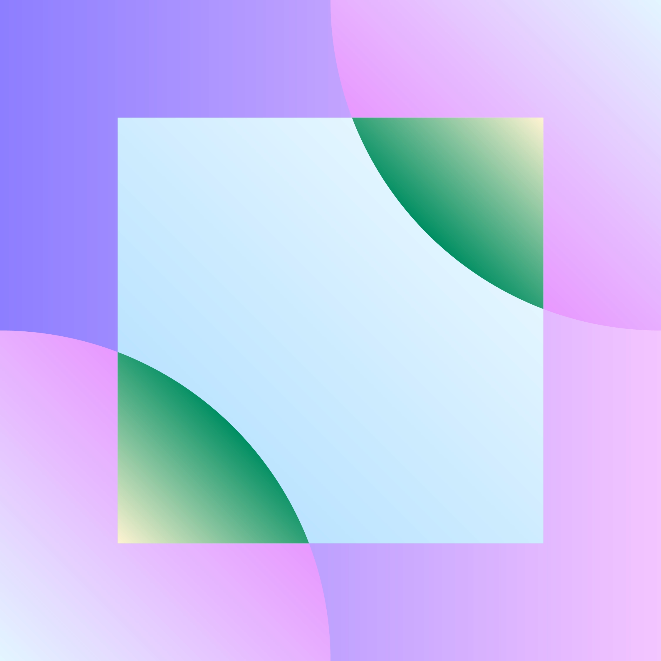
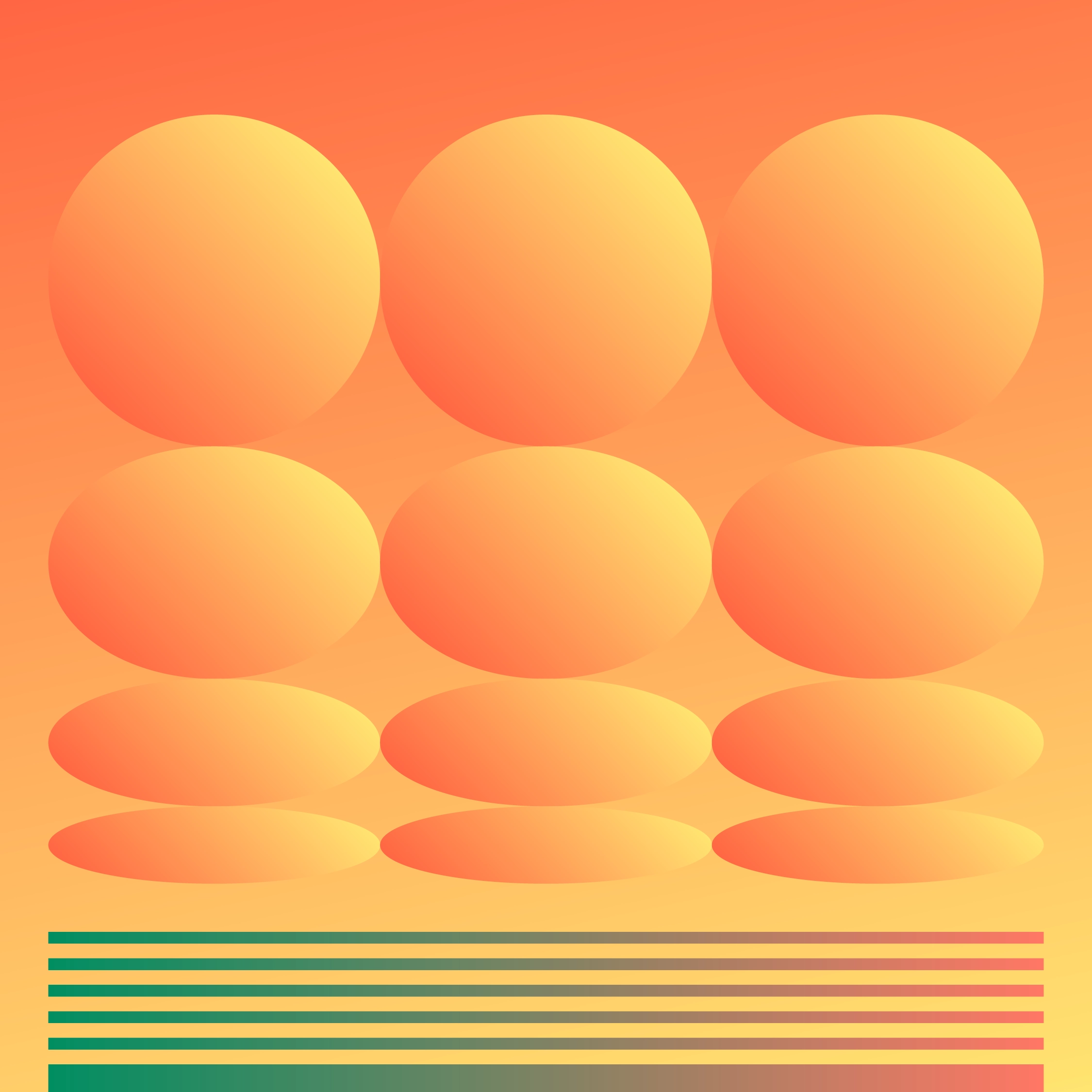
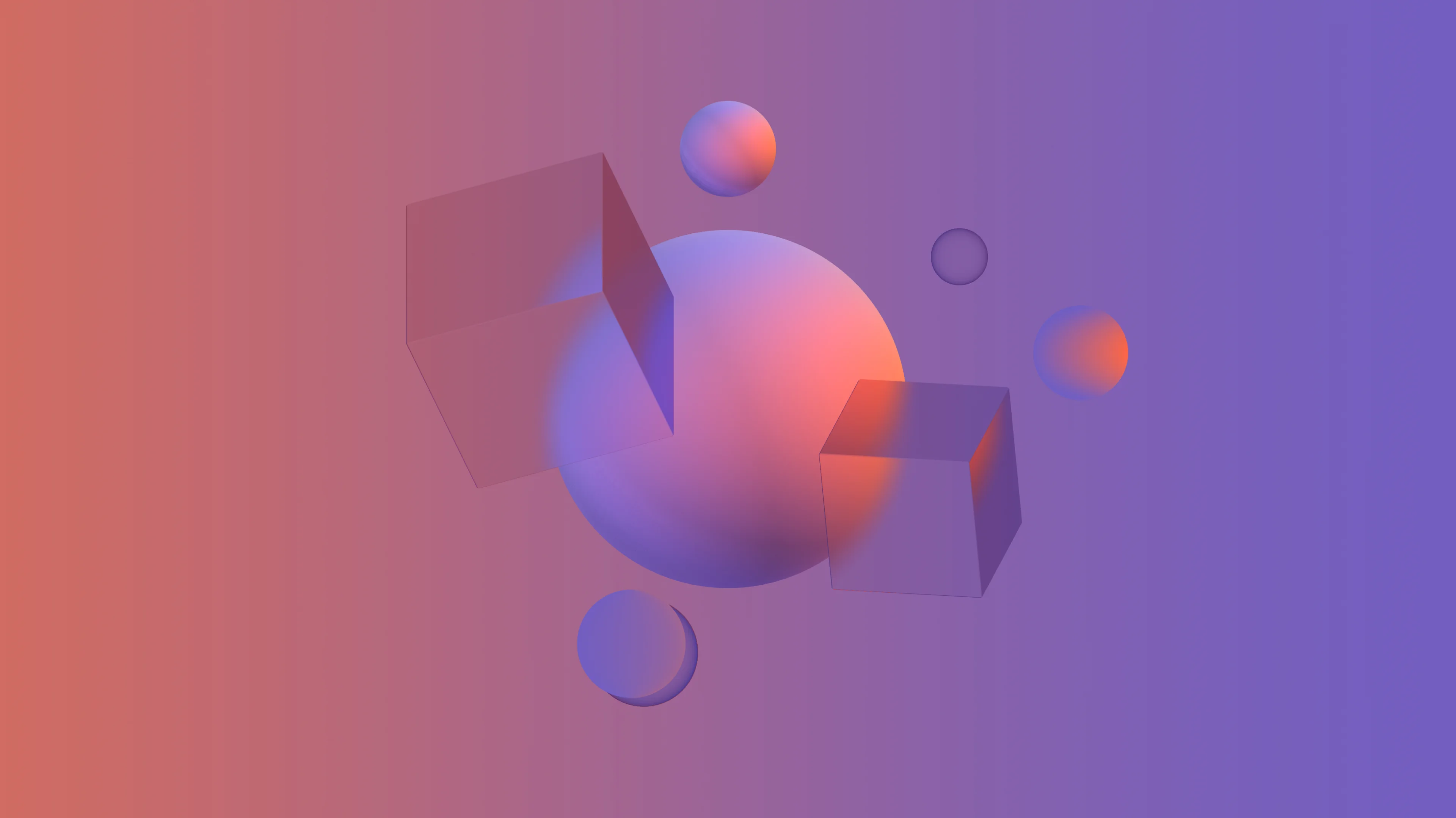
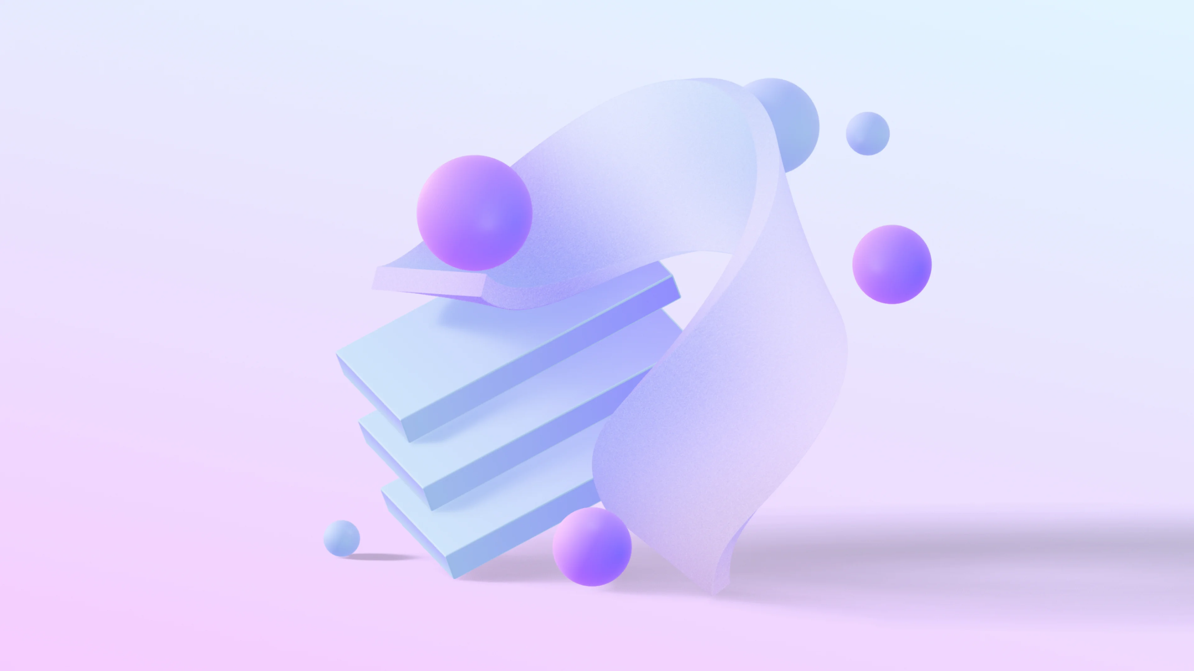
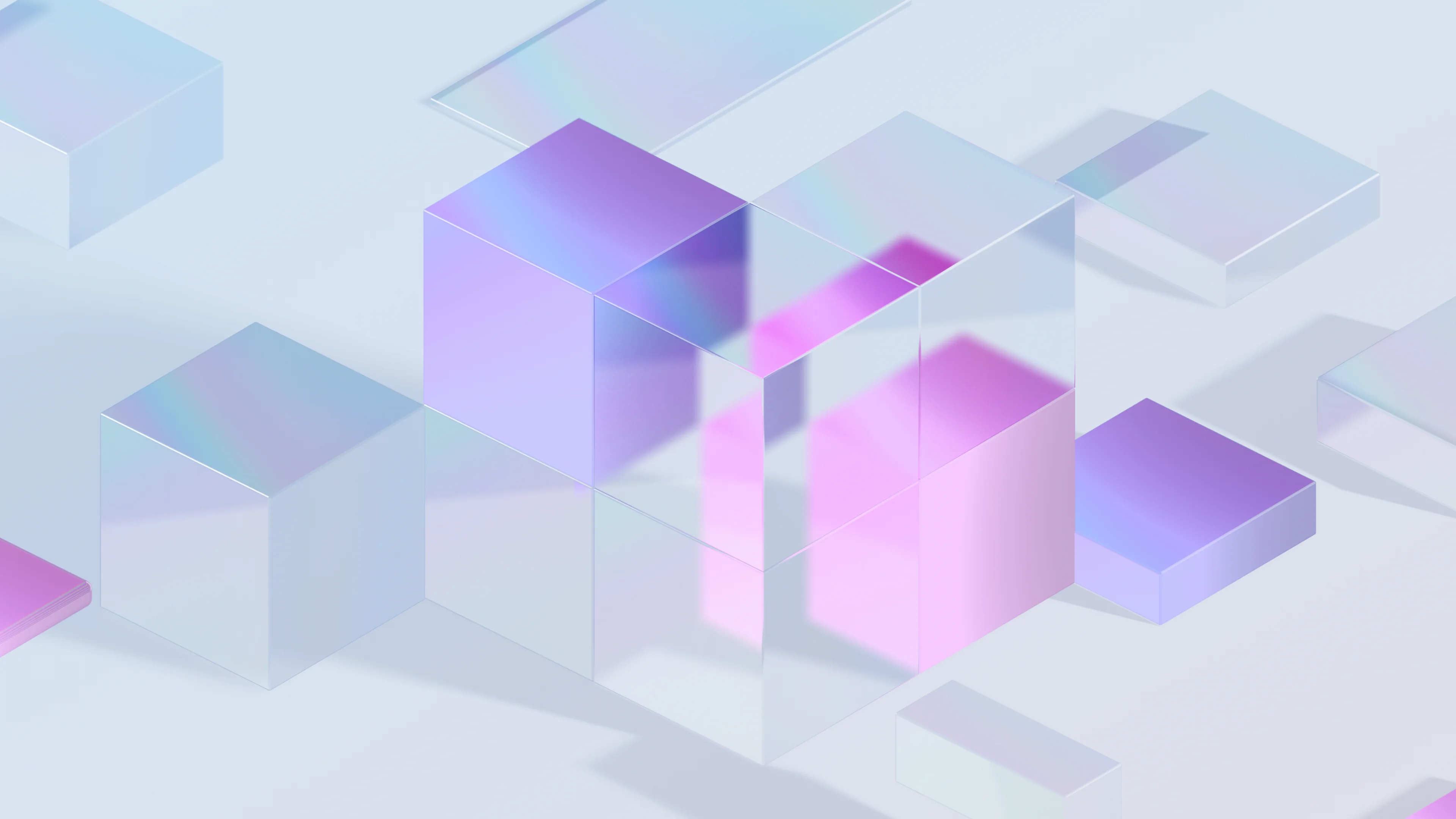
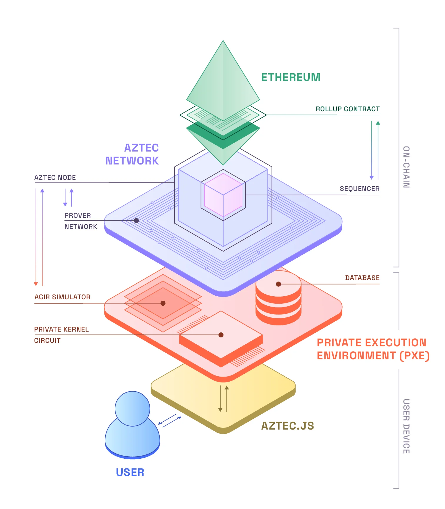
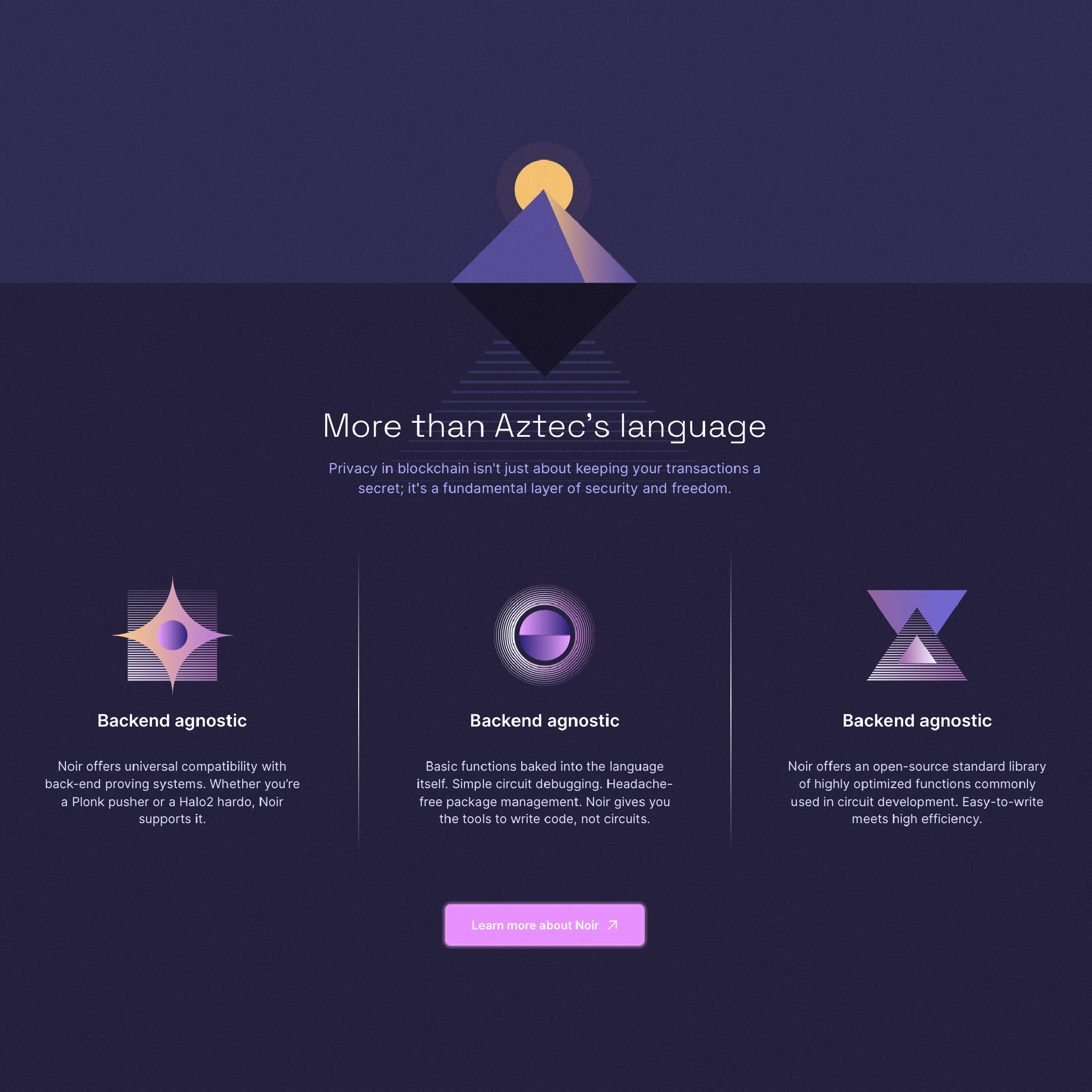
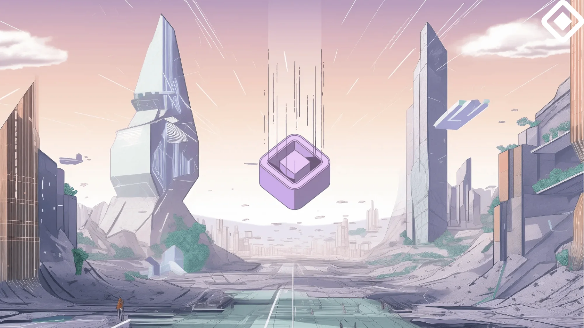
At Level 2, diagrams transform into fully visual representations. These diagrams are highly stylized, and likely work better to depict simpler / simplified systems. They incorporate a wide range of visual elements, from intricate icons and color gradients to dynamic shapes and patterns, and various perspectives.
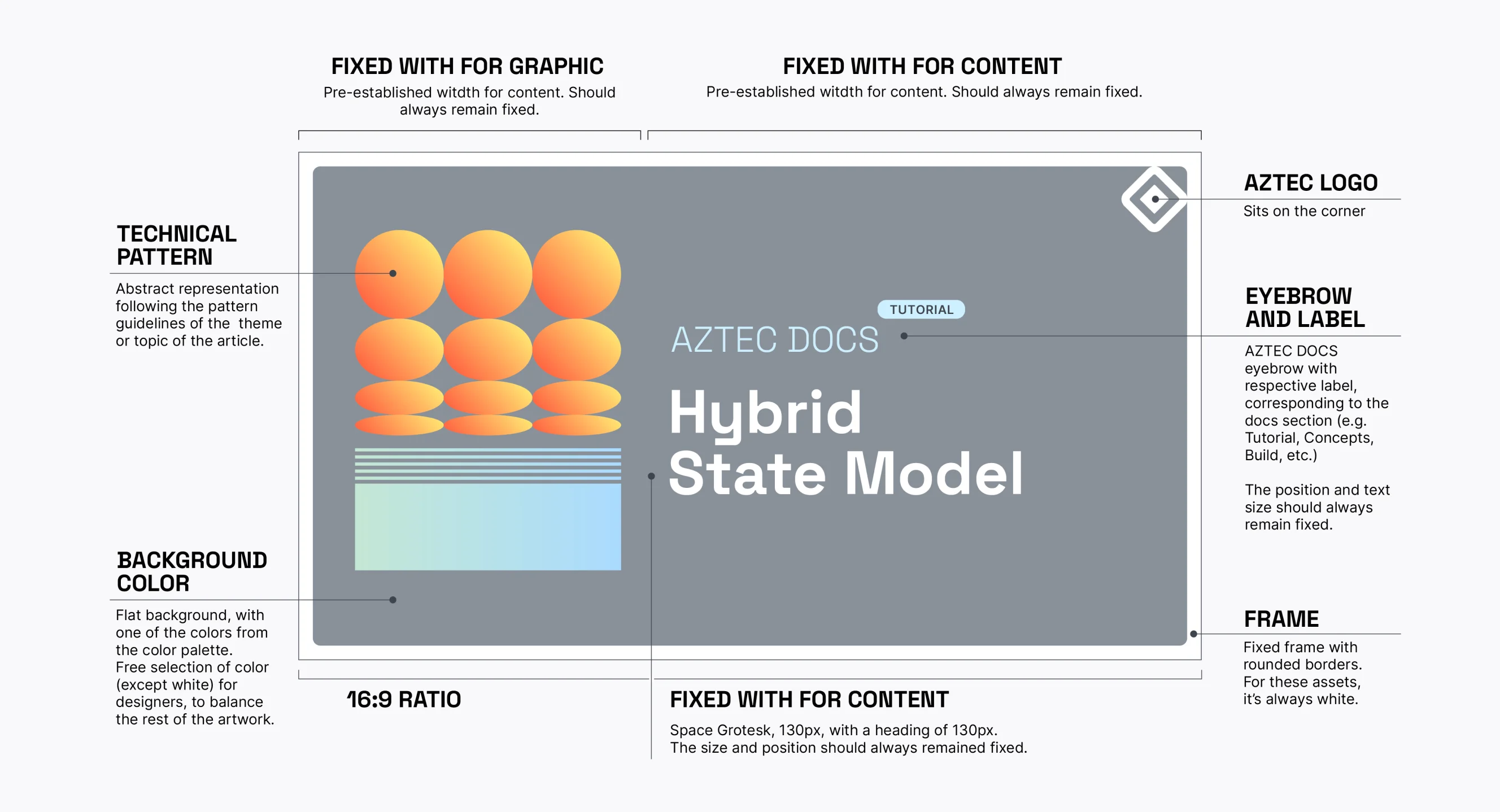
Stationary elements, both printed and digital, must always incorporate established brand elements, and always prioritize legibility. Creativity in layout, favoring irregular and innovative designs, is encouraged.
General guidelines, backgrounds, and templates were made available to keep a consistent visual language throughout the overall presentation output. Consistency not only serves to consolidate the brand, but it’s also the key value to educate an audience on how to process information.
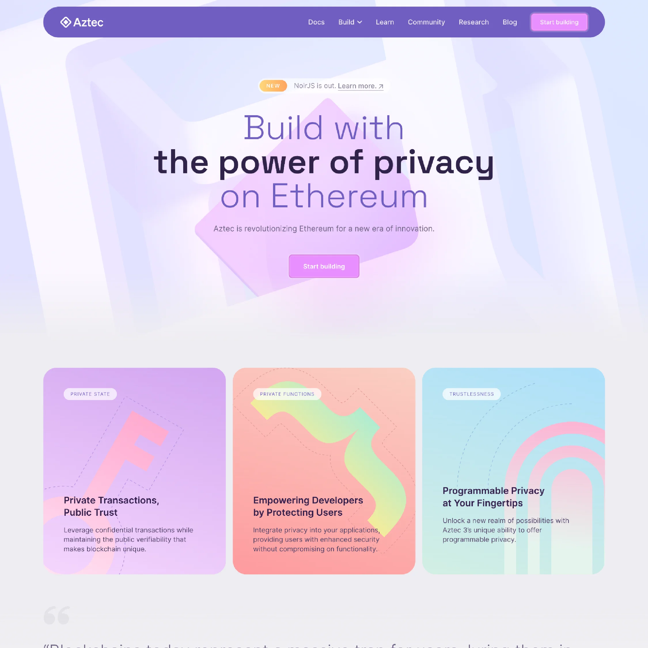
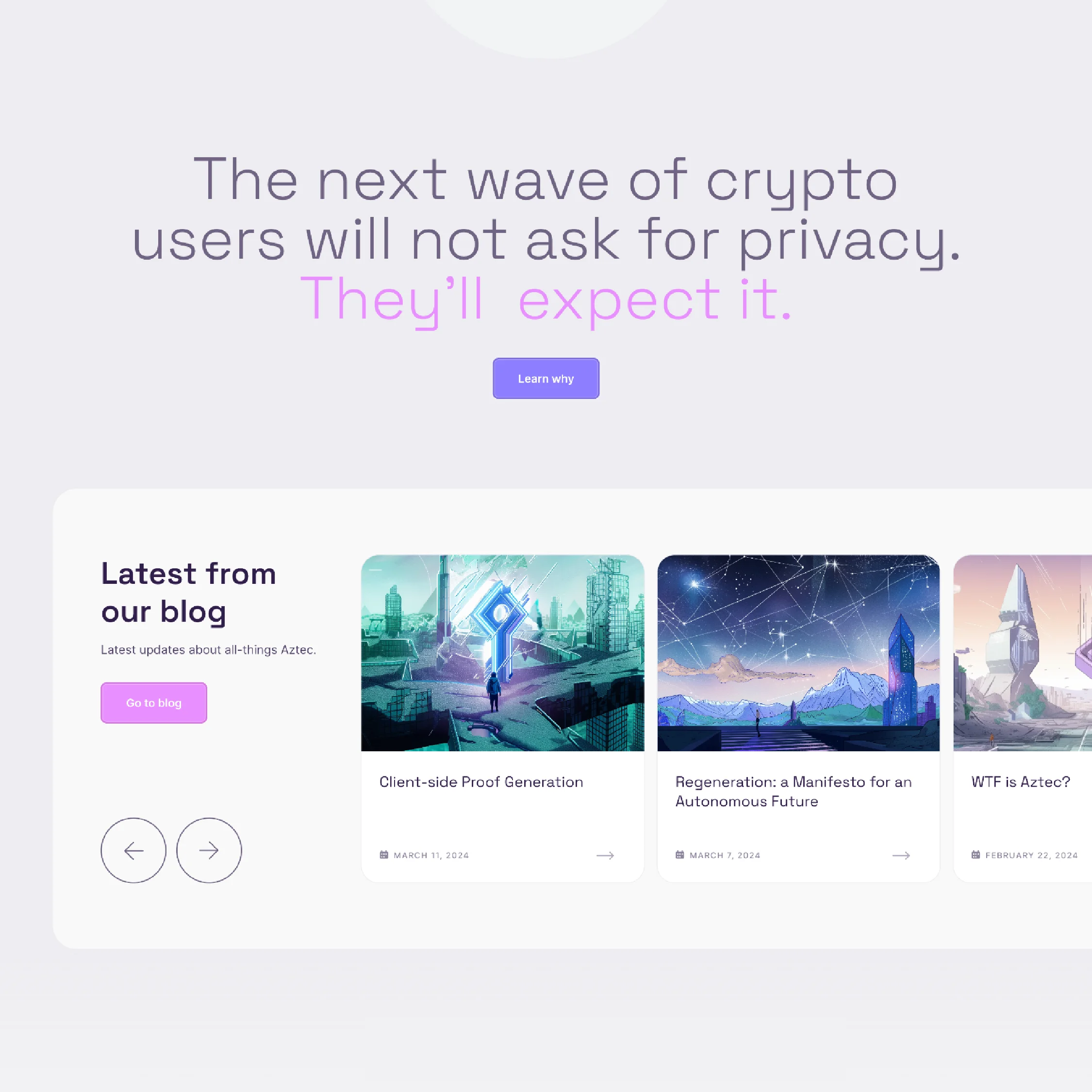
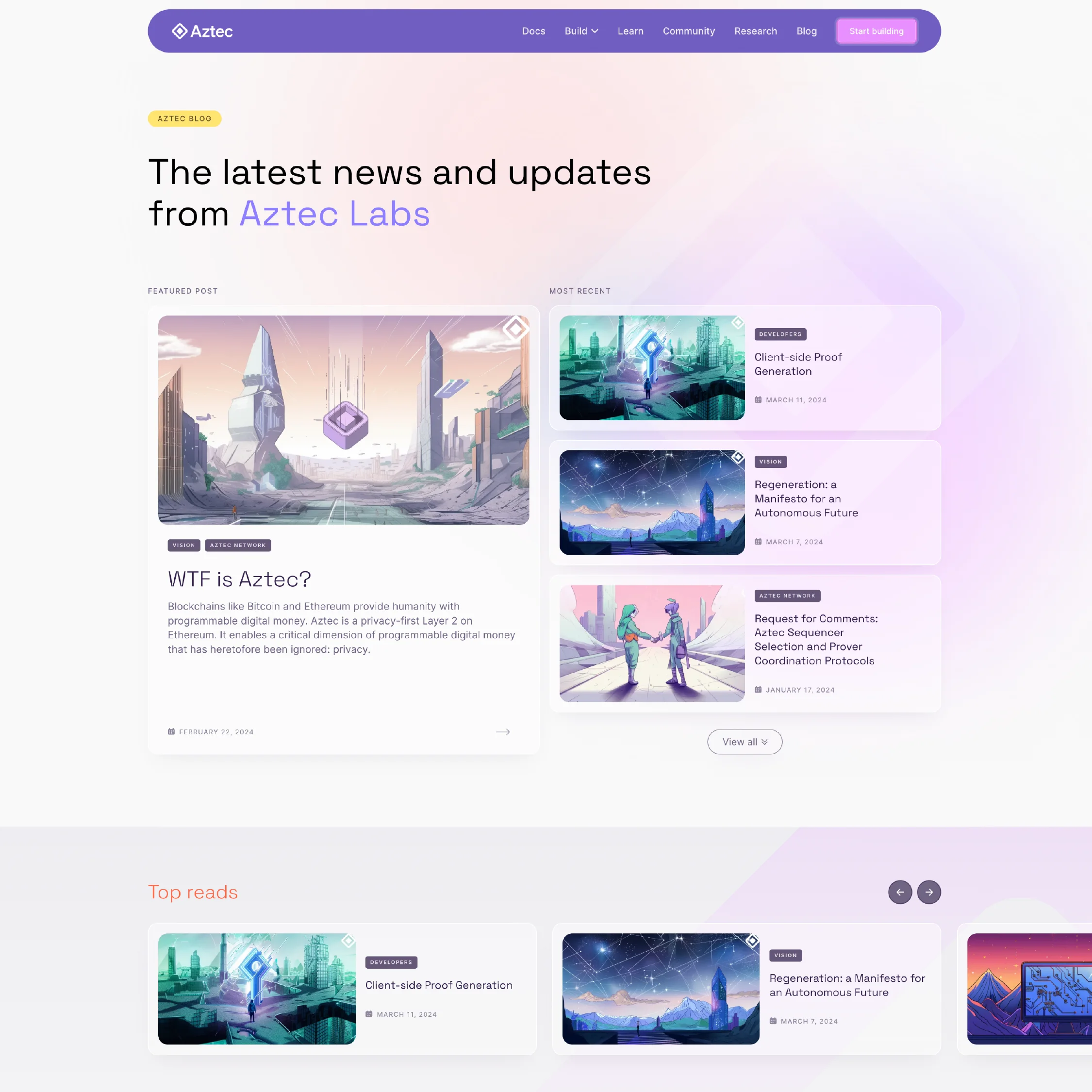
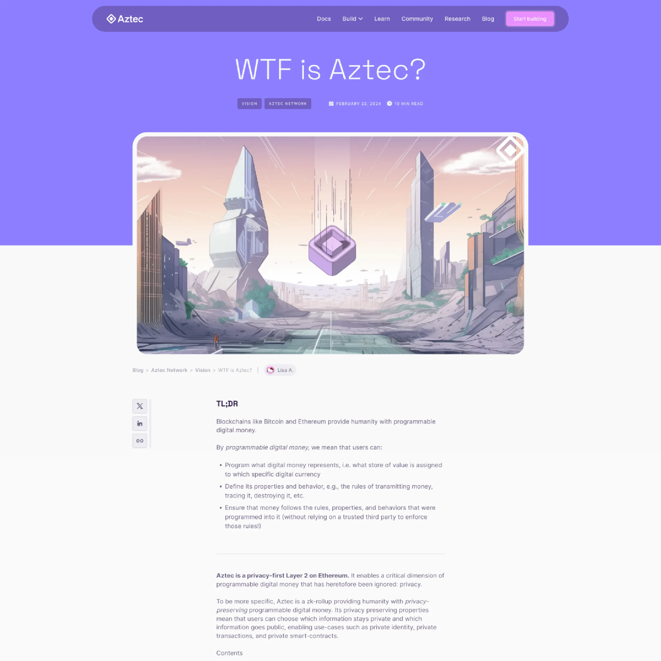
Aztec's web design is where all our brand's visuals come together, offering a user-friendly and visually engaging experience. It's crafted for easy navigation and responsiveness, ensuring a seamless and enjoyable journey on any device.
Aztec's website features and related materials merge the various graphics and techniques of our main brand, along with some crafted visual extensions. This approach is especially notable in our blog, which is further detailed below.
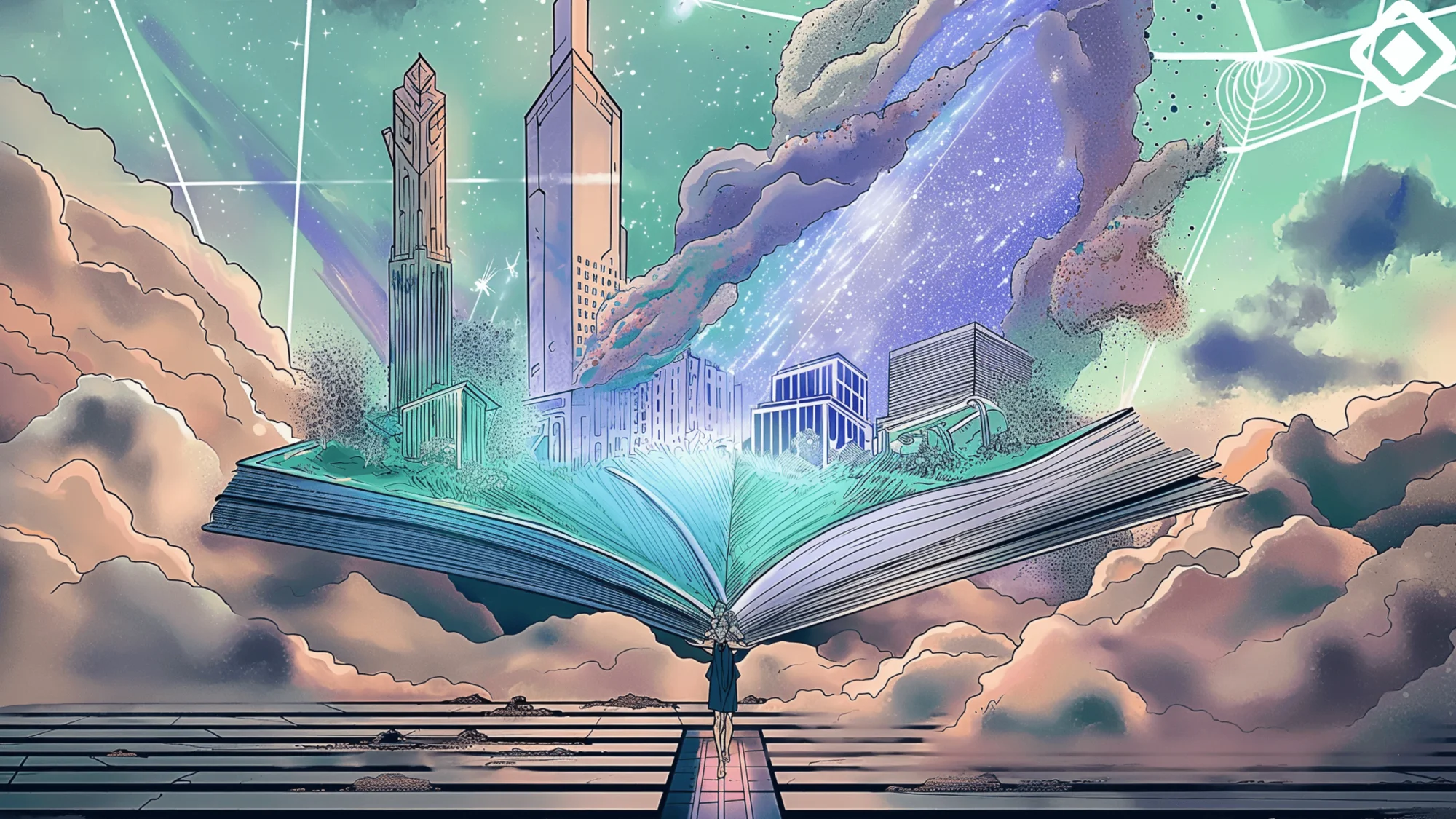
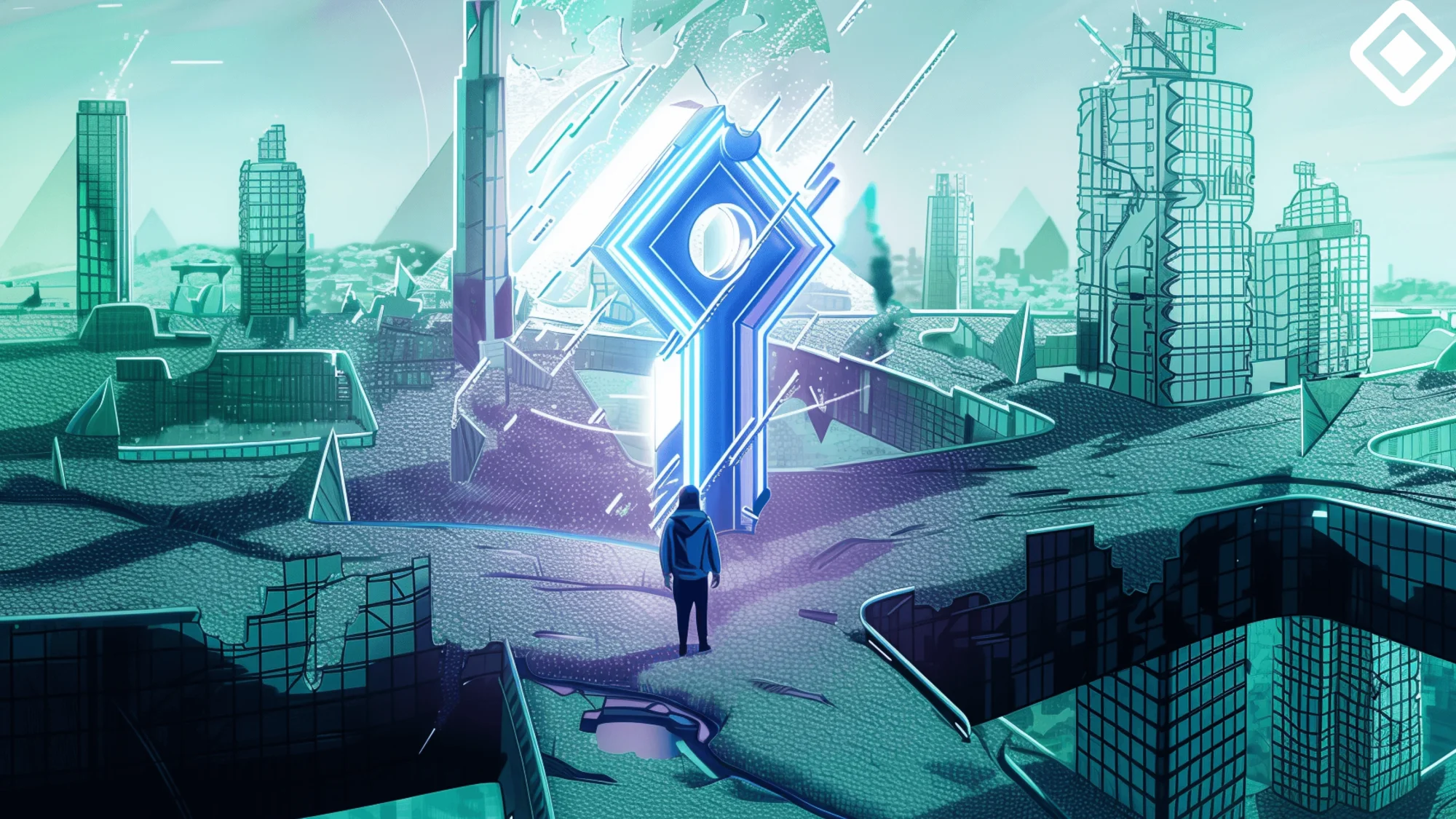
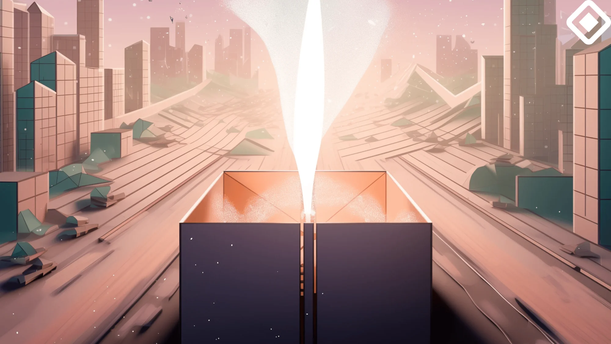
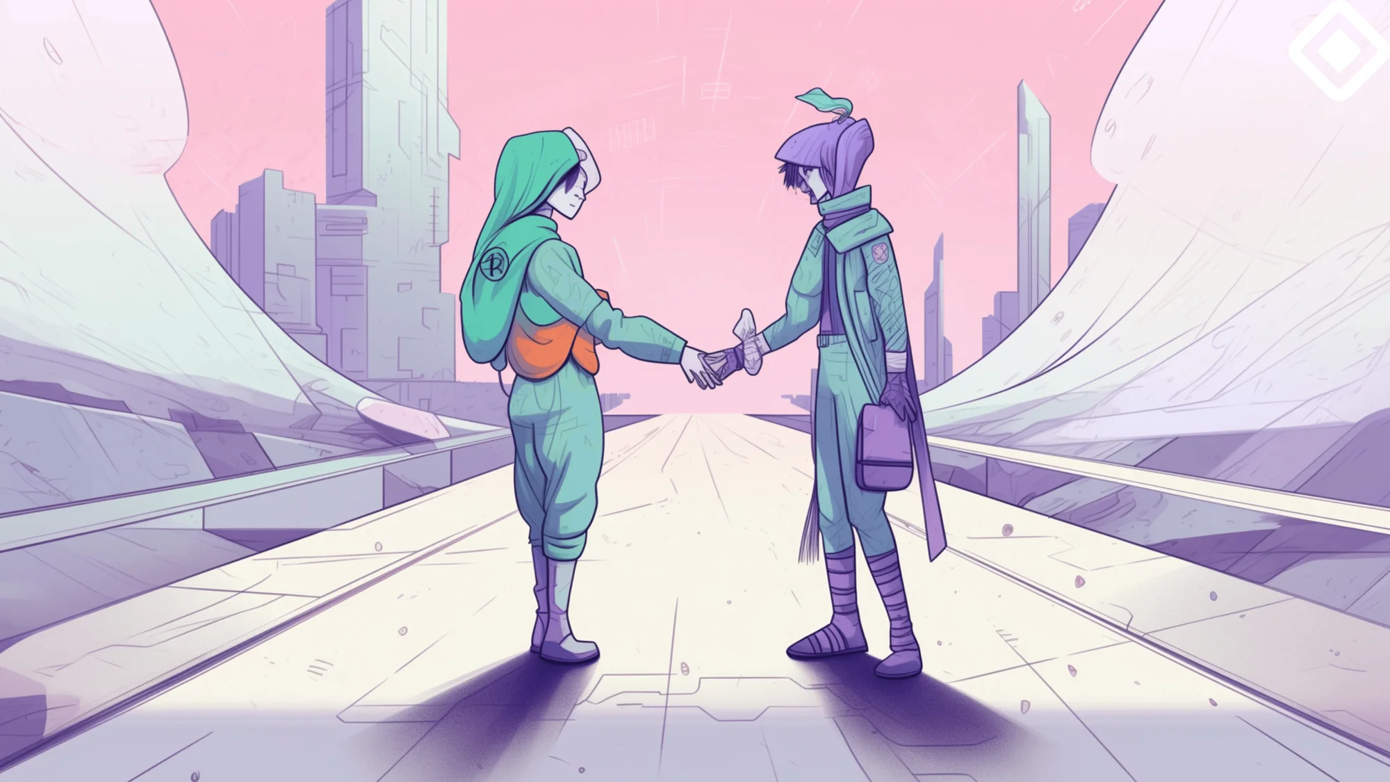
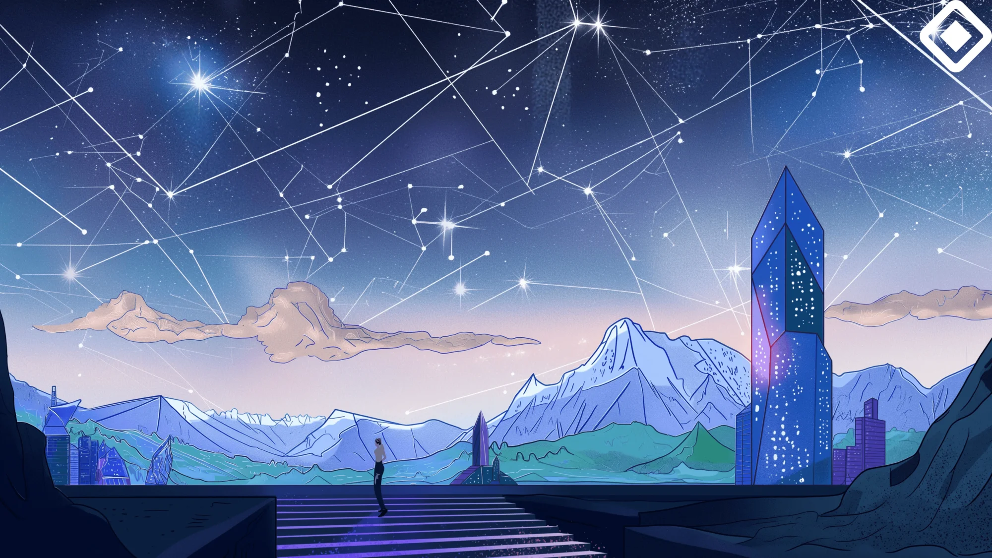
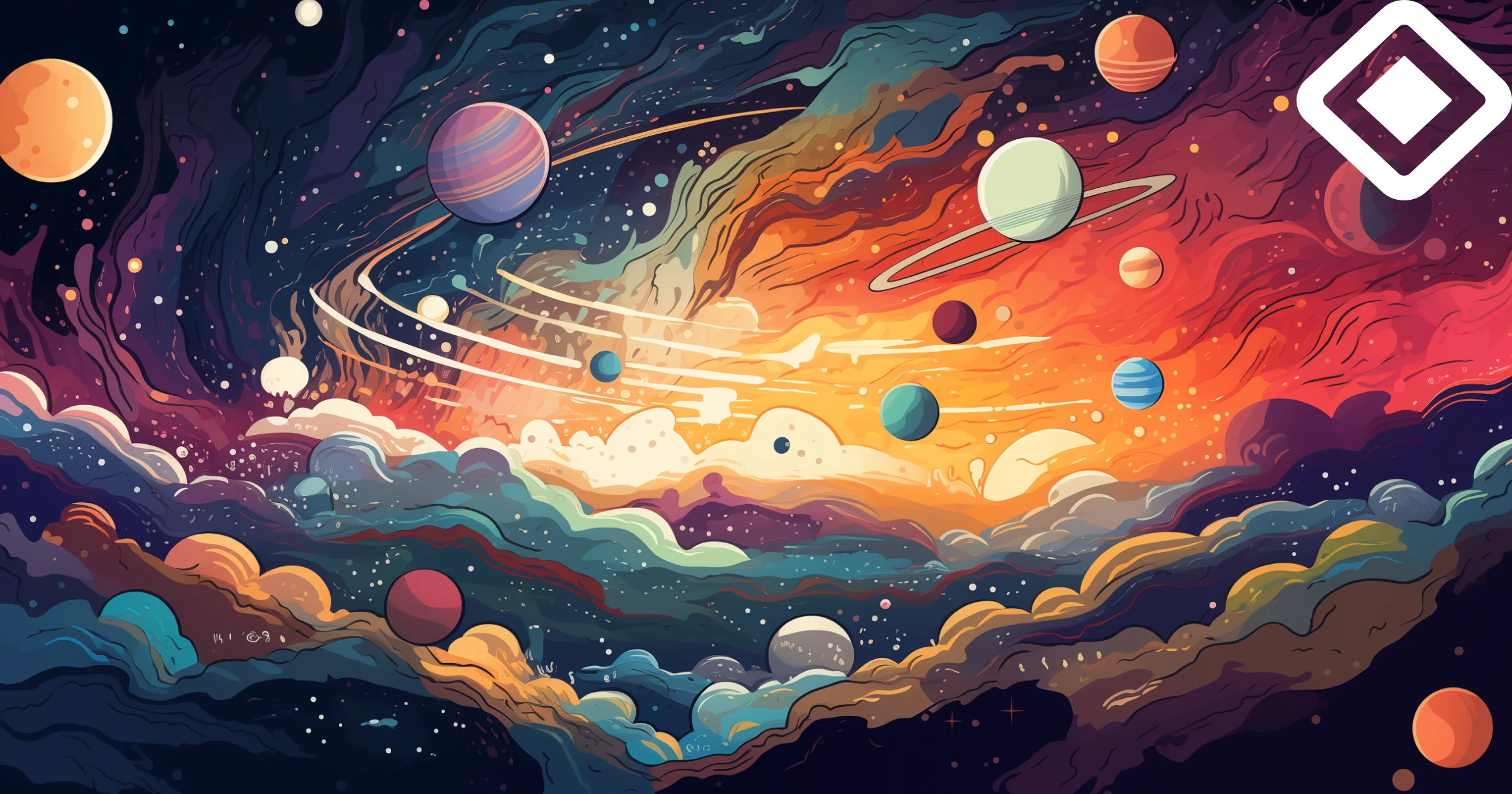
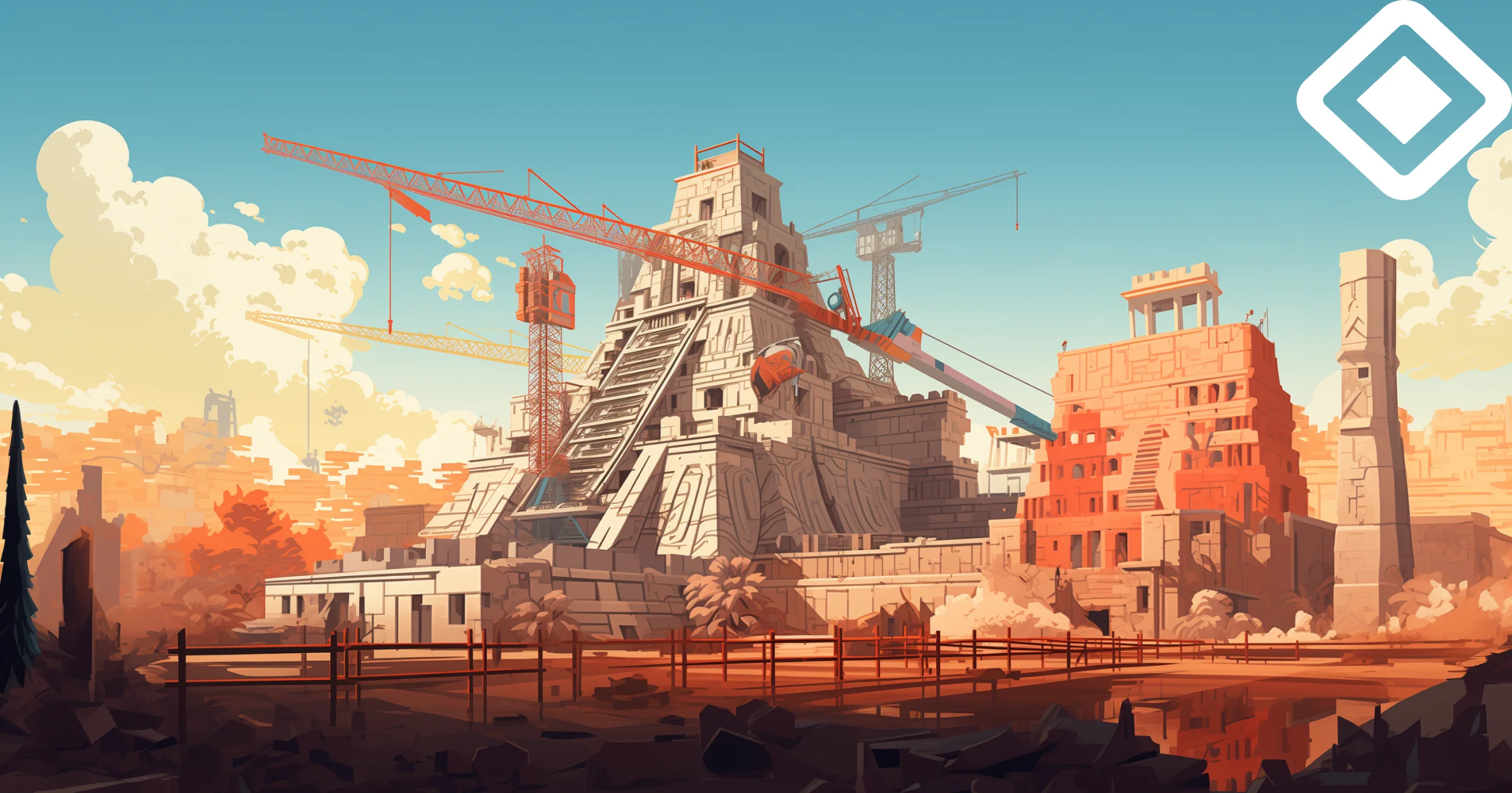
The vision for Aztec's blog visuals is to construct a distinct, immersive universe that complements the blog content, creating a special experience for readers. While the overall aesthetics align with the core brand through its color palette and overarching themes, it introduces a more narrative-driven and richly detailed environment. This approach is designed to engage readers in a way that goes beyond standard blog visuals, making each article a journey into a crafted world.
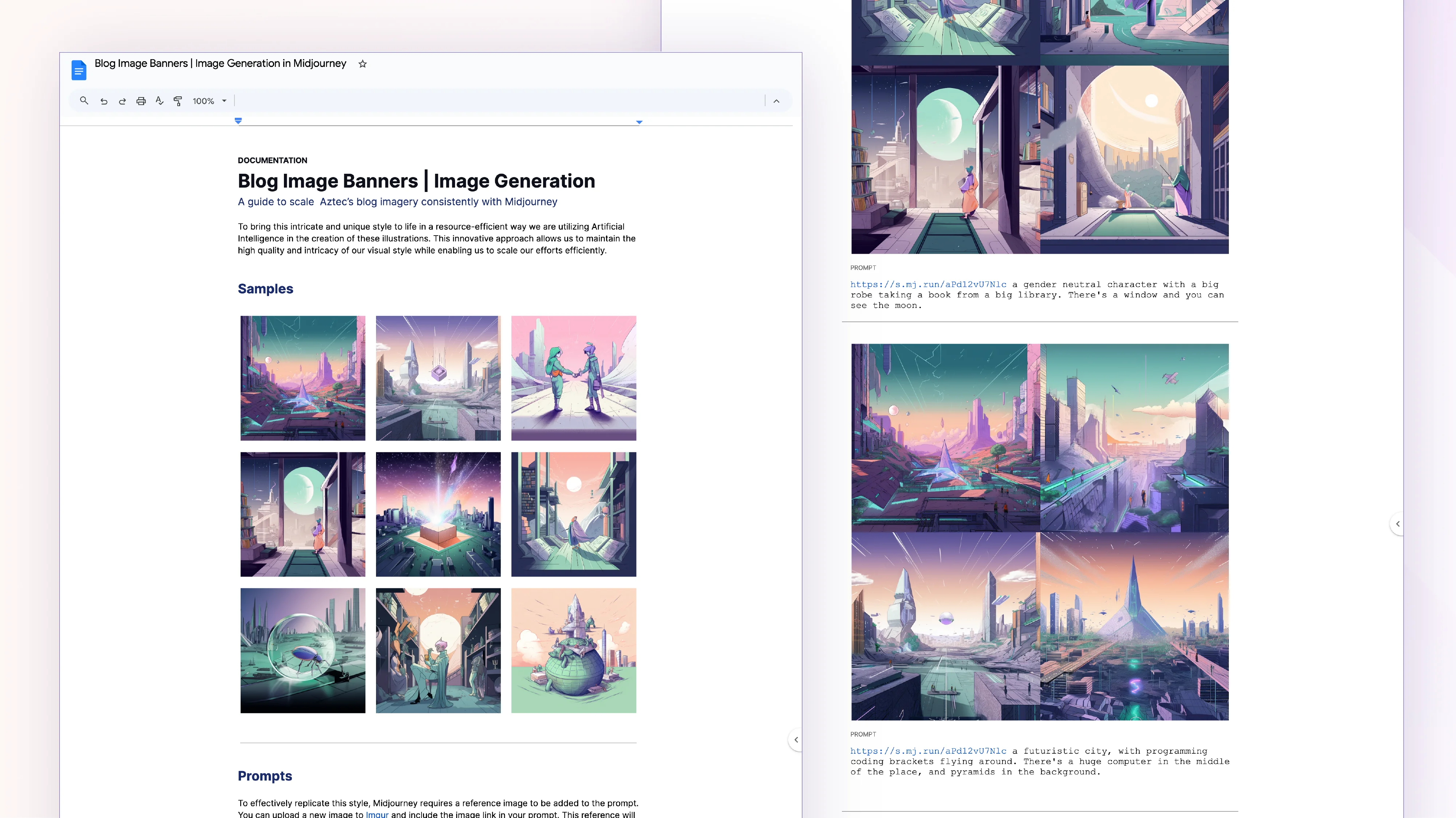
The theme of this universe evolves the historical Aztec style that have been so well-received both internally and externally, helping the brand to embrace Aztec's legacy. We envision a futuristic space populated with gender-neutral characters, employing an outlined style that exudes a sense of craftsmanship and attention to detail.
To bring this intricate and unique illustration style to life in a resource-efficient way we decided to leverage artificial intelligence. This approach allowed the Design team to maintain the high quality and detail of Aztec's visual style while enabling it to scale our efforts efficiently.
Various marketing applications
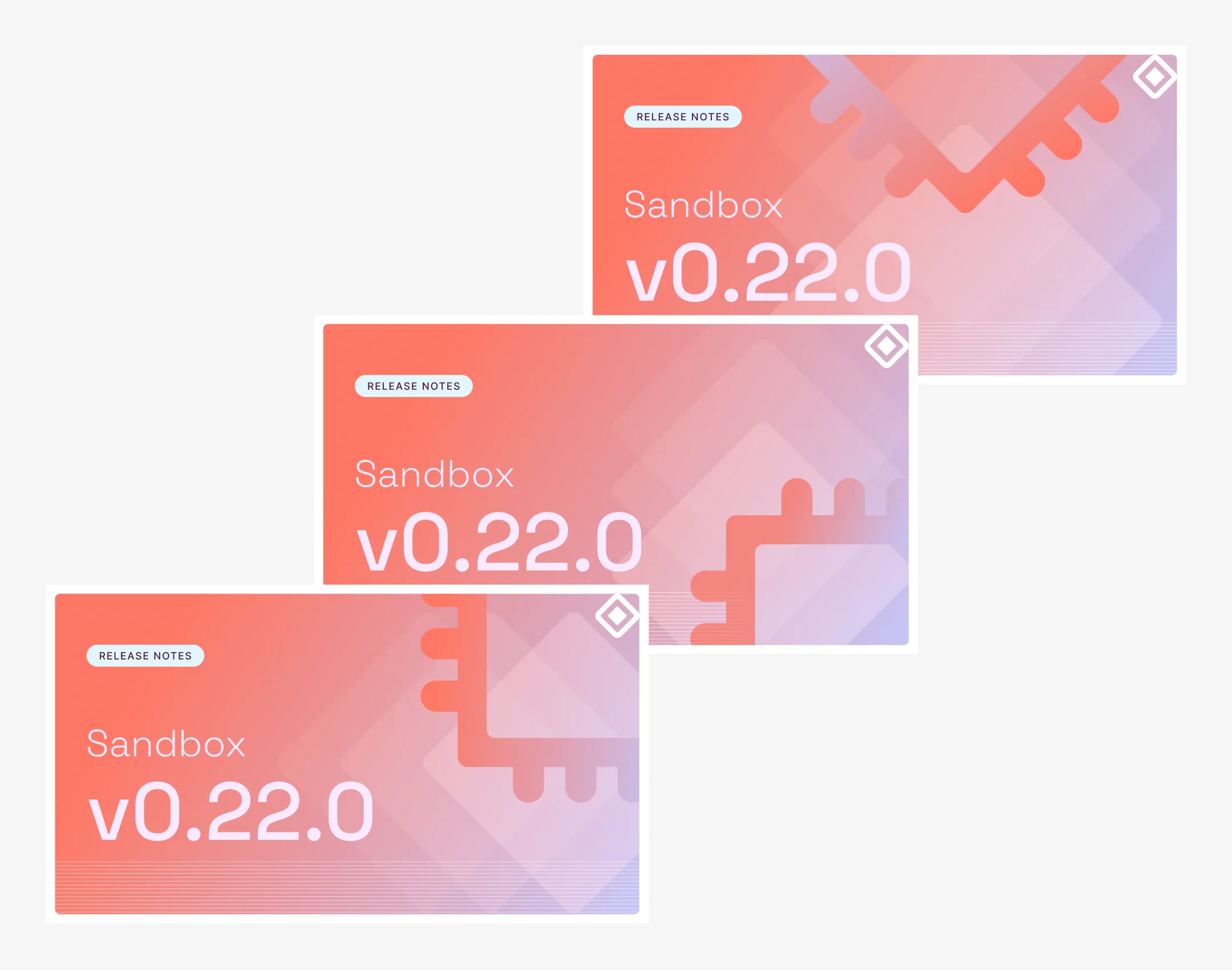
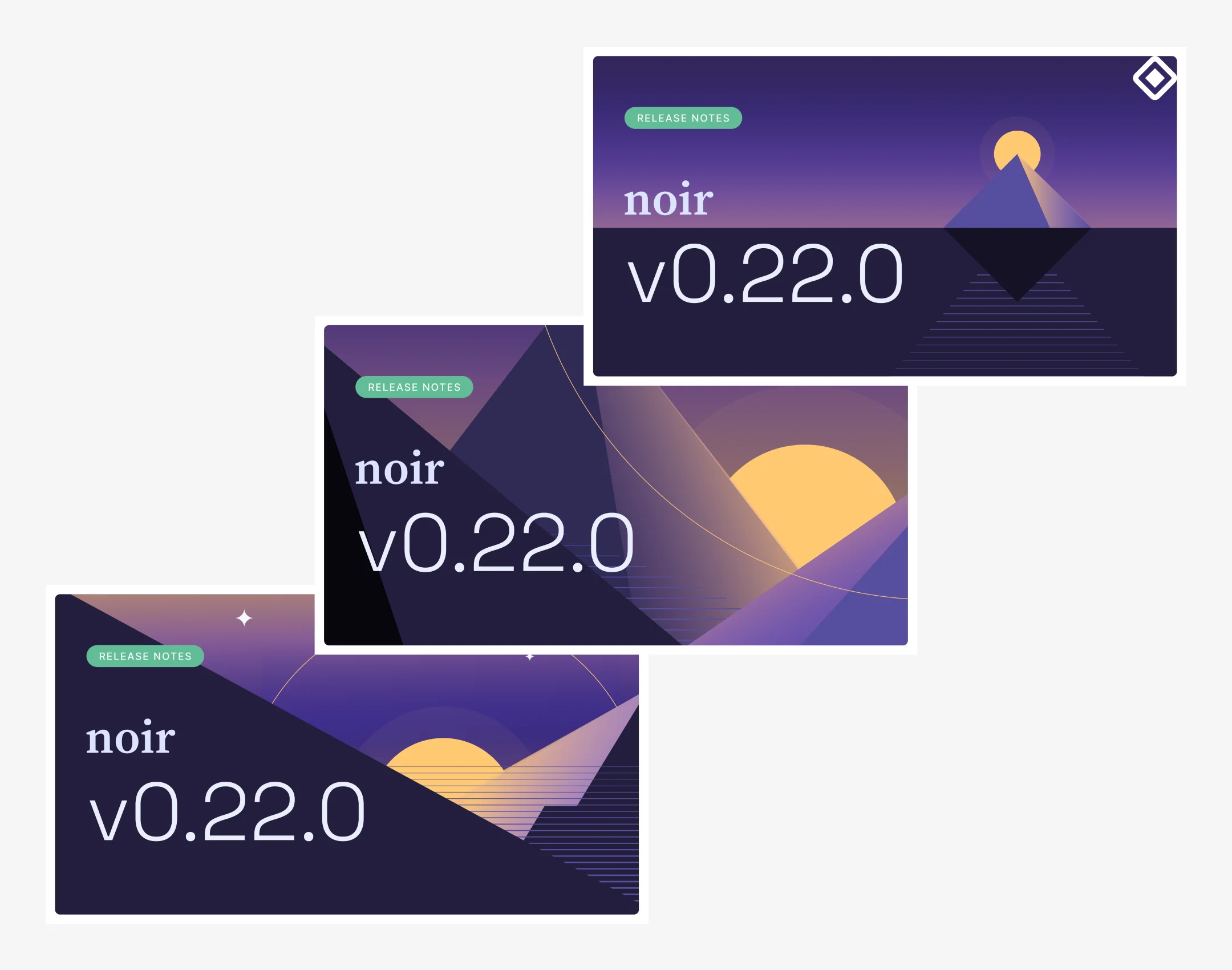
Graphic to promote releases for the Aztec Sandbox and Noir on social media.
Animated loop to promote Request for Proposals (RFP) announcements on social media.
Animated loop to promote and/or communicate Request for Proposals (RFP) selections on social media.
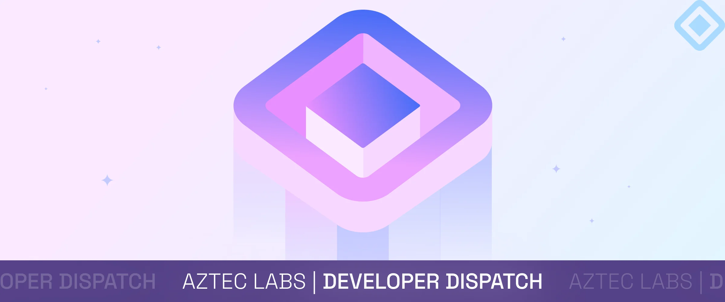
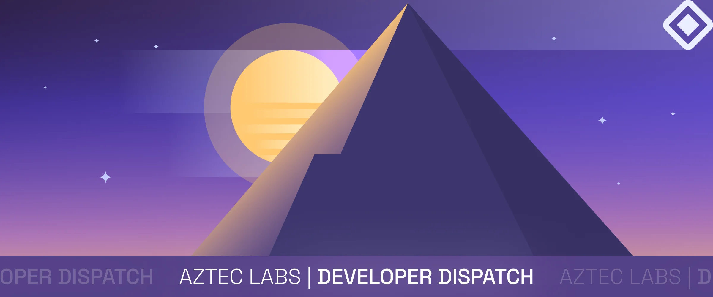
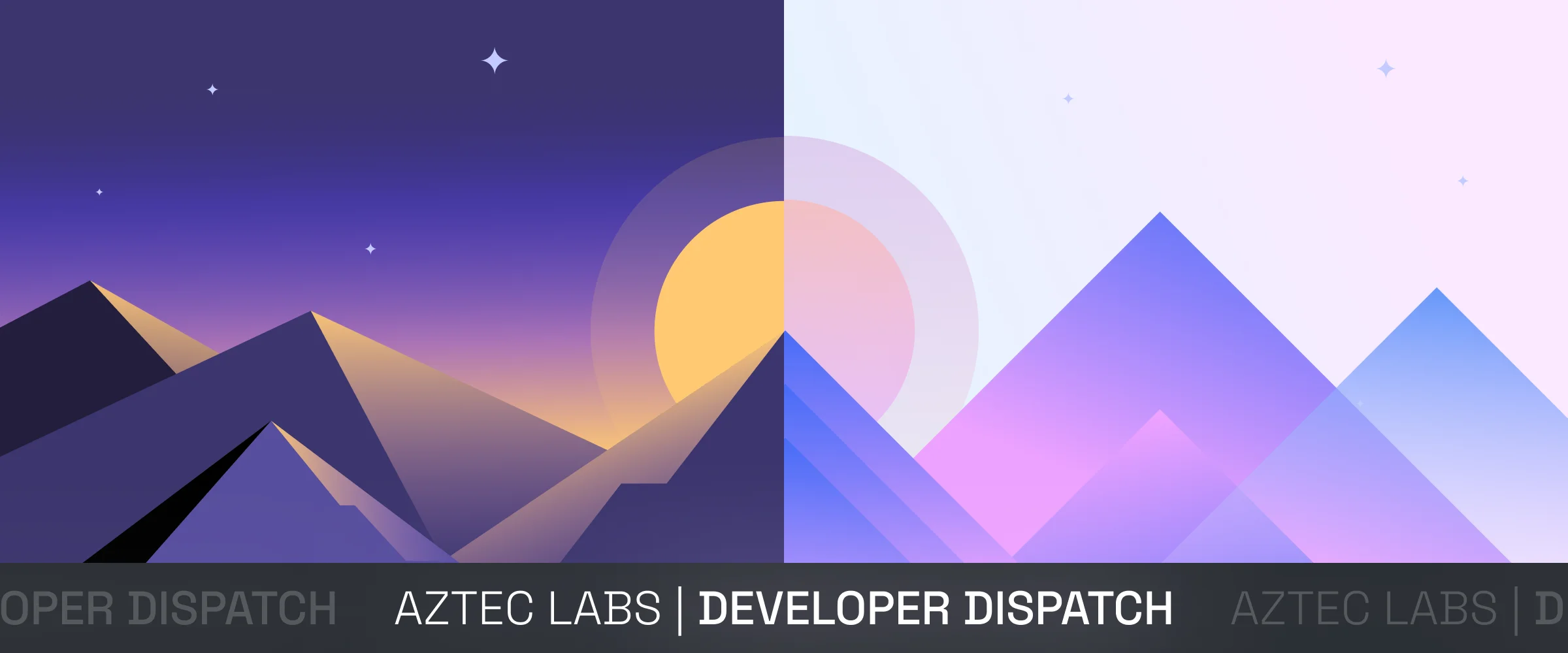
Header images for the Developer Dispatch newsletter.
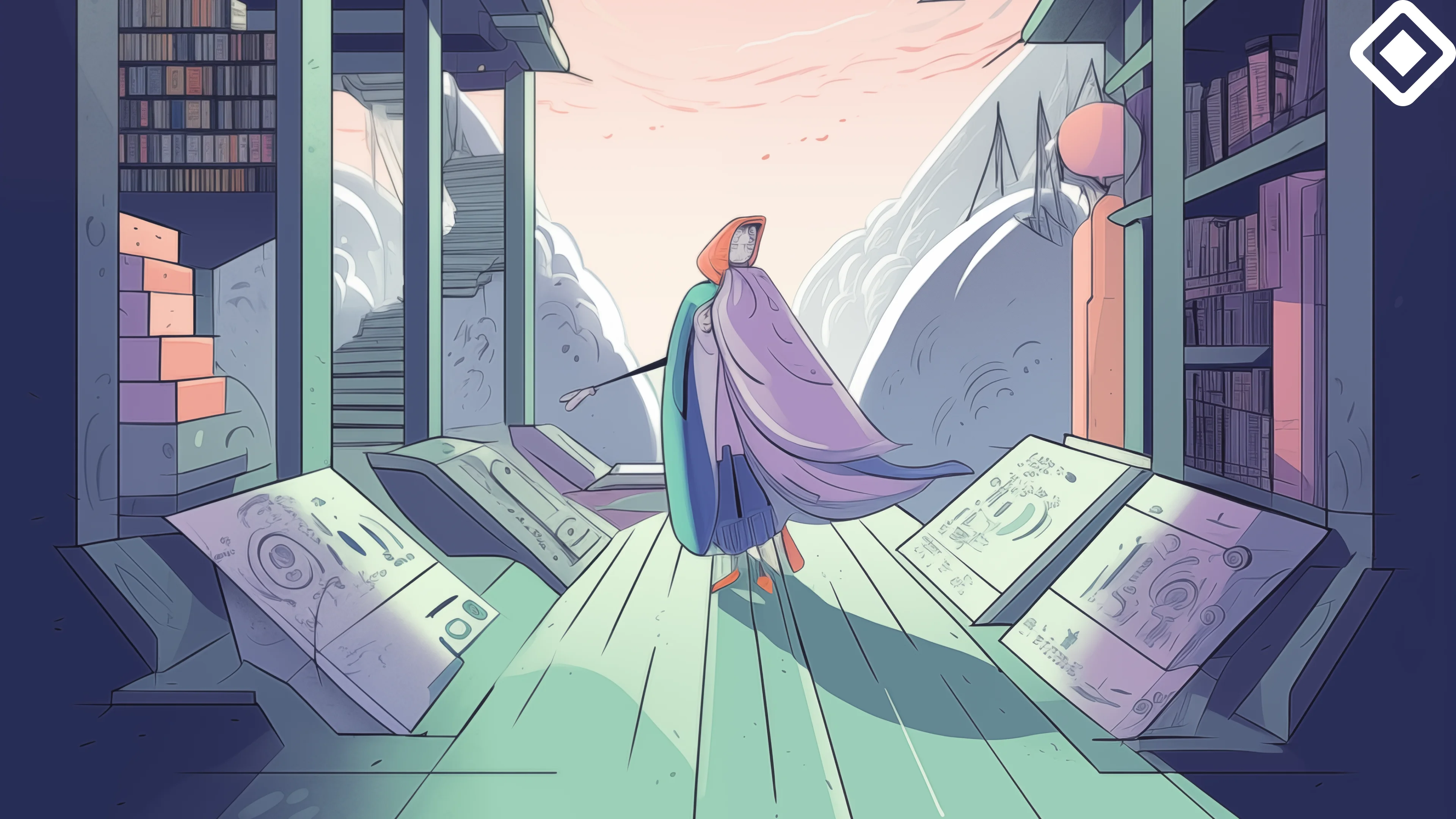
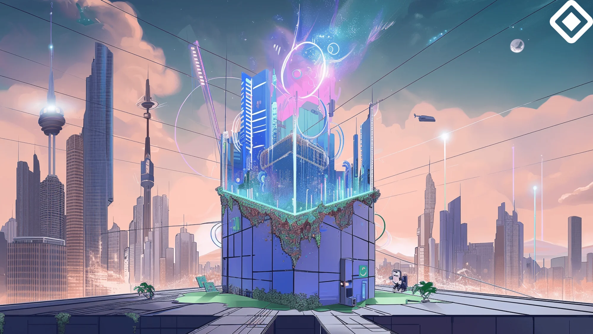
Developer Dispatch visuals
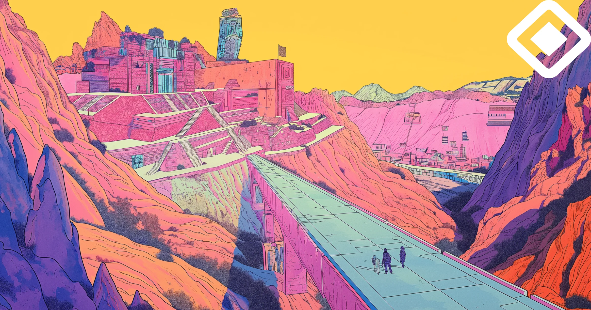
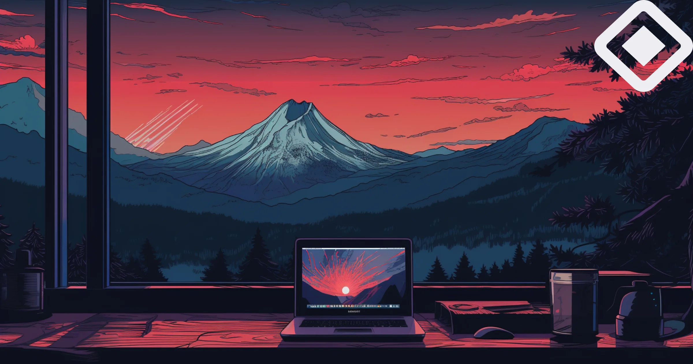
The background illustrations, which follow the principles of Level 2 illustrations, can be abstract or figurative, depSimilarly to the universe created for the Blog thumbnails, the Developer Dispatch thumbnails feature a world inspired by the Aztecs, filled with bright colors and bold shapes.
The style combines the grand structures of Aztec architecture with the wild beauty of nature. Figures in traditional dress appear against these scenes, blending ancient culture with a modern touch.ending on the topic. These are colored using gradients from the secondary palette to avoid high contrast. This system balances a content-first approach aimed at maximizing conversions, while also providing designers the creative freedom to add variety and counteract banner fatigue.
Animated loop to promote and/or communicate partnerships. For enhanced visual appeal and to emphasize Aztec's decentralized ethos, these promotional pieces incorporate branded elements from the projects Aztec is partnering with.
Animated loop to promote featured Aztec open positions on social media.
Animated loop to promote Aztec team members on social media.
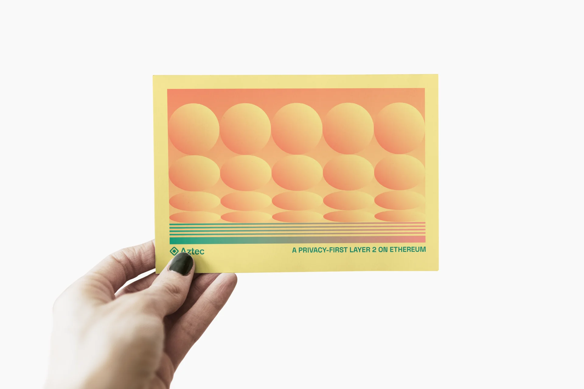
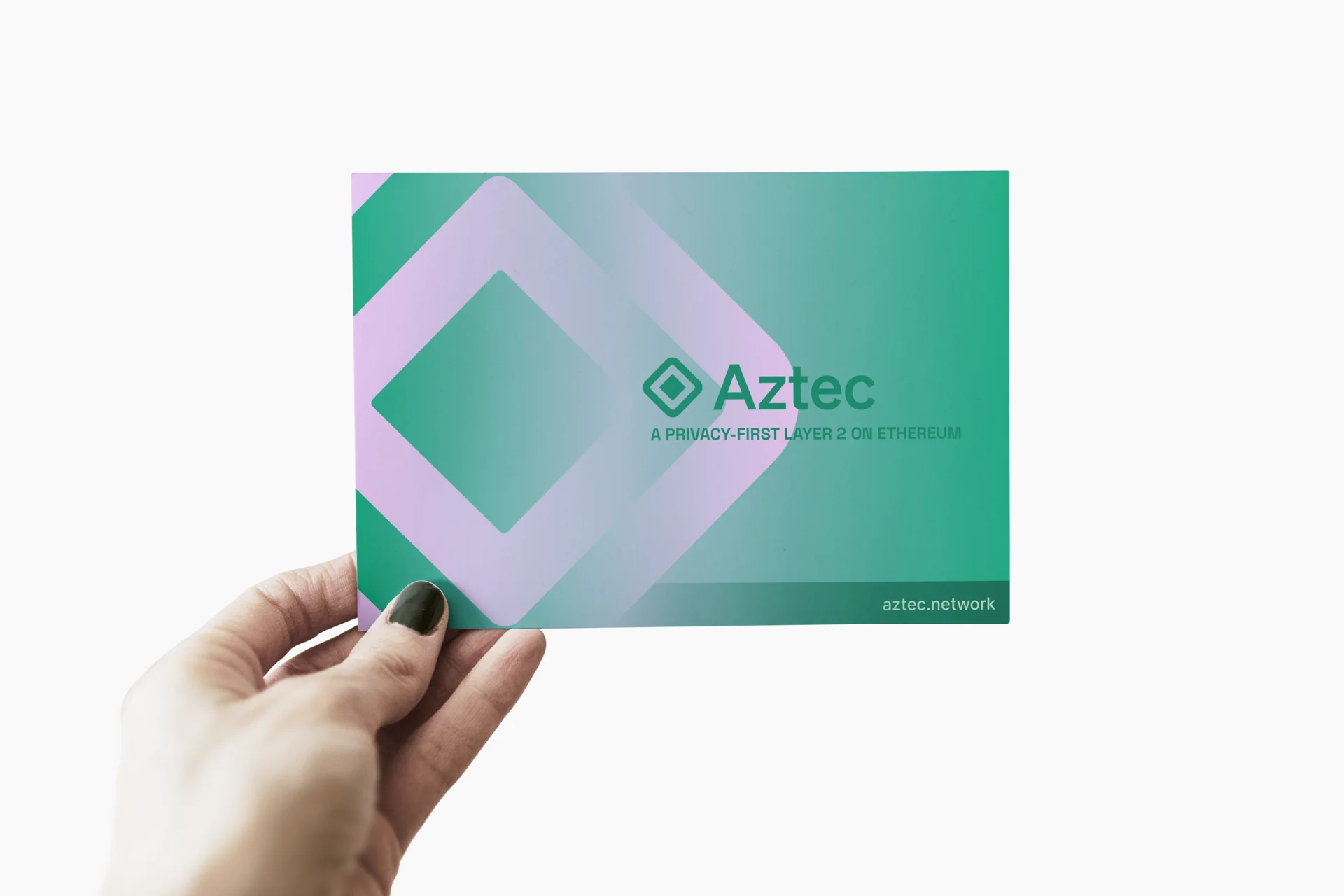
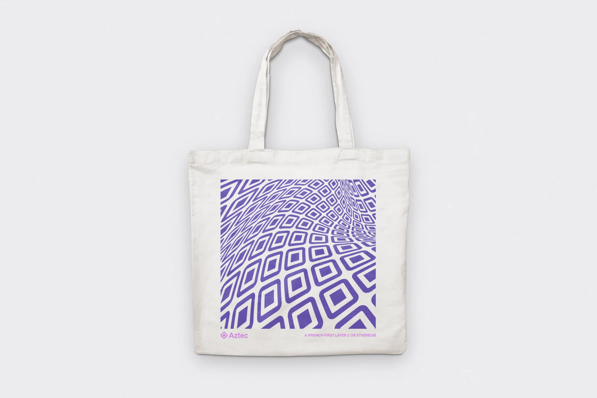
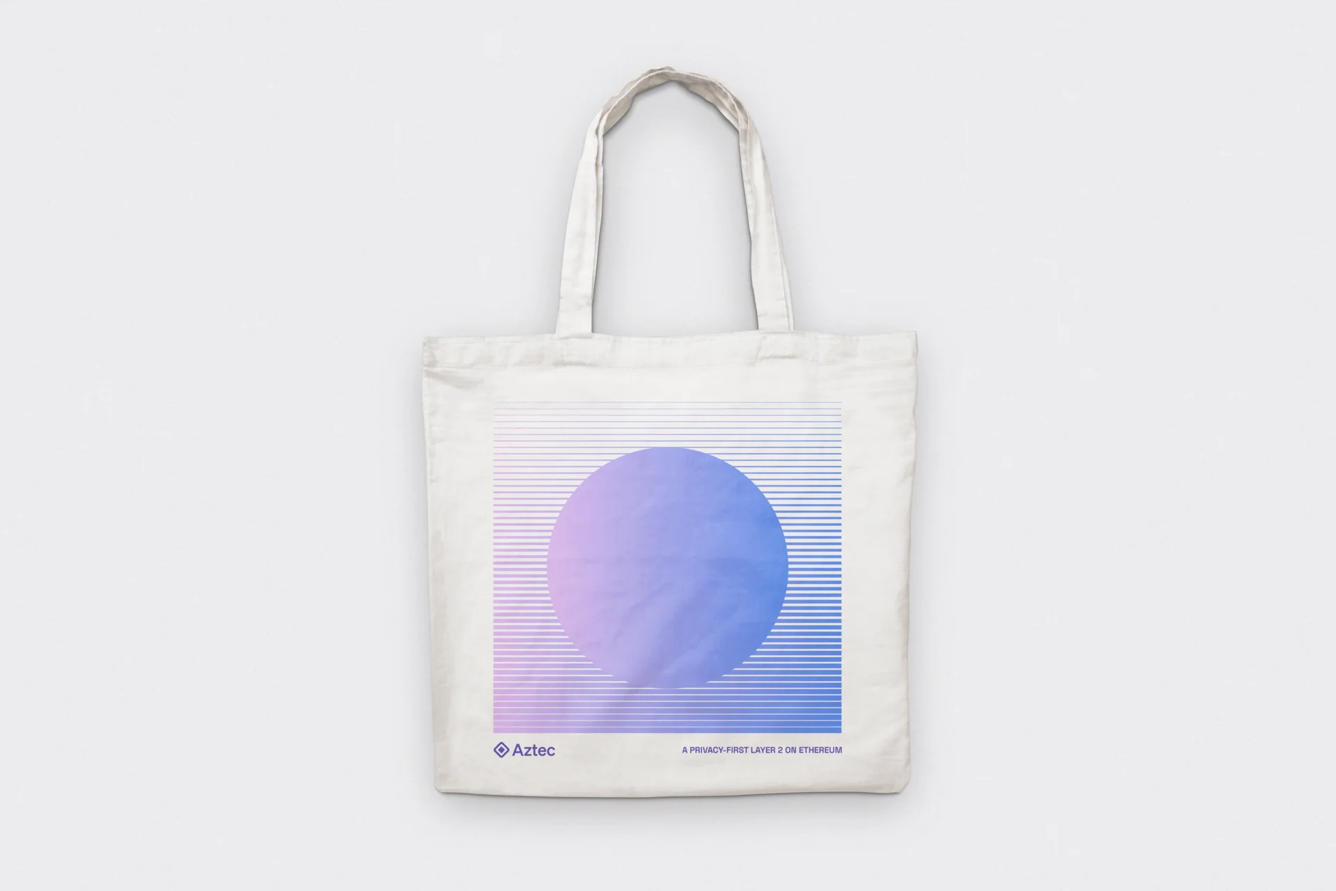
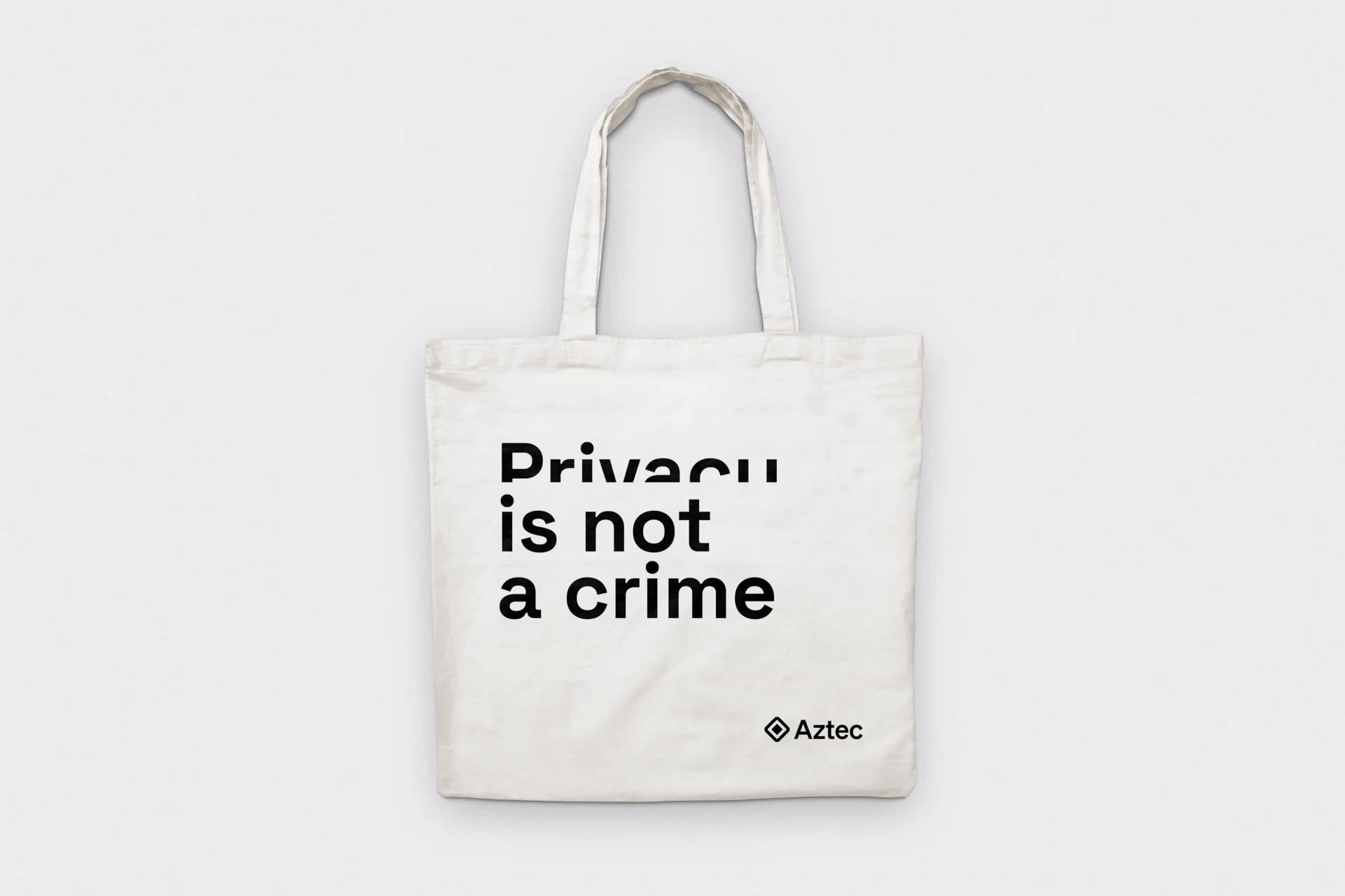
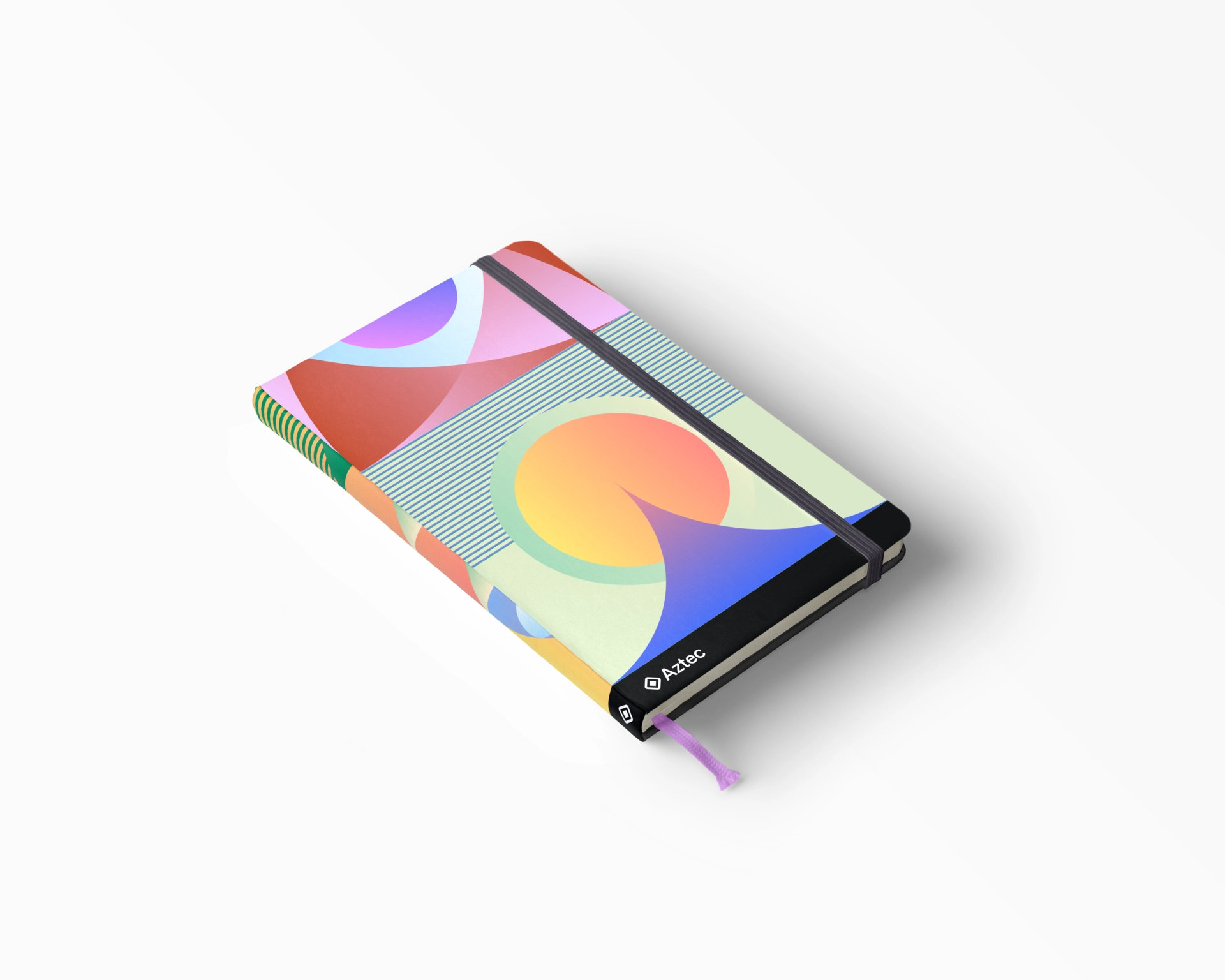
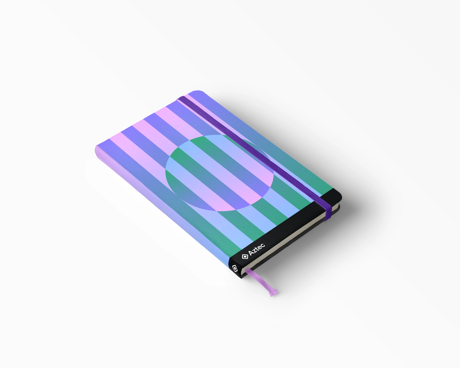
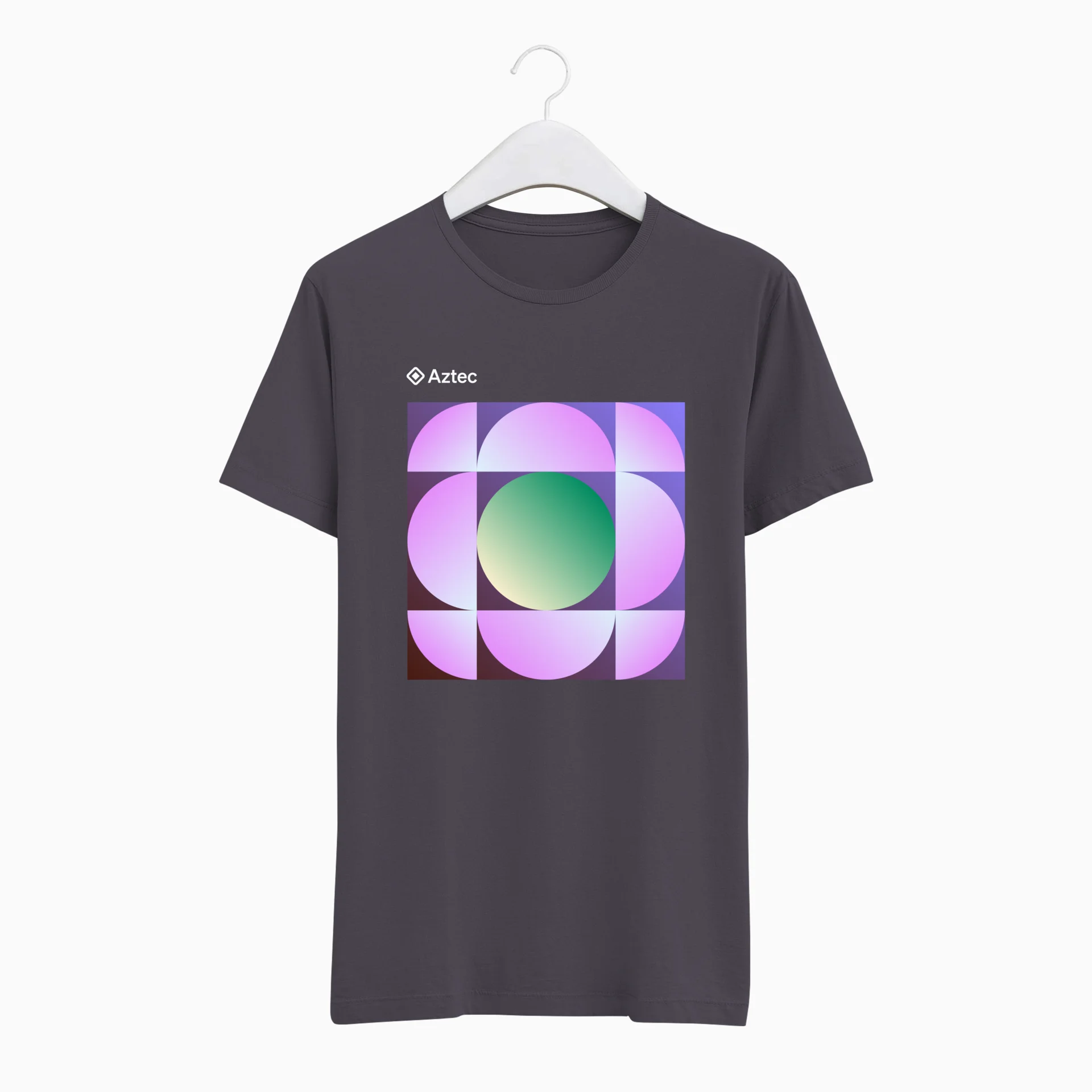
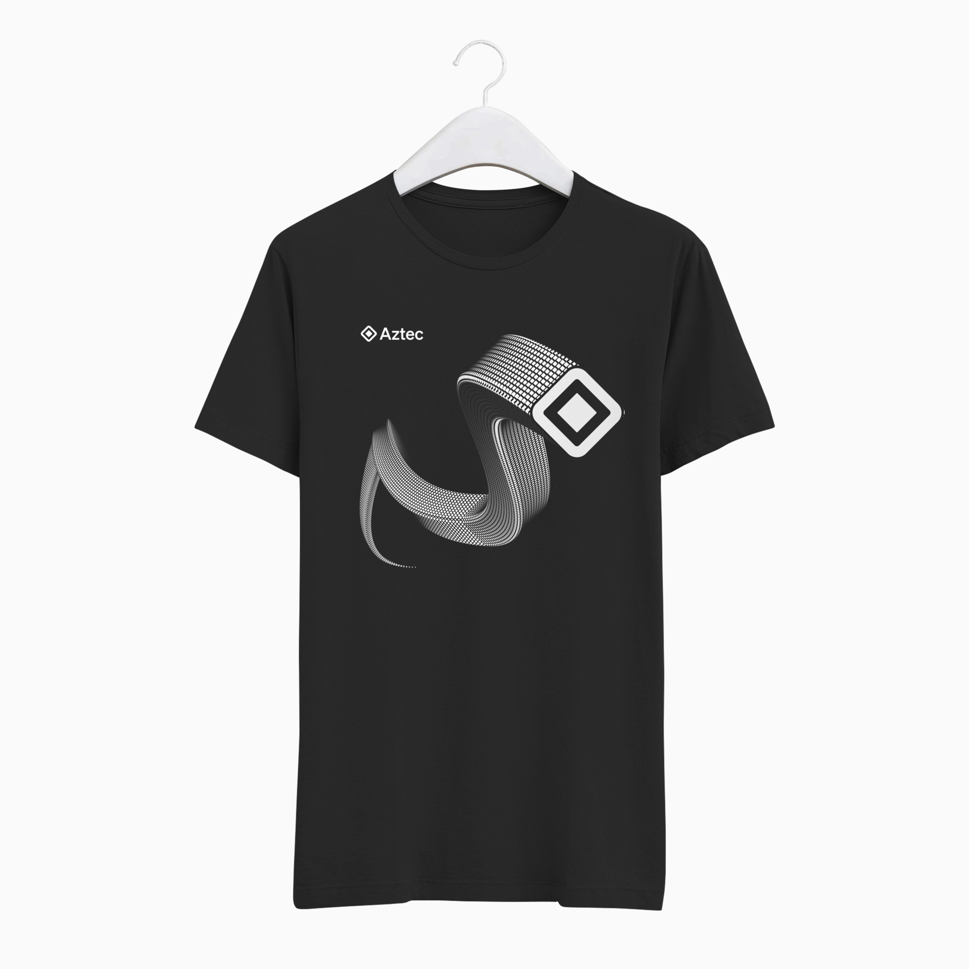
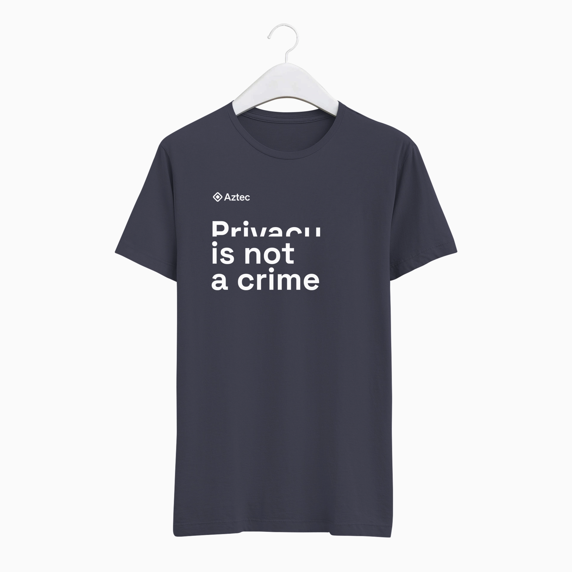
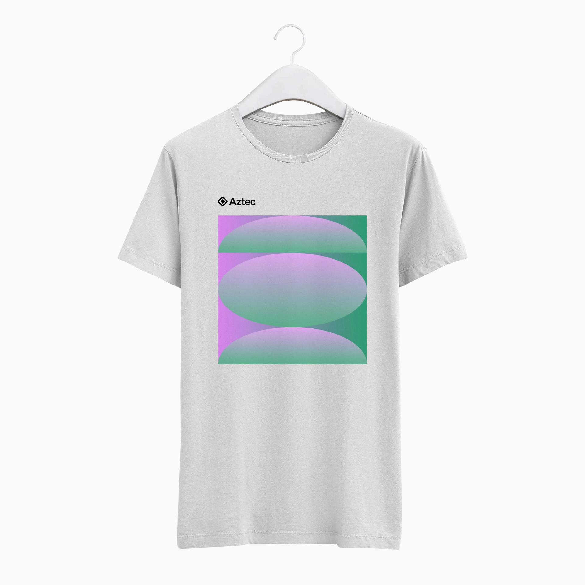
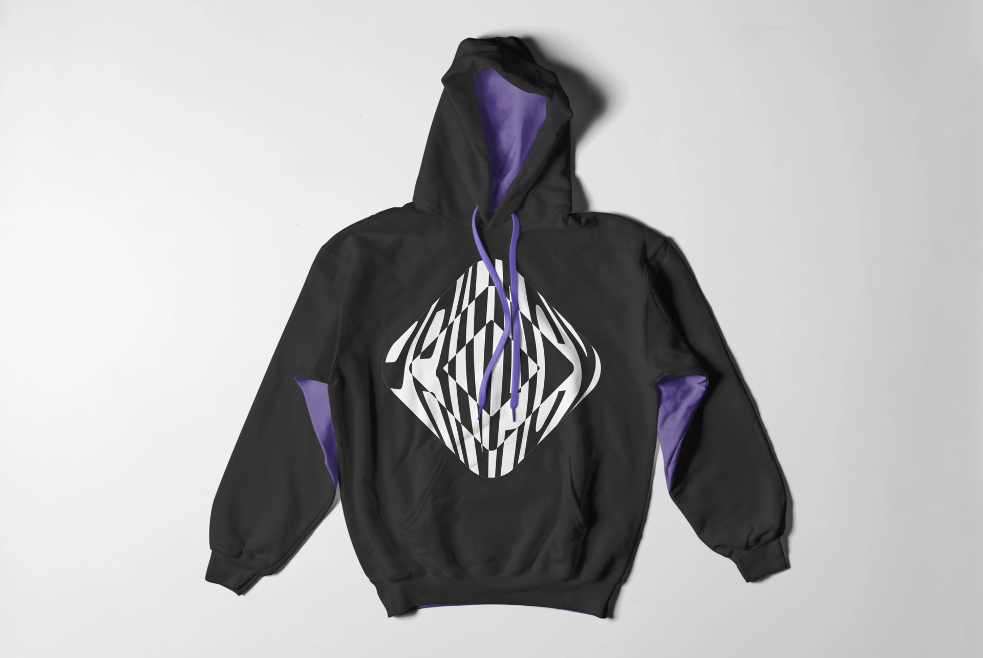
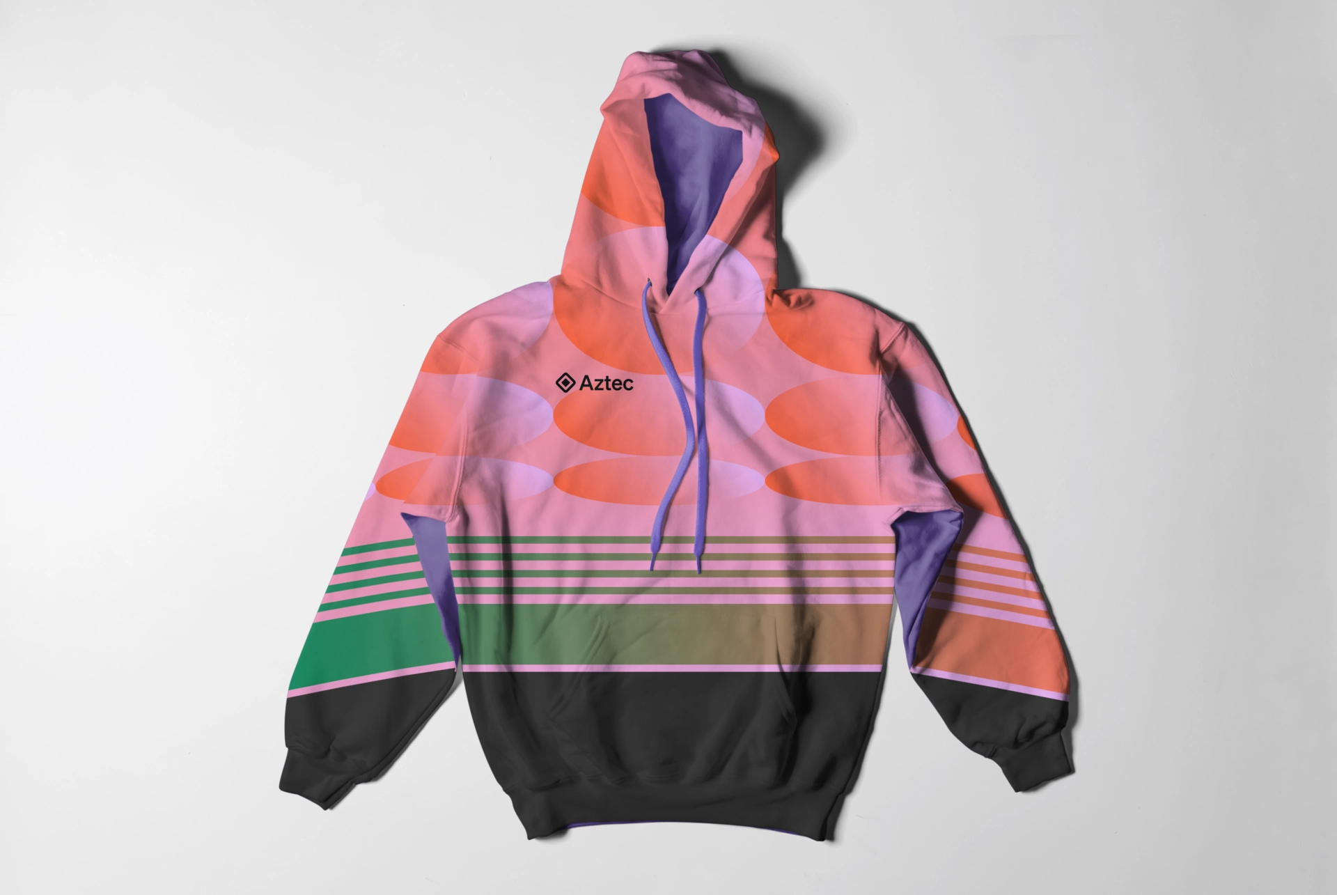
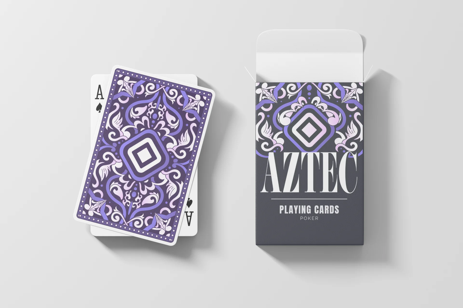
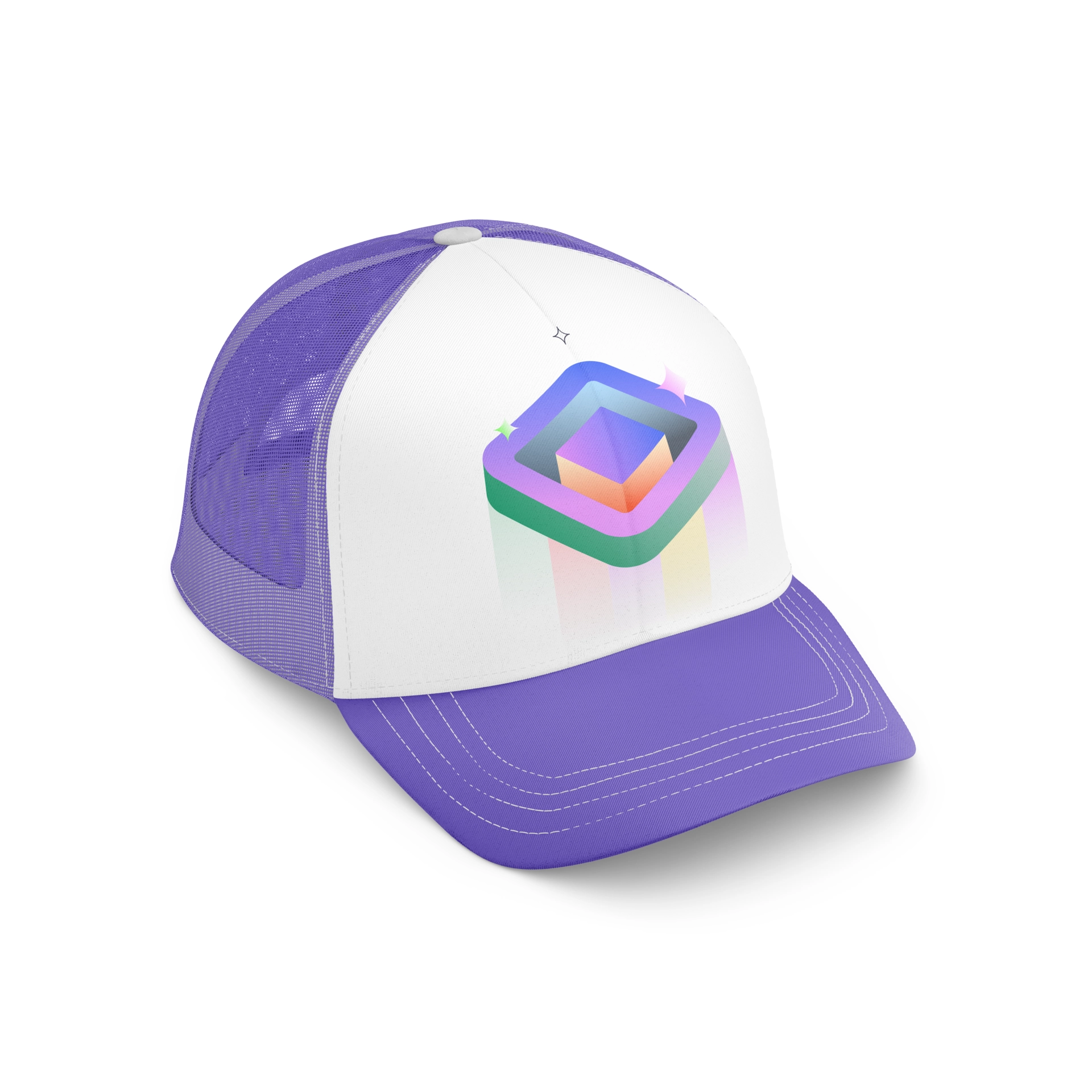
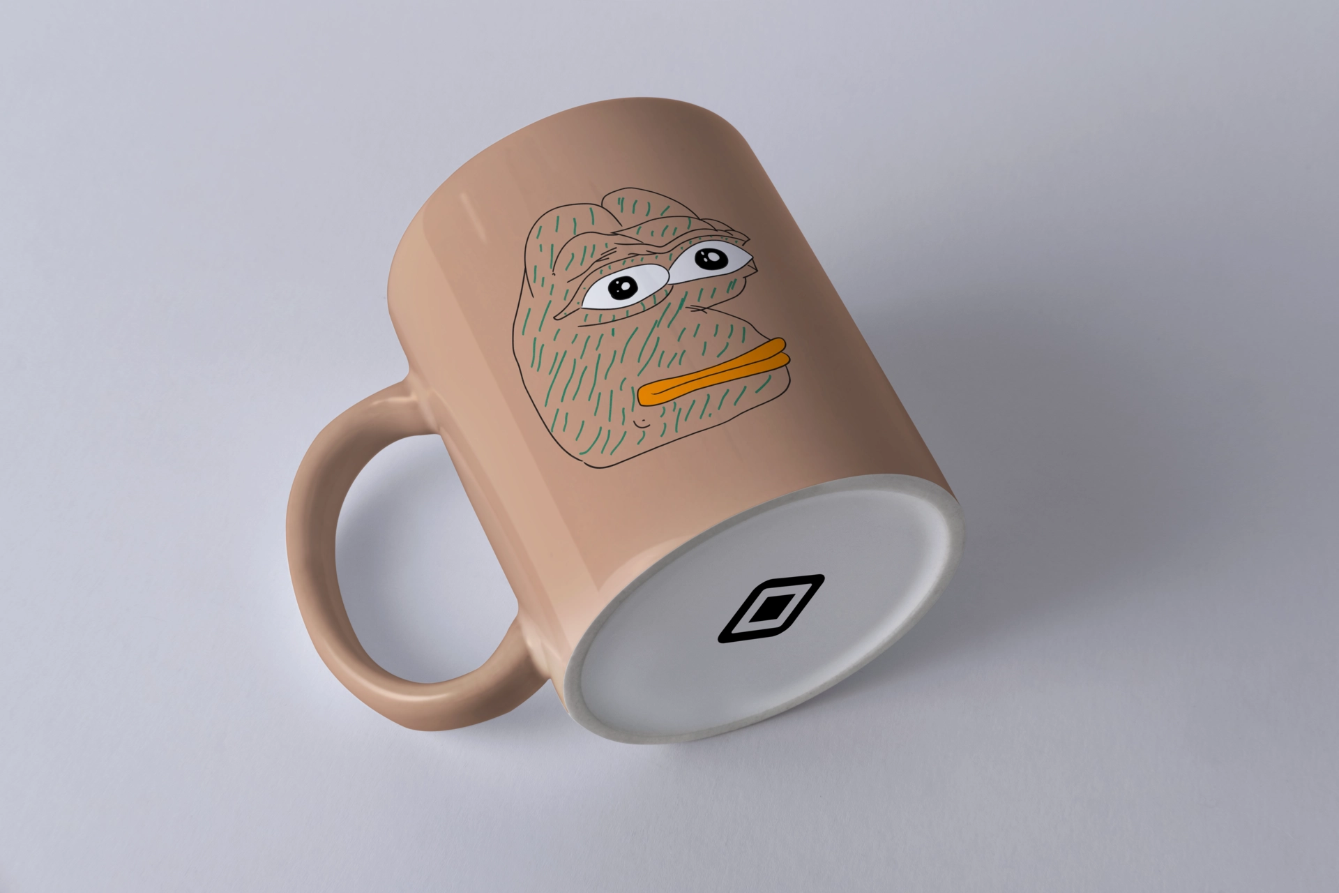
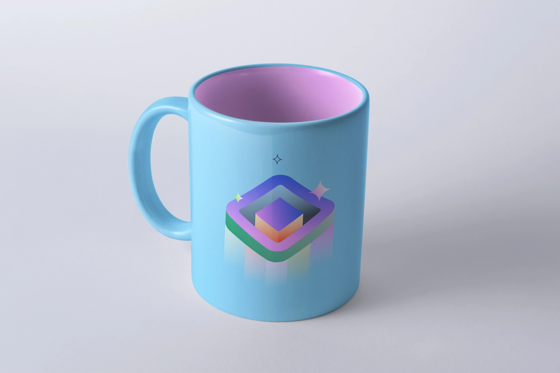
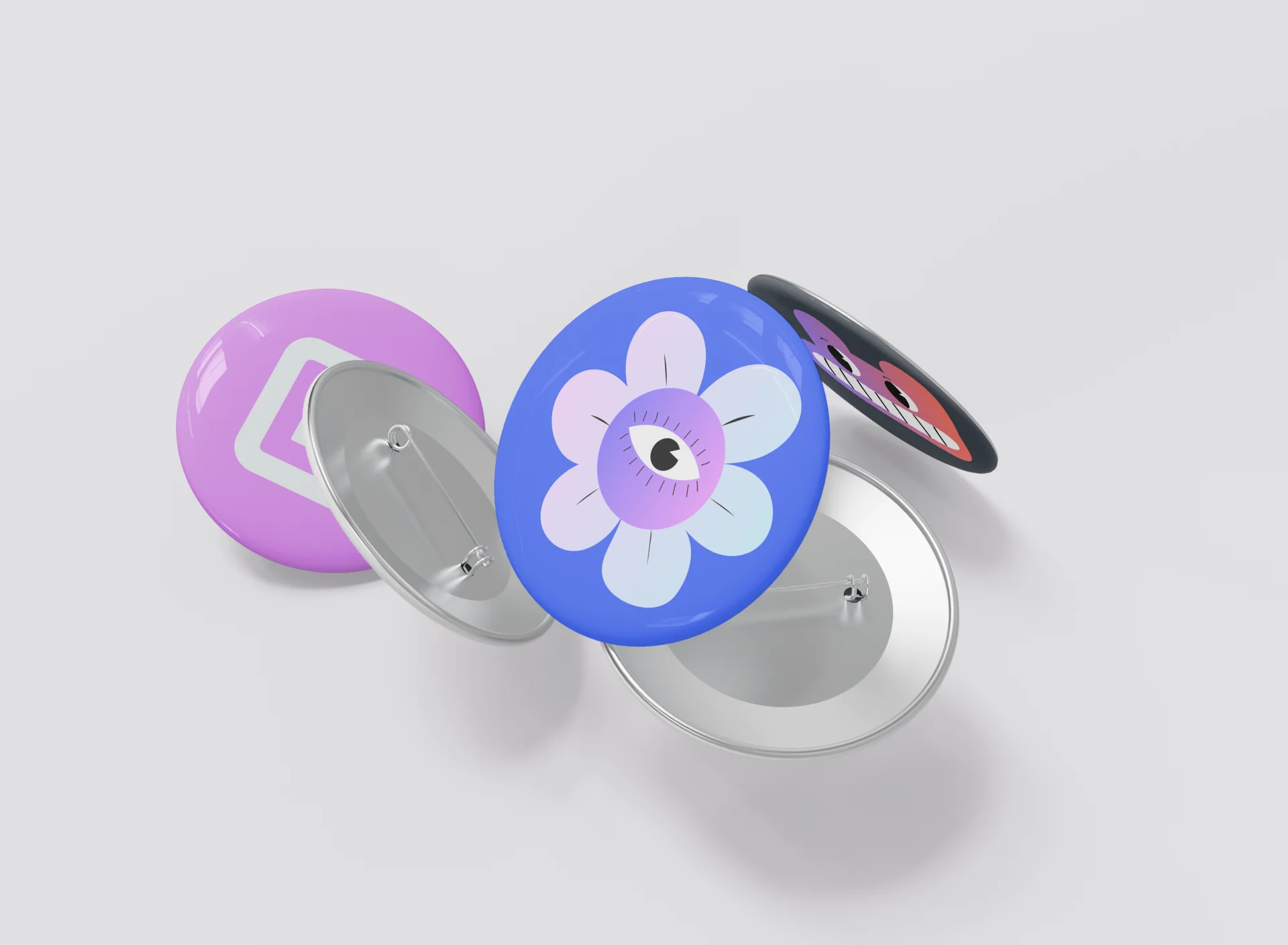
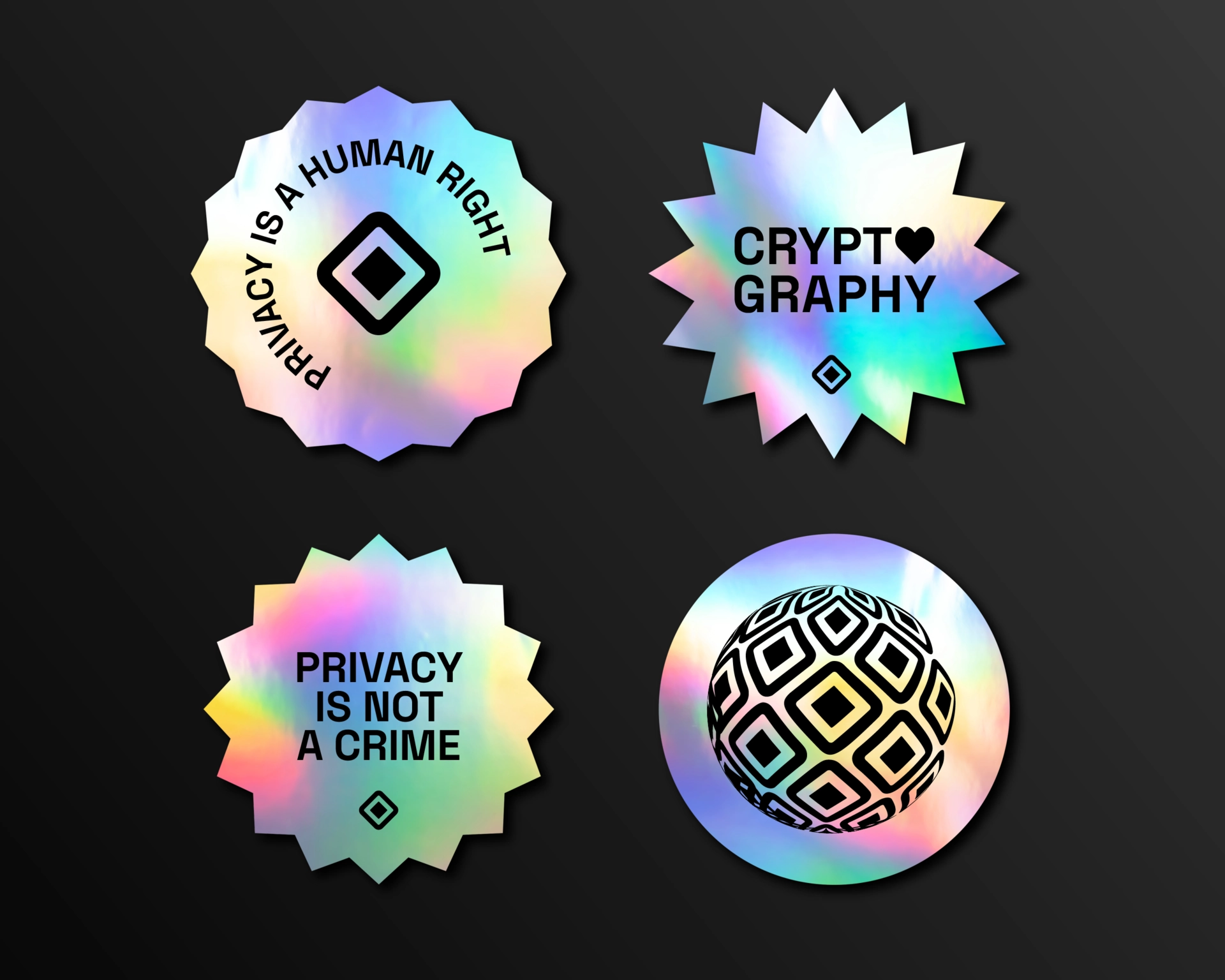
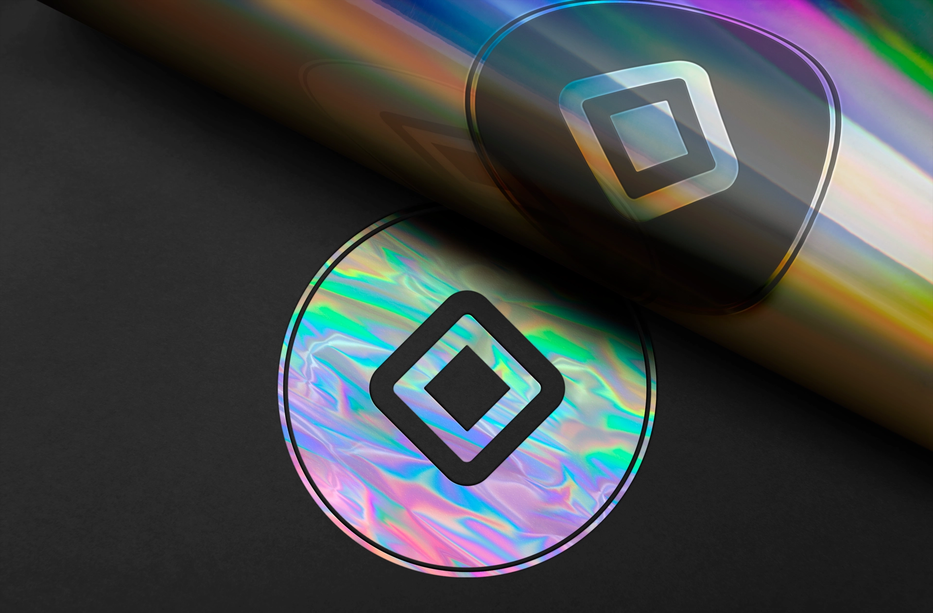
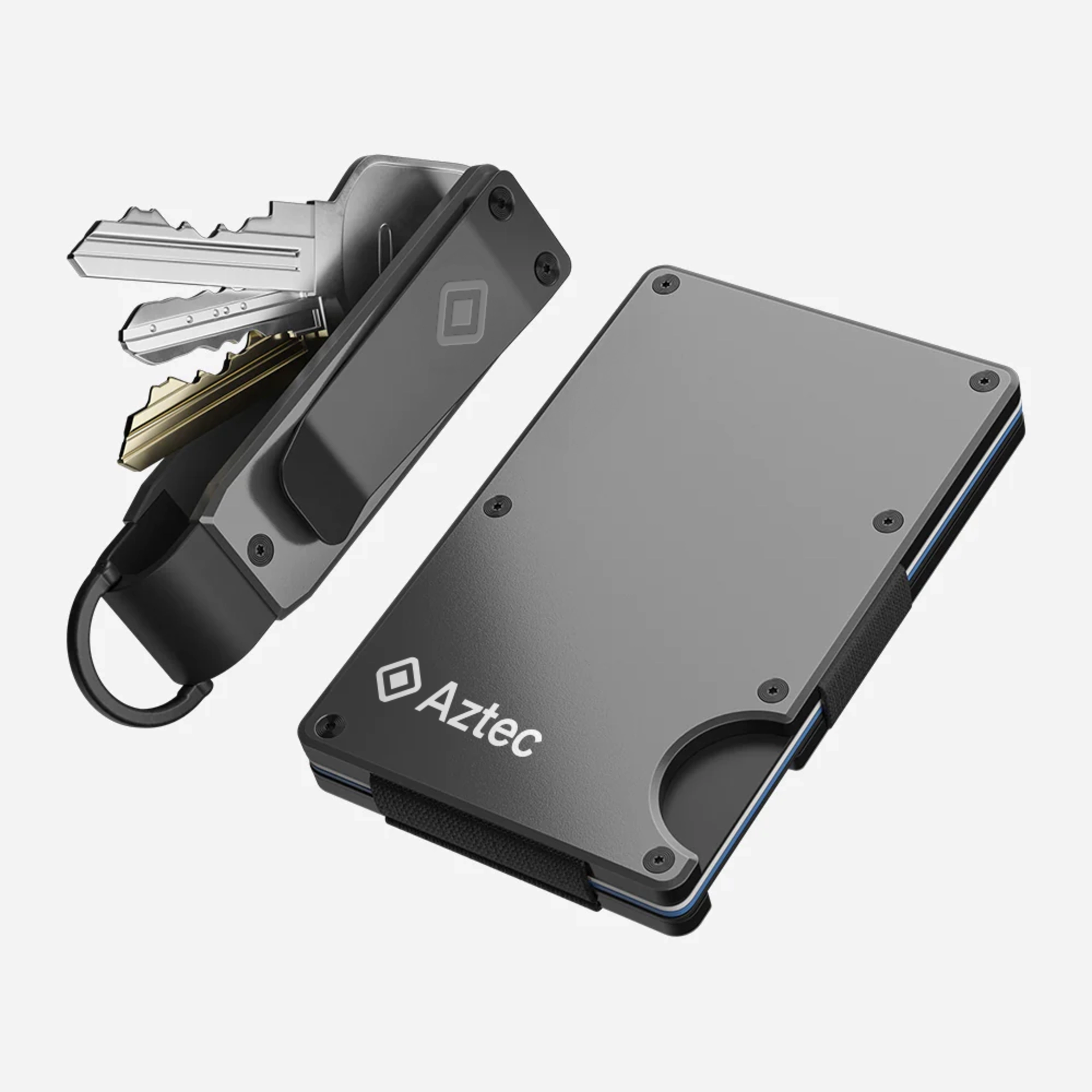
Swag is essential in shaping a Web3 brand like Aztec, significantly influencing its brand identity. At Aztec, the power of the swag comes from both its design and the careful choice of items, always reflecting our ethos and fostering positive connections.
In creating swag, designers were encouraged to balance between utilizing existing brand elements and being playful by intervining existing assets, such as the Aztec logo.