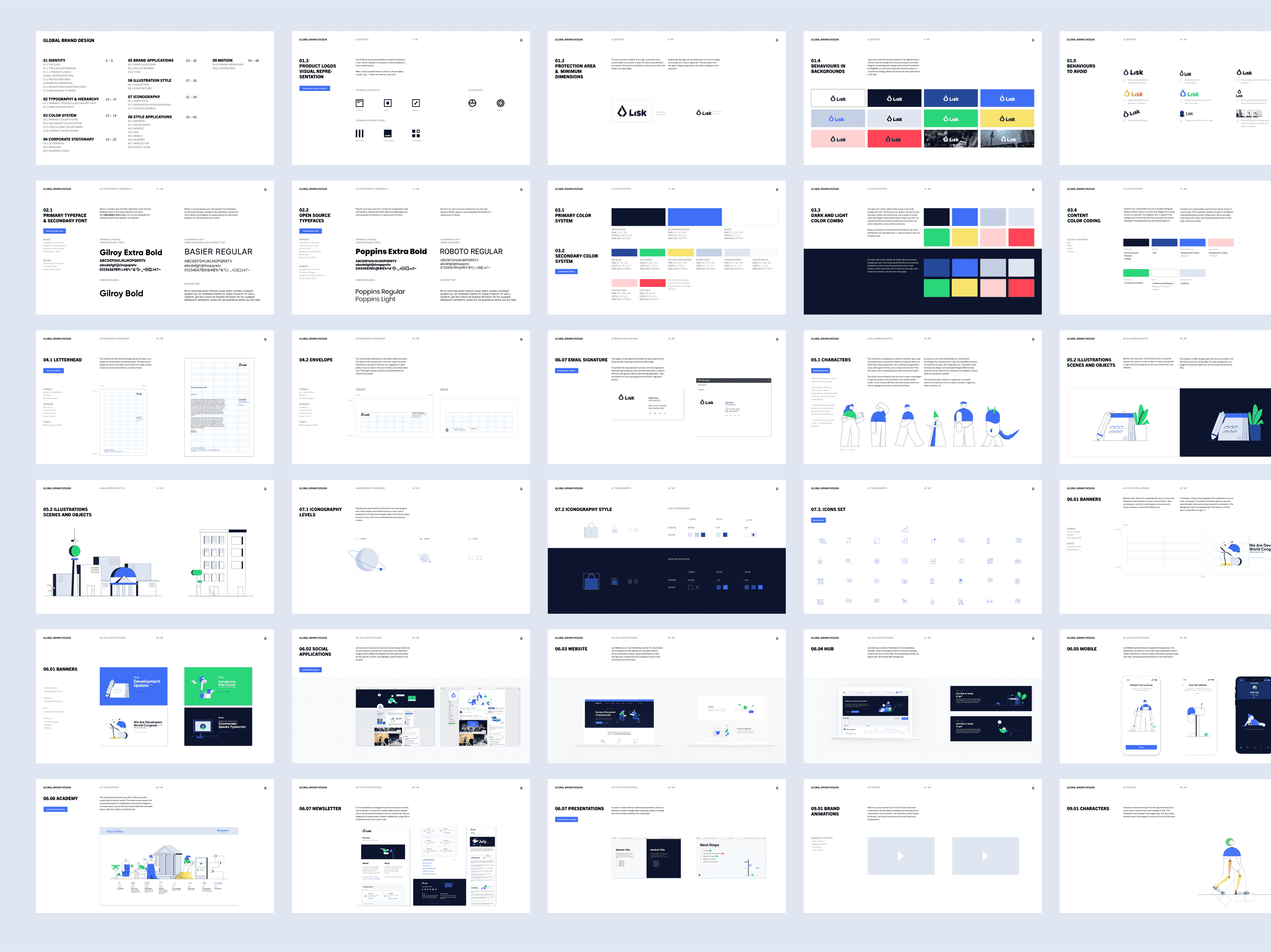
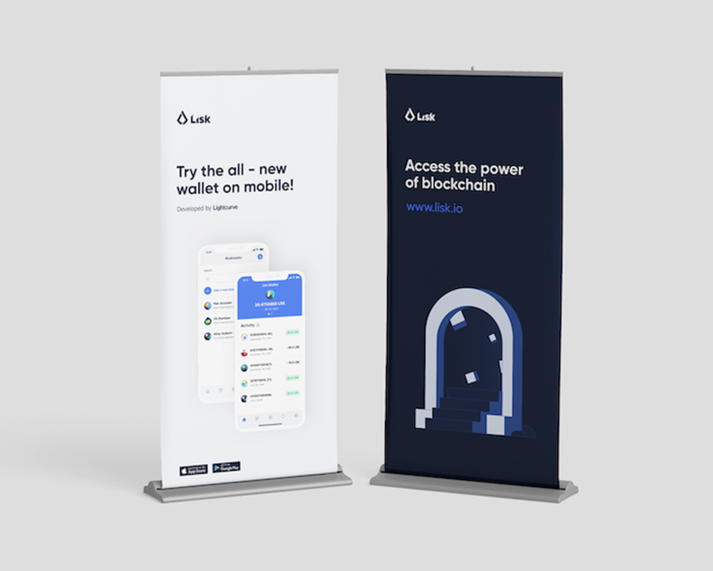
The Lisk redesign was driven by the goal to create a visually captivating and engaging experience that could seamlessly blend the technical nature of blockchain with a more human-centered approach. The ultimate goal was to create an accessible, playful, and approachable brand identity that resonated with a diverse audience, while staying true to the innovative spirit of the project.
A logo rooted in Lisk’s origins
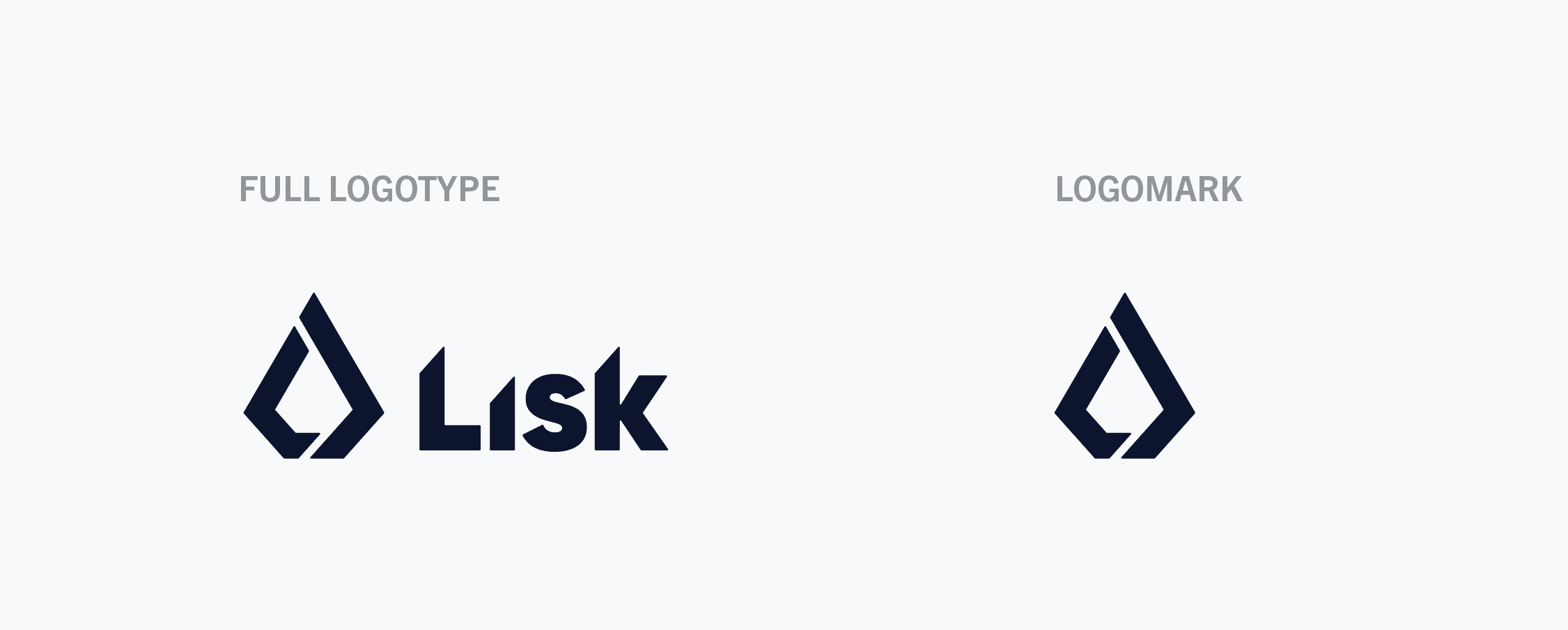
The Lisk logo was redesigned in late 2017, in collaboration with the German agency Taikonauten. It is flat and versatile, ensuring its adaptability across various channels. The logomark symbolizes the tip of an obelisk, with a pentagonal shape and triangular top that reference the project's first original legacy logo. The white subdivisions within the shape emphasize the collaborative nature of blockchain technology.
The wordmark employs Gilroy, the primary brand font, with slight modifications to the top angles for visual unity with the main concept and logomark. This combination results in a strong, unique, and recognizable symbol for the Lisk brand.
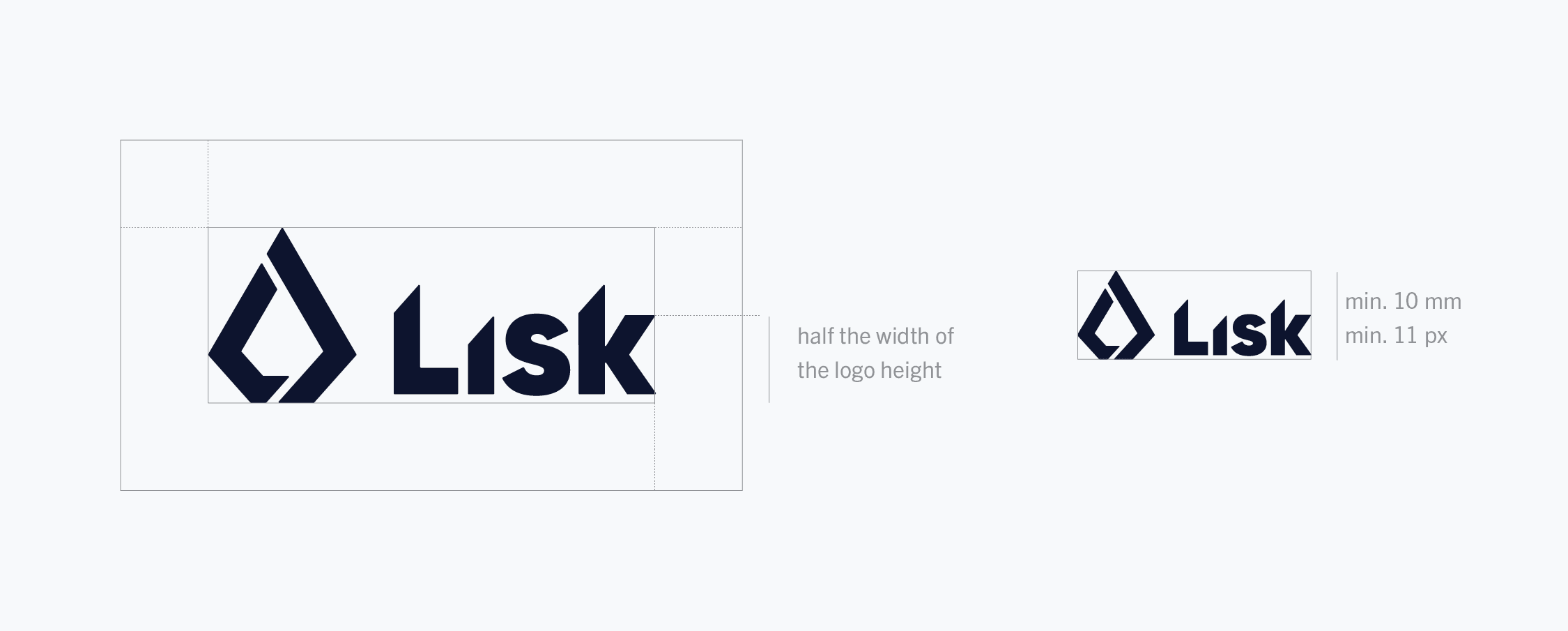
To maintain the logo's visibility, a protection area was incorporated, free from other visual elements. Specifically, the threshold was measured as half the logo's height, and the logo could be scaled down no further than 10 mm for print and 11px for digital use, which ensured its recognizability even at low resolutions.
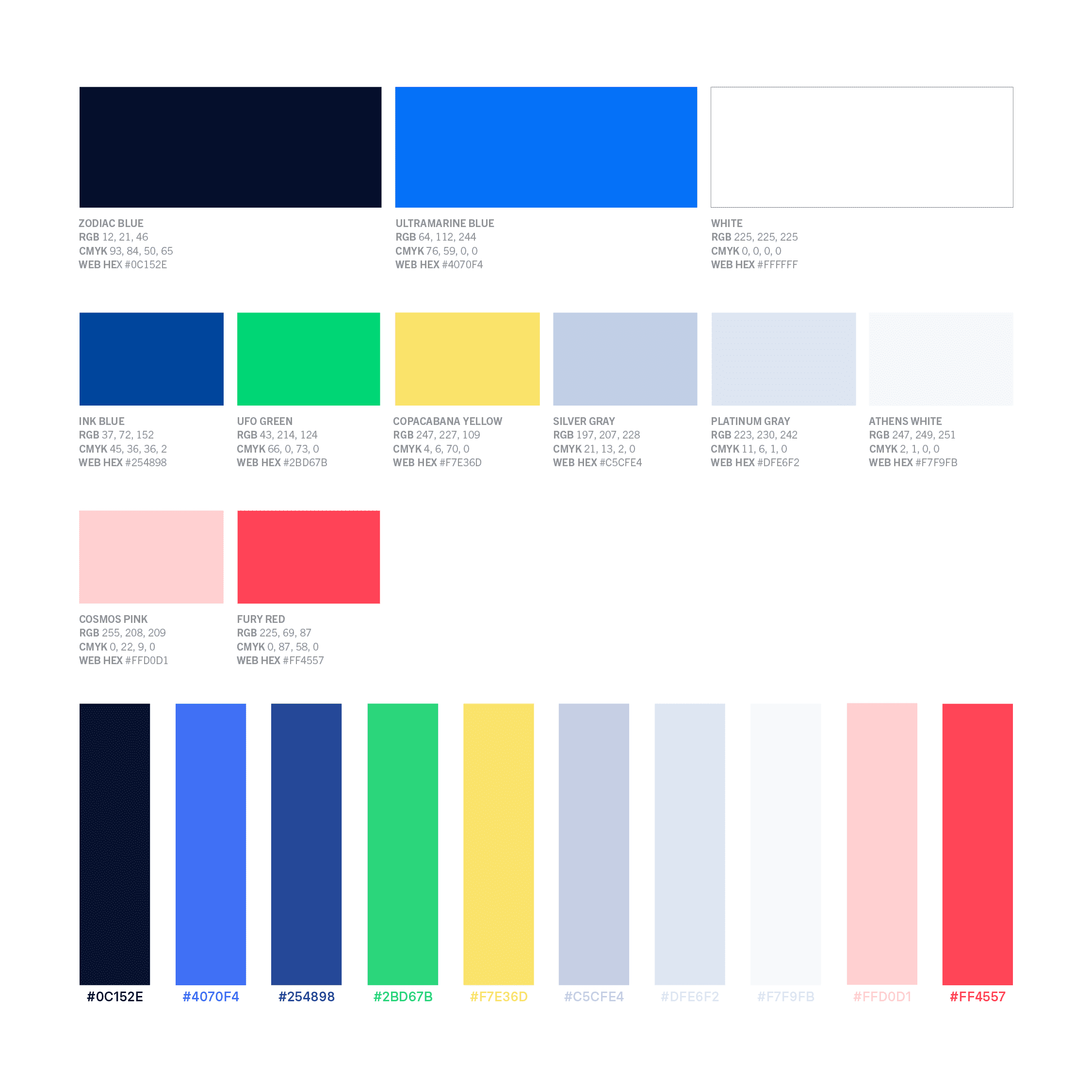
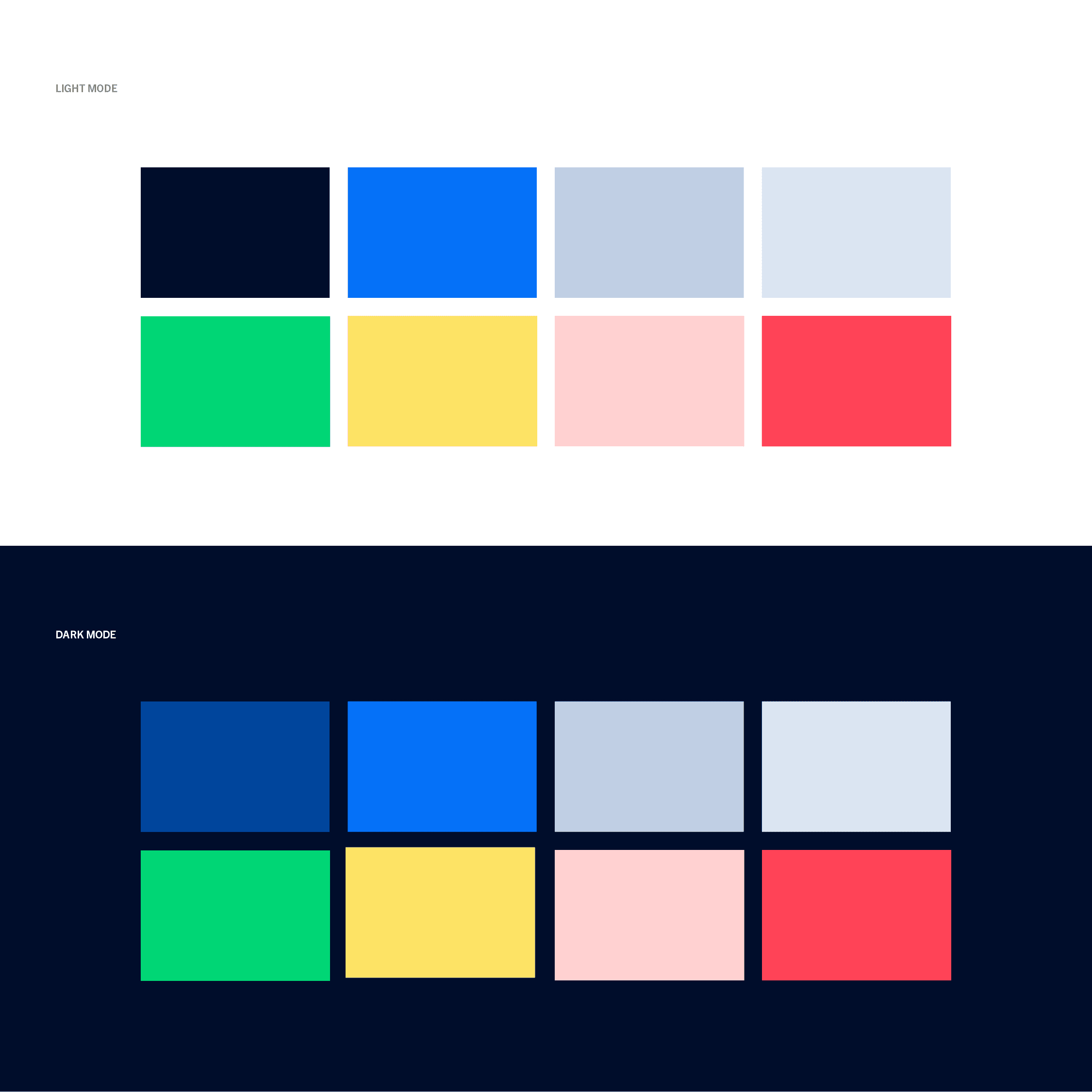
The Lisk color palette, centered around the primary blue and two key secondary colors, was a harmonious blend of colors that conveyed trust, innovation, and accessibility. The palette needed to align with the brand's core values and target audience while seamlessly adapting to diverse platforms and use cases within the Lisk ecosystem.
Ultramarine Blue acted as the primary color, symbolizing trust, stability, and innovation. Zodiac Blue and Ink Blue contributed a foundation, depth, and sophistication to the design. Accent colors such as UFO Green for growth and success, Copacabana Yellow for optimism and creativity, Cosmos Pink for warmth and empathy, and Fury Red for highlighting essential elements were incorporated. Additionally, a predefined array of grays provided a neutral base for balance.
Lisk employed two distinct color systems: light and dark, following the 60/30/10 rule for visual balance and consistency, with a shade of blue always serving as the more prominent color. In the light mode, white or gray functioned as the main background color. The primary color system included Lisk blues and a range of accent colors, with advice against combining Pink and Yellow. The dark mode featured Zodiac Blue as the main background color and introduced Ink Blue for depth and contrast. The dark mode retained all colors from the light mode, applying the same rules across both systems.
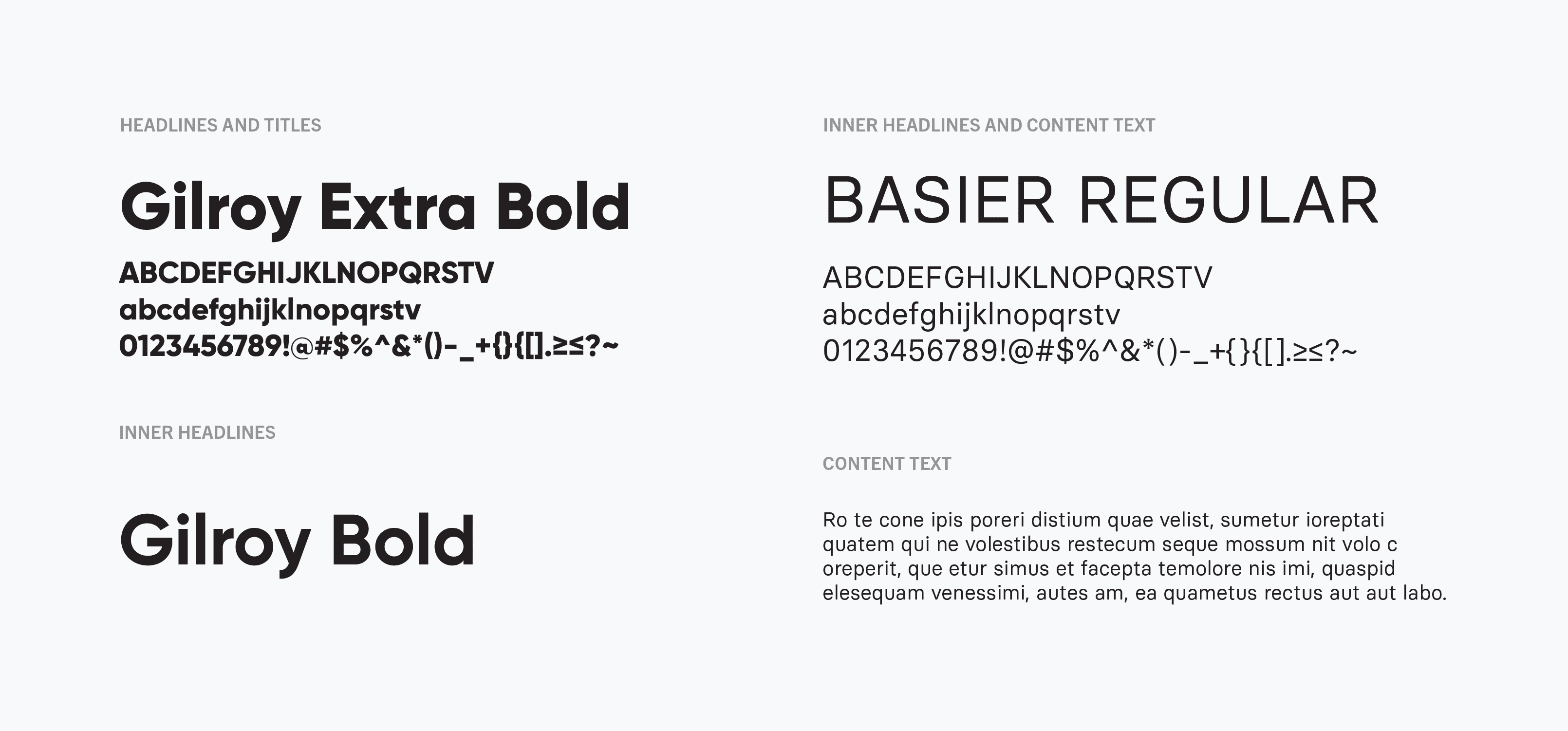
The Lisk design incorporated two carefully chosen typefaces that would pair seemingly to create visual hierarchy and ensure readability across various applications, ultimately contributing to Lisk's mission of making blockchain technology accessible to a broader audience.
Gilroy served as the primary font for headings and titles, lending a modern and bold touch to the design. Its geometric sans-serif style reinforced the brand's innovative nature while maintaining a sense of approachability and professionalism. On the other hand, Basier Circle was employed as the secondary font for inner headlines and body text. Its rounded sans-serif style complemented Gilroy, offering a more relaxed and friendly tone while retaining a sense of clarity and legibility.
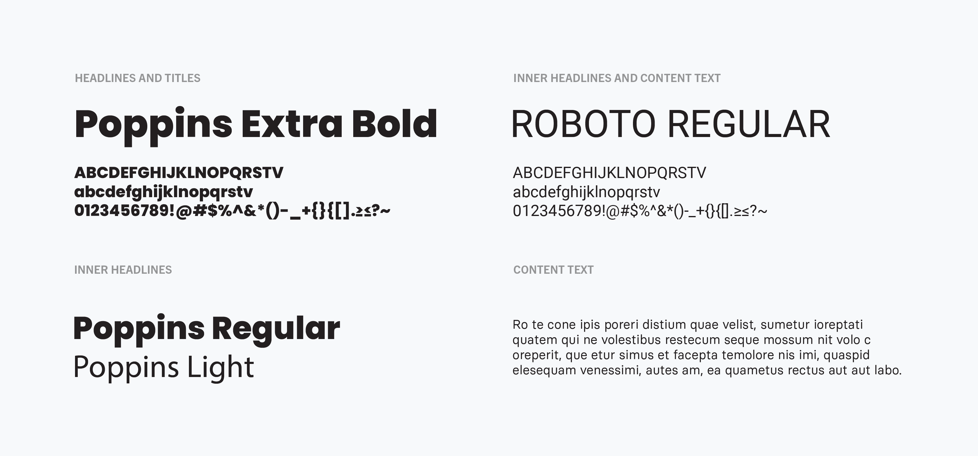
Due to the open-source nature of Lisk's project, it was crucial to have open fonts included in the system that could be used as replacements when custom fonts were not available. To this end, Poppins, a versatile sans-serif font, was chosen as the alternative to Gilroy, while Roboto was selected as the replacement for Basier Circle.
As the Lisk brand system evolved, the goal of making blockchain more accessible remained at the forefront. To establish a connection with various audiences, including both technical and non-technical individuals, it was vital to adopt an illustration style that was engaging, relatable, and human. Consequently, the choice was made to emphasize characters as the primary illustrations, infusing the brand's visual identity with a sense of personality and warmth.
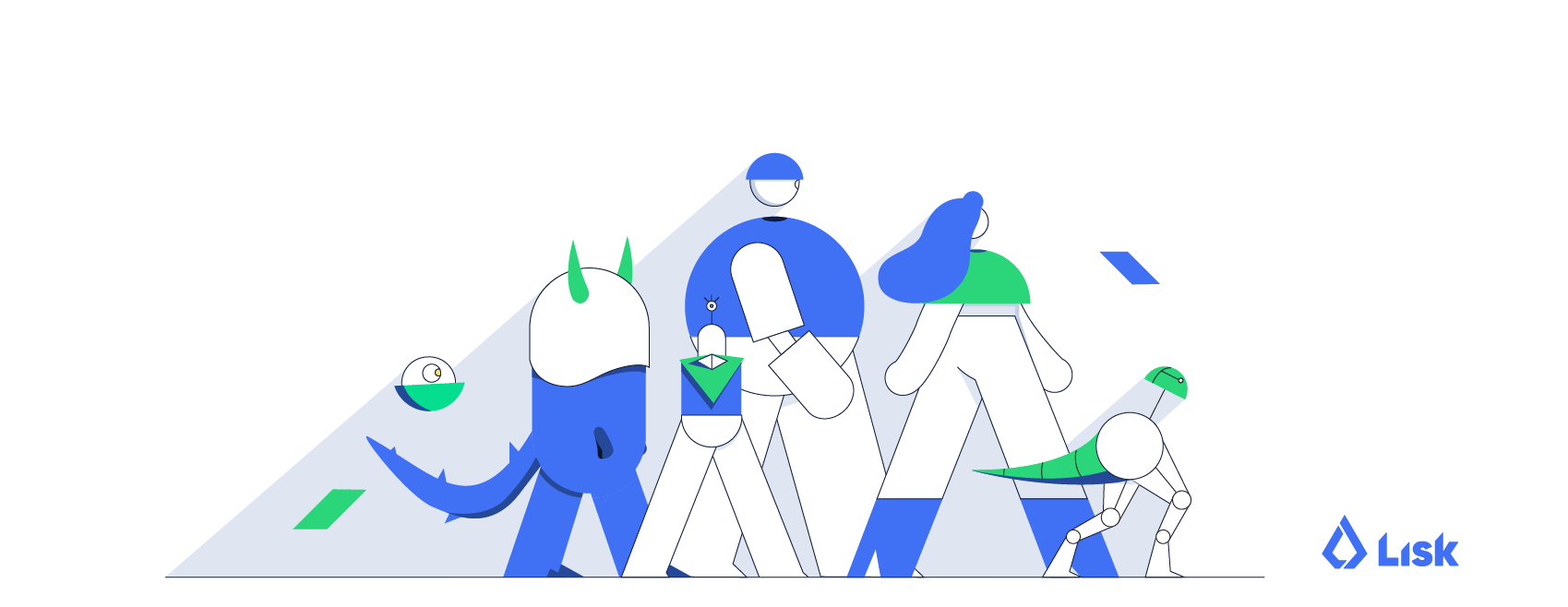
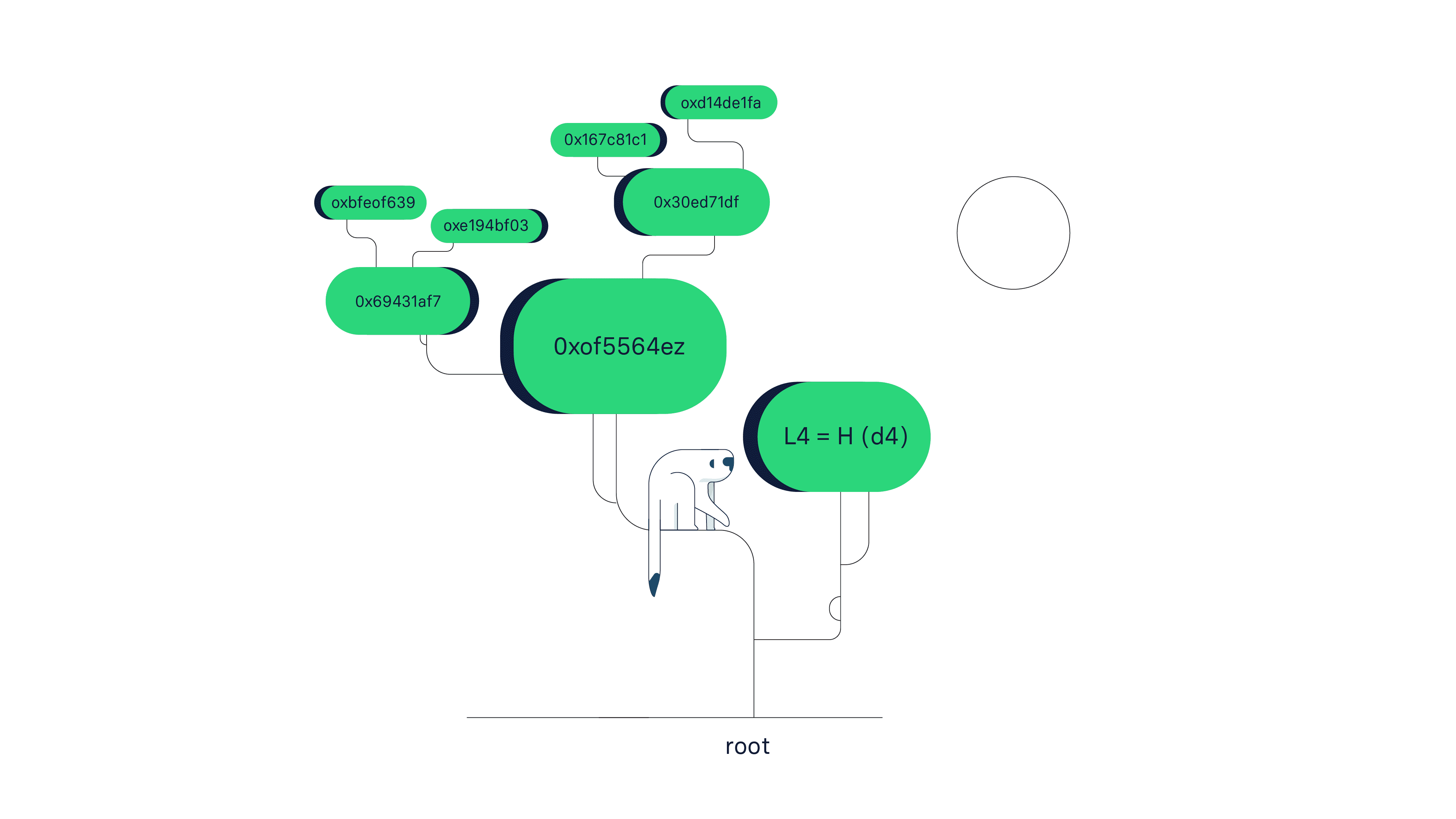
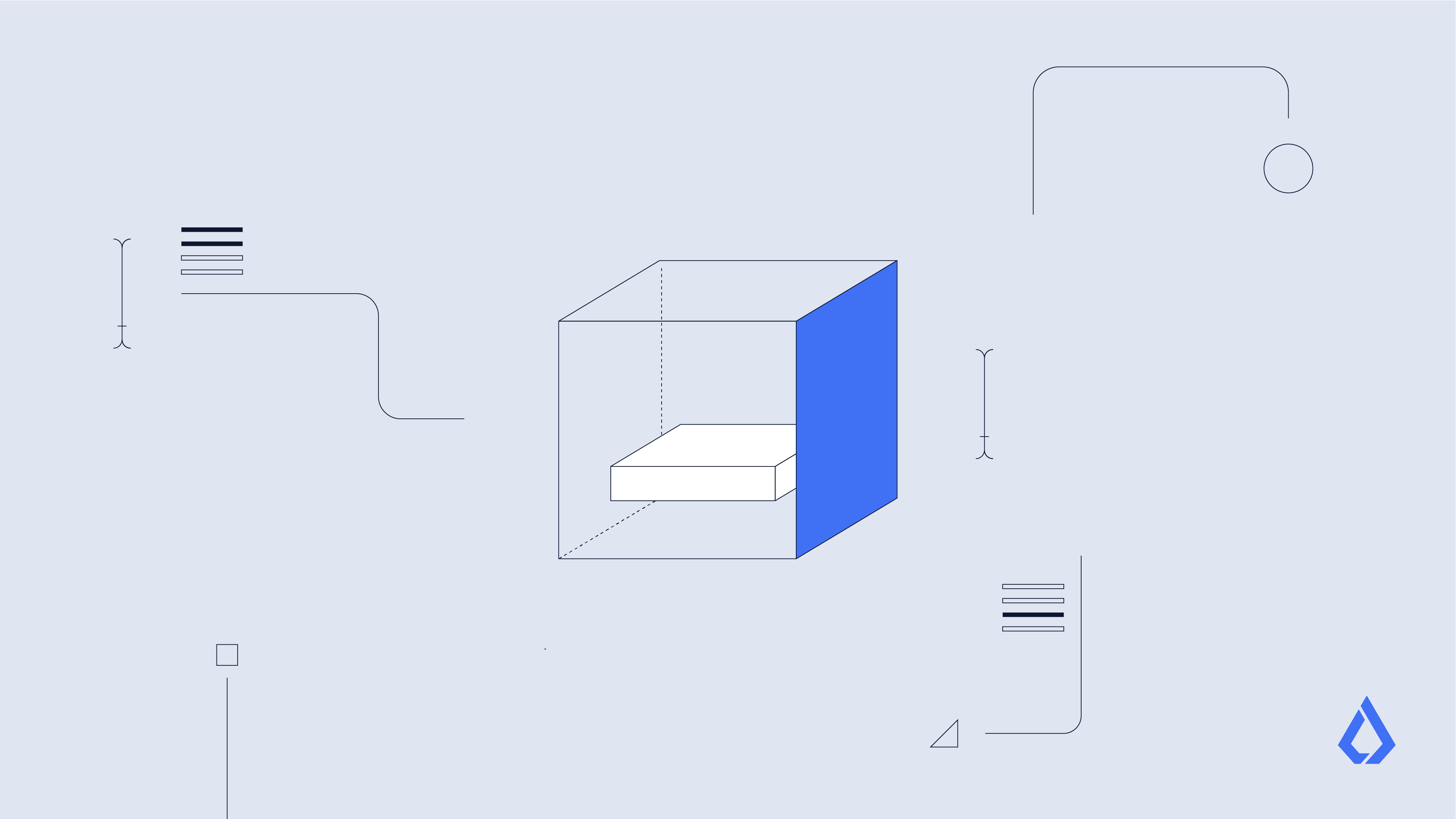
The characters in the Lisk illustration style were designed in a bold yet minimalistic manner, using exclusively basic and primitive shapes to define details and create personality. These characters featured geometric, curvy forms with organic finishes and a unique look and feel. Basic shadowing was employed to add volume and depth. The visual contrast between line and form was utilized to emphasize specific portions of the illustration. Unfilled strokes created a clear contrast with color-filled shapes, which were used to highlight actions or balance the frame.
Considering the importance of privacy in blockchain technology, the characters lacked identifiable facial features. Instead, expressions and emotions were conveyed through various body postures, with the characters' bodies designed to easily adapt to specific positions. The dynamic character style allowed for the constant evolution of characters, such as robots, monsters, magicians, and other unique creatures.
In addition to characters, the illustrations also integrated objects and scenes, adhering to the same design principles. Outlines were employed to create both figurative and abstract elements, which facilitated the portrayal of a wide range of subjects and concepts to effectively convey diverse ideas and scenes, while maintaining a consistent visual language.
To ensure compatibility with both light and dark backgrounds, the color scheme was adapted accordingly. For instance, on light backgrounds, fills were pure white, and strokes were Zodiac Blue. For dark backgrounds, pure white fills were avoided, and strokes were Ink Blue. This approach ensured a seamless integration of illustrations within the broader Lisk design ecosystem.
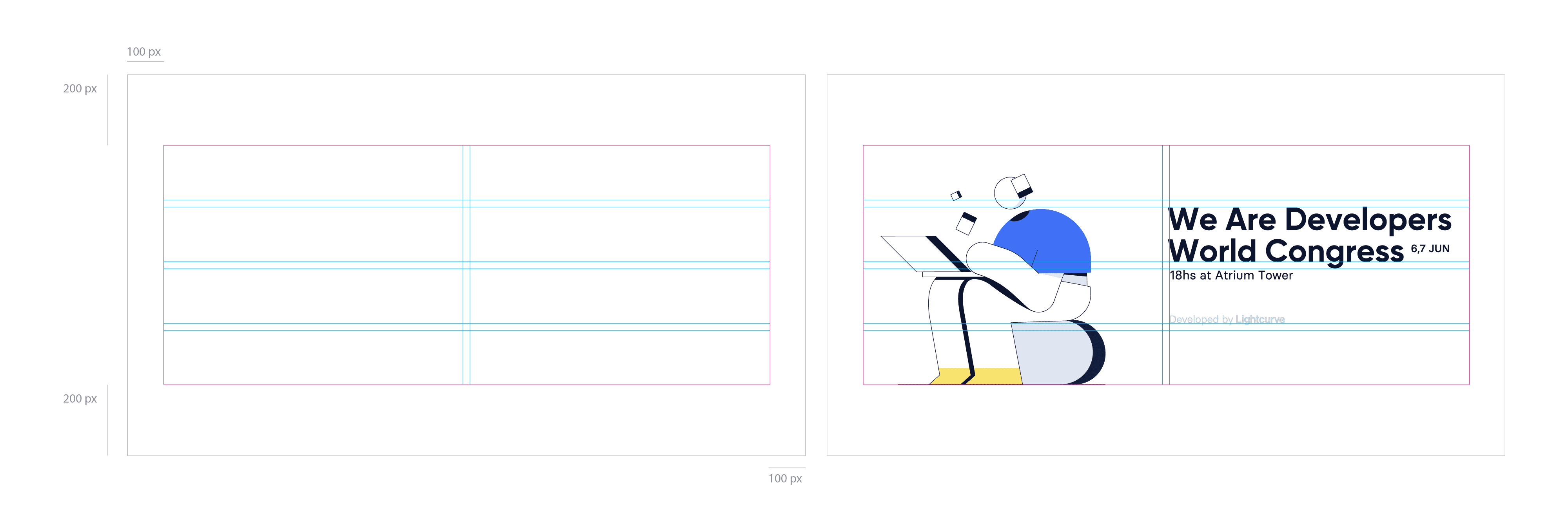
In the realm of digital applications, a strict grid system was employed to ensure a consistent, structured, and visually harmonious experience across all platforms. Systematically organizing the artboard space allowed designers to consistently create clean layouts and establish a clear hierarchy of content, ultimately leading to better user comprehension and engagement.
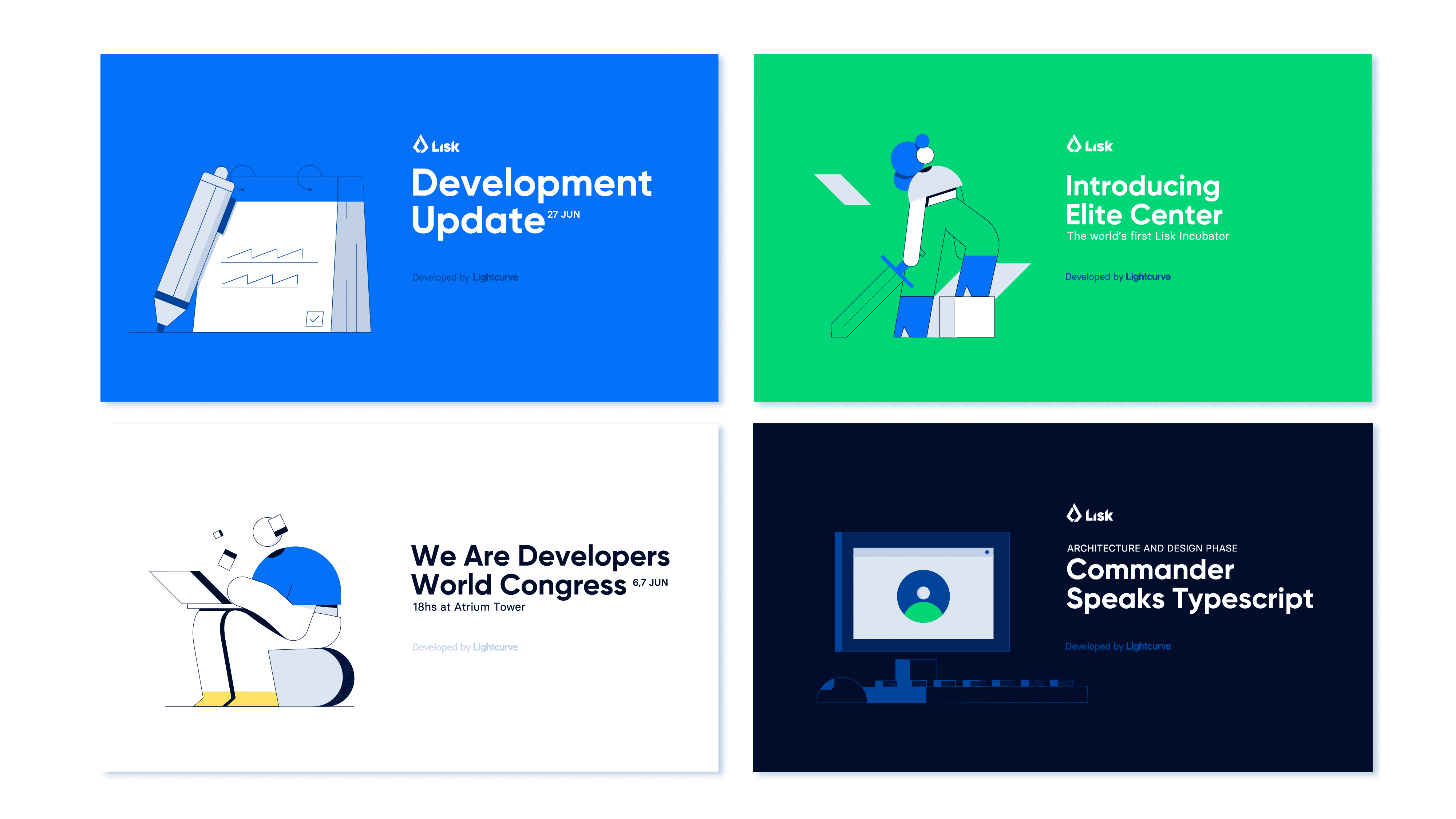
Banners were one of the most prevalent forms of visual communication within the Lisk ecosystem, accompanying various content types such as announcements, events, releases, and community initiatives. To maintain visual unity across these diverse publications, a two-column grid system was utilized. The written information occupied one column, while the other was exclusively reserved for illustrations.
The banners were color-coded, with the background color of each banner determined by its content type, ensuring a consistent and recognizable presentation of information.
Lisk was active across numerous social channels, and as each platform catered to a unique audience, purpose, and content type, the institutional imagery needed to be designed and illustrated exclusively for each specific channel.
Motion played a vital role in the Lisk brand. Animations were designed to be dynamic, with quick transitions and smooth keyframe interpolations, resulting in a fluid and engaging experience for viewers.
Motion was not only utilized in video formats but also incorporated as a visual communication resource into applications to provide a more engaging experience across all touchpoints.
Furthermore, character animation was used to bring the figures behind the Lisk brand to life. Each character had a skeleton scripted in Duik, and the animations were designed to be organic, with each action causing at least a first degree of inertia on the rest of the body.
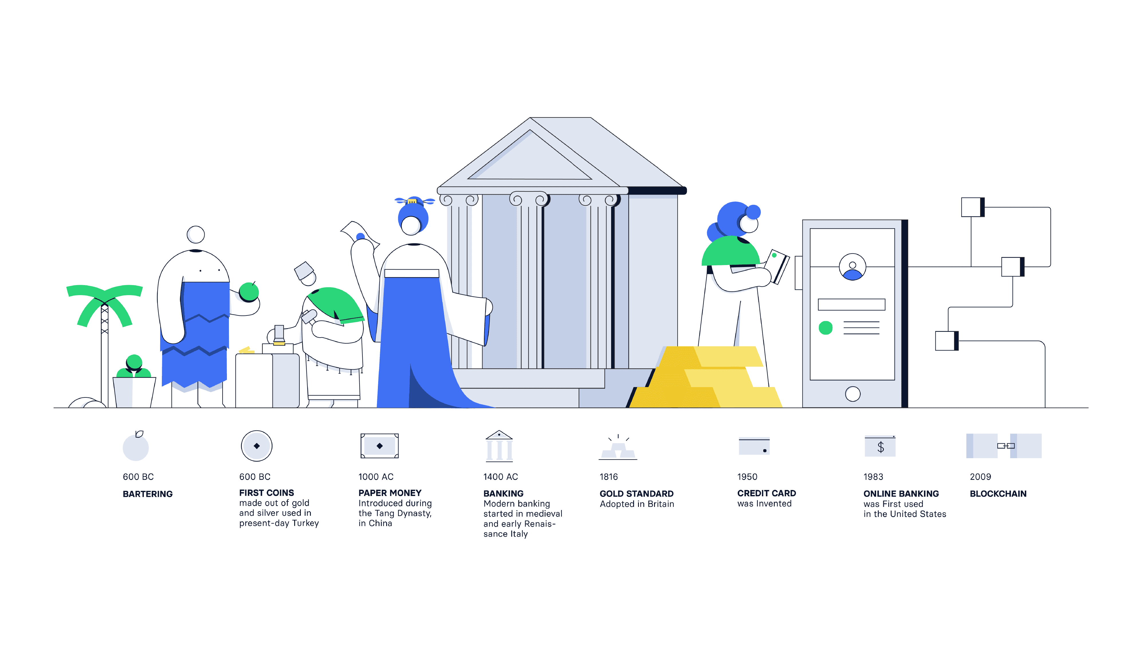
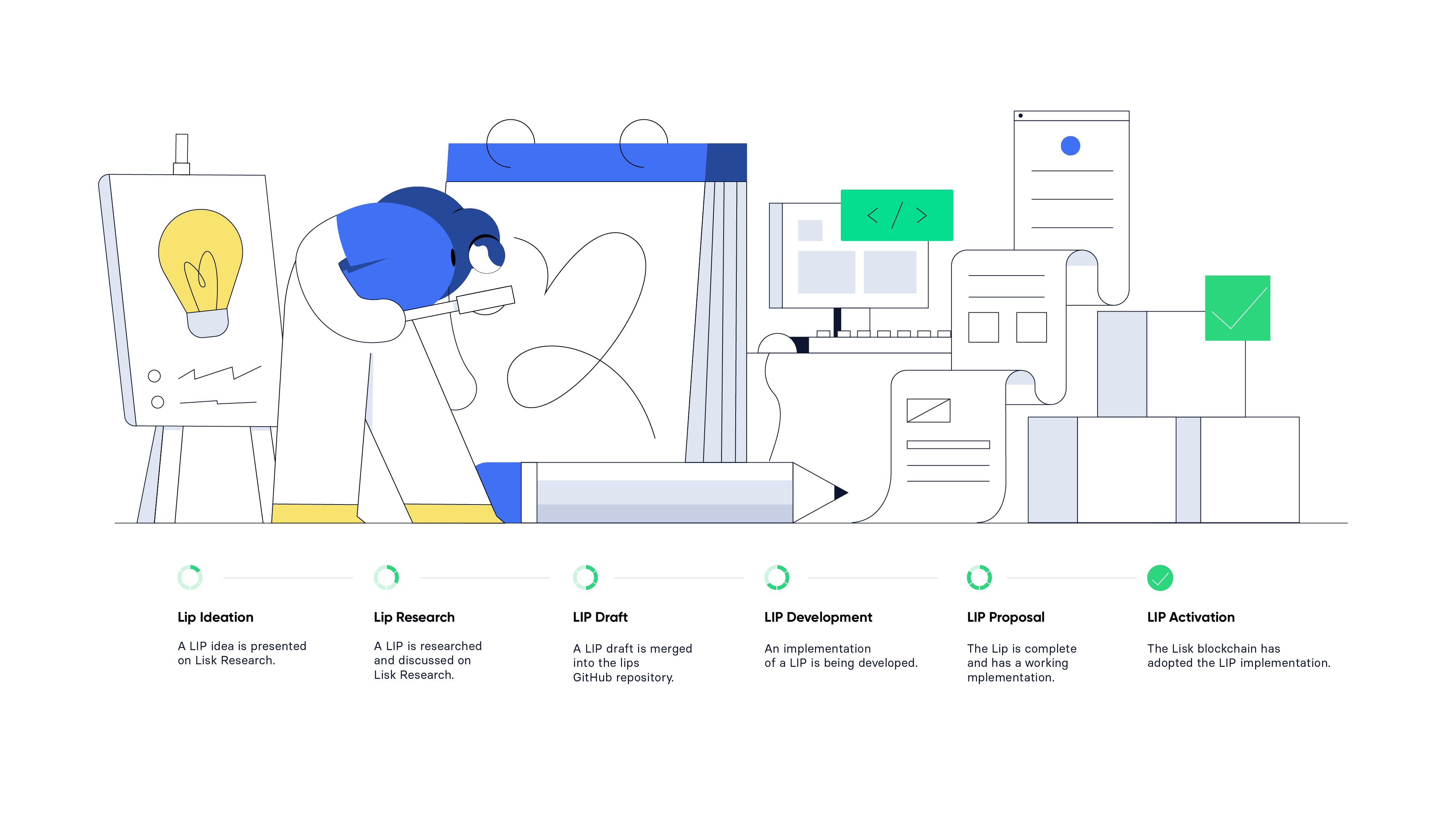
Lisk's commitment to bringing blockchain technology to a broader audience called for the creation of an efficient infographic system. Boasting more than 100 instructive visual assets, the objective was to convey intricate information in an attractive and simple-to-grasp manner.
To accomplish this, the design team crafted a system that guaranteed visual uniformity while facilitating the understanding of complicated ideas. By employing a structured grid layout and integrating a diverse array of illustrations, they transformed the learning process into an enjoyable and captivating experience.
In line with the visual identity of the Lisk brand, the iconography was crafted using simple shapes and a restrained color palette, with a maximum of three colors even in the most intricate designs with the goal of creating a style that remained easy to read and did not overshadow the content they accompanied.
A clear, intuitive system built out of figurative icons allowed the brand system to make complex concepts more approachable, ultimately reinforcing Lisk's commitment to promoting a user-friendly and accessible experience within the world of blockchain technology.
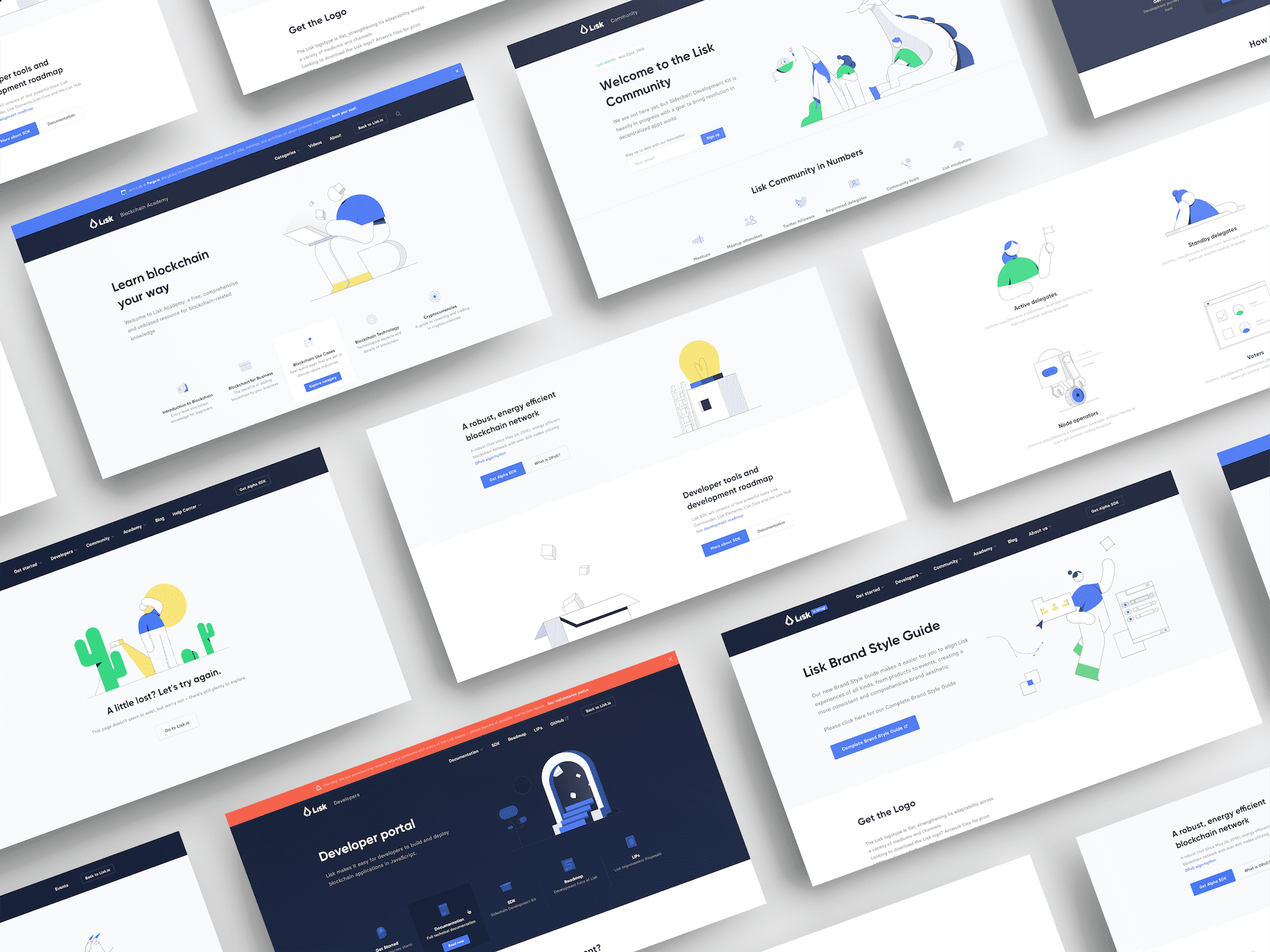
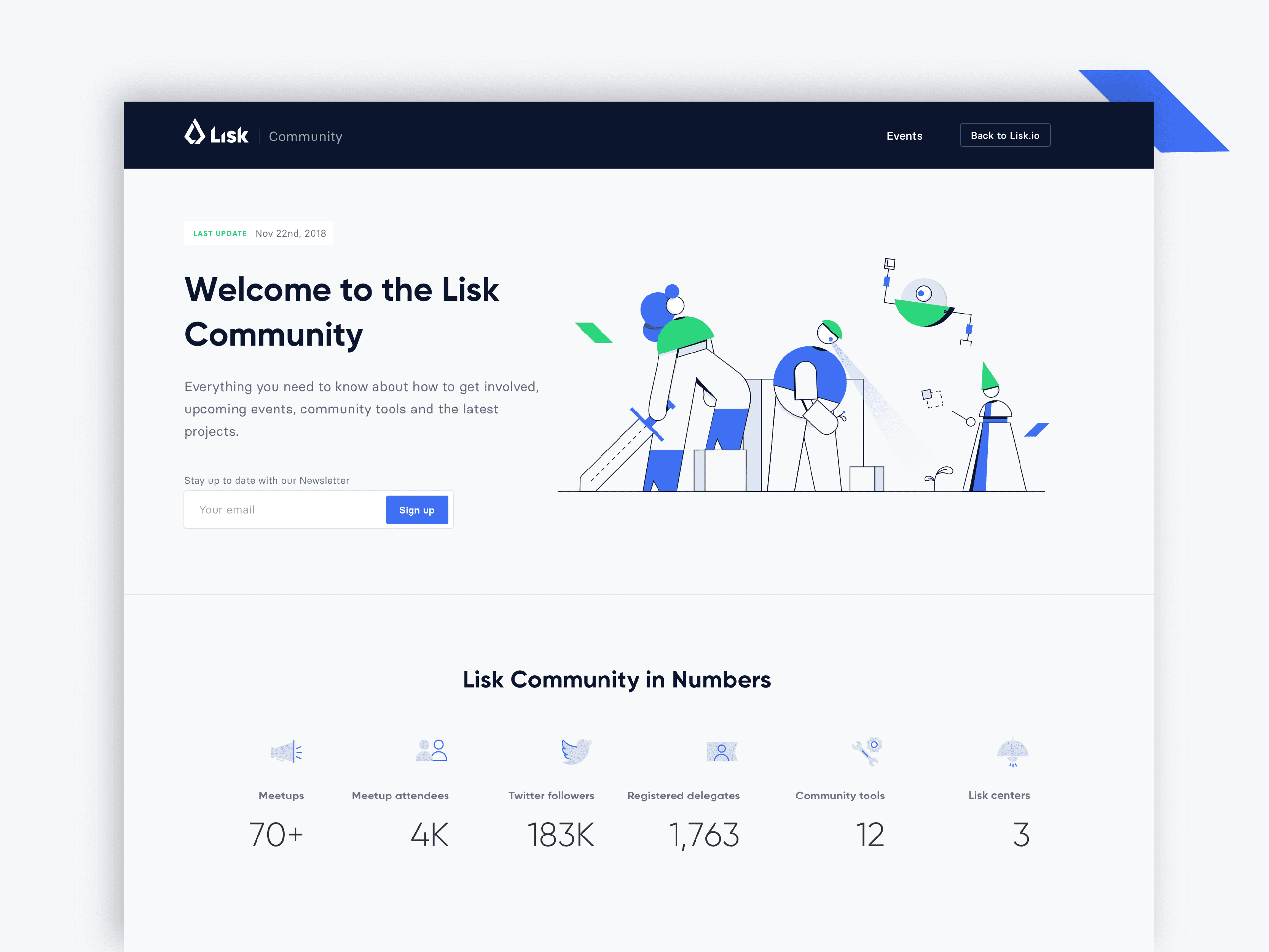
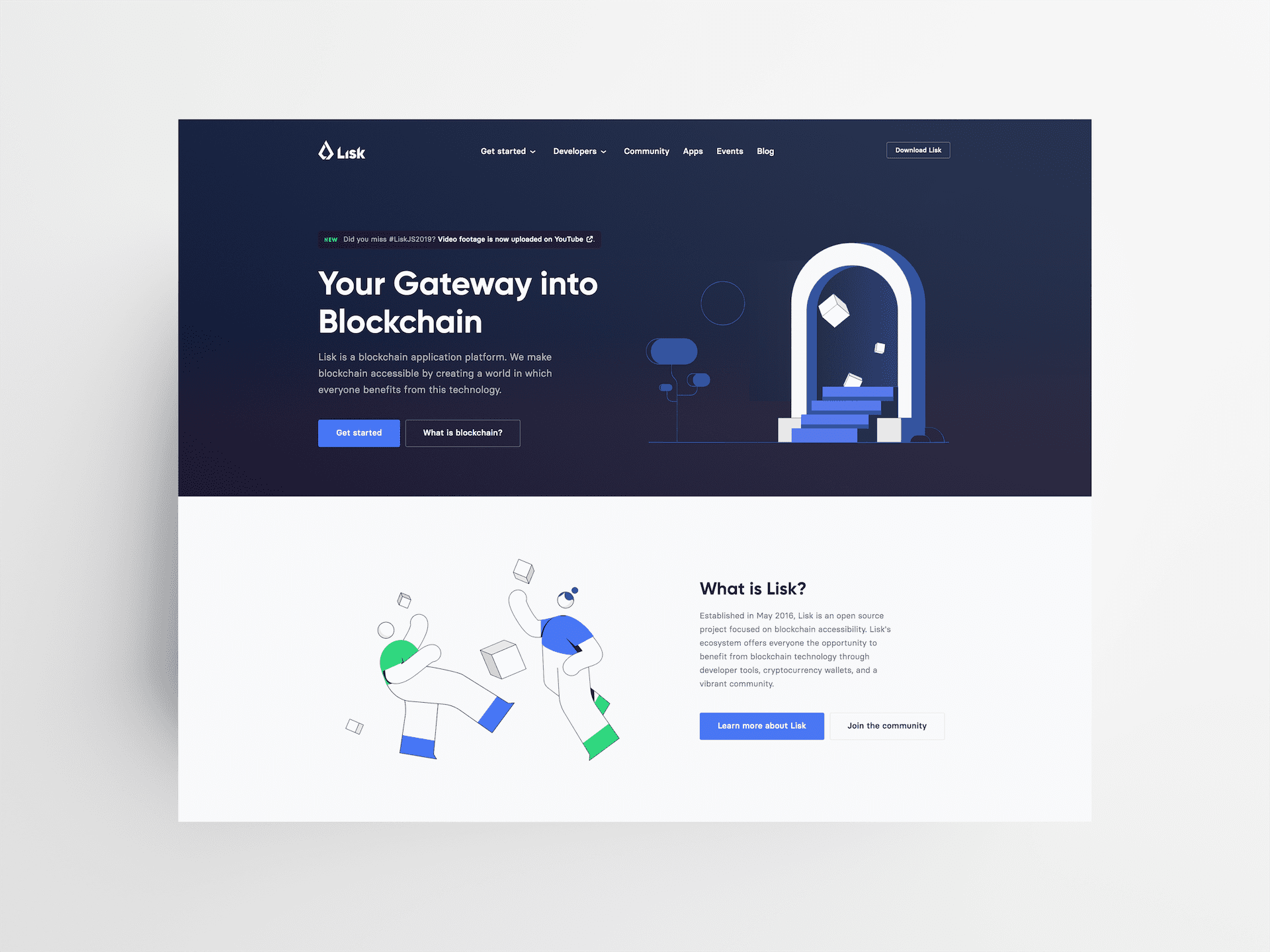
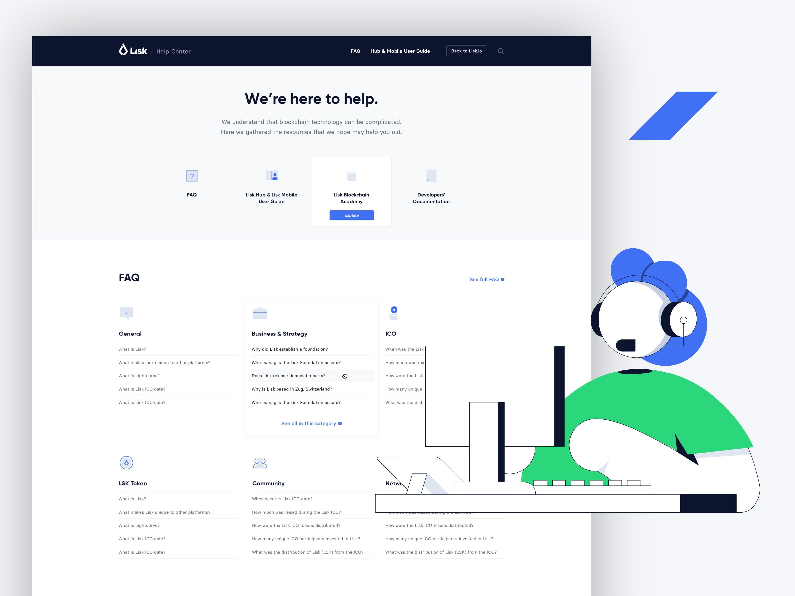
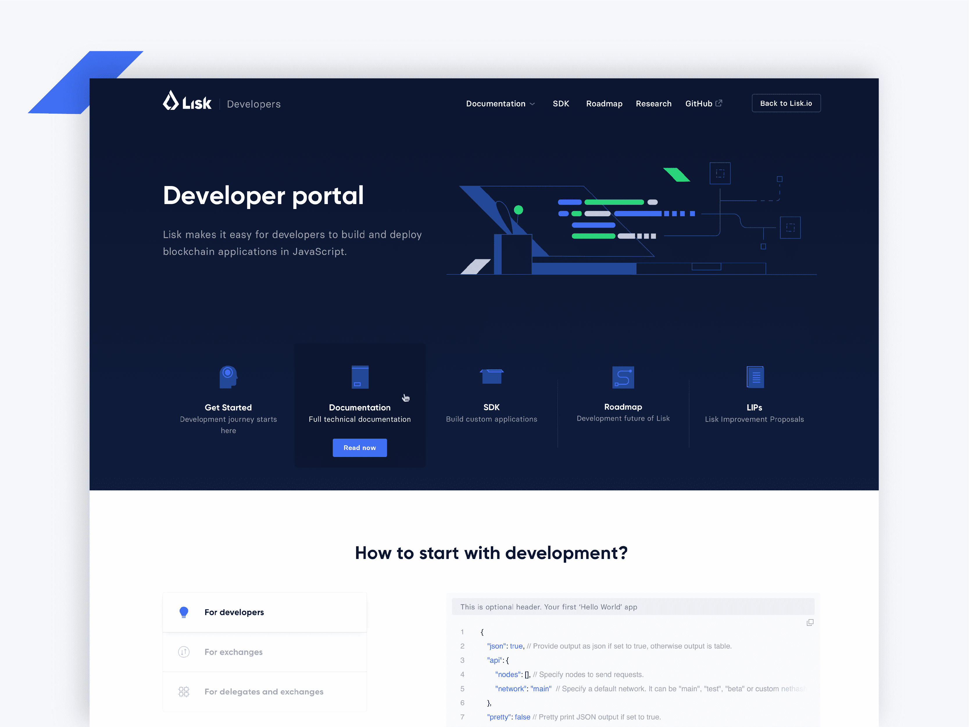
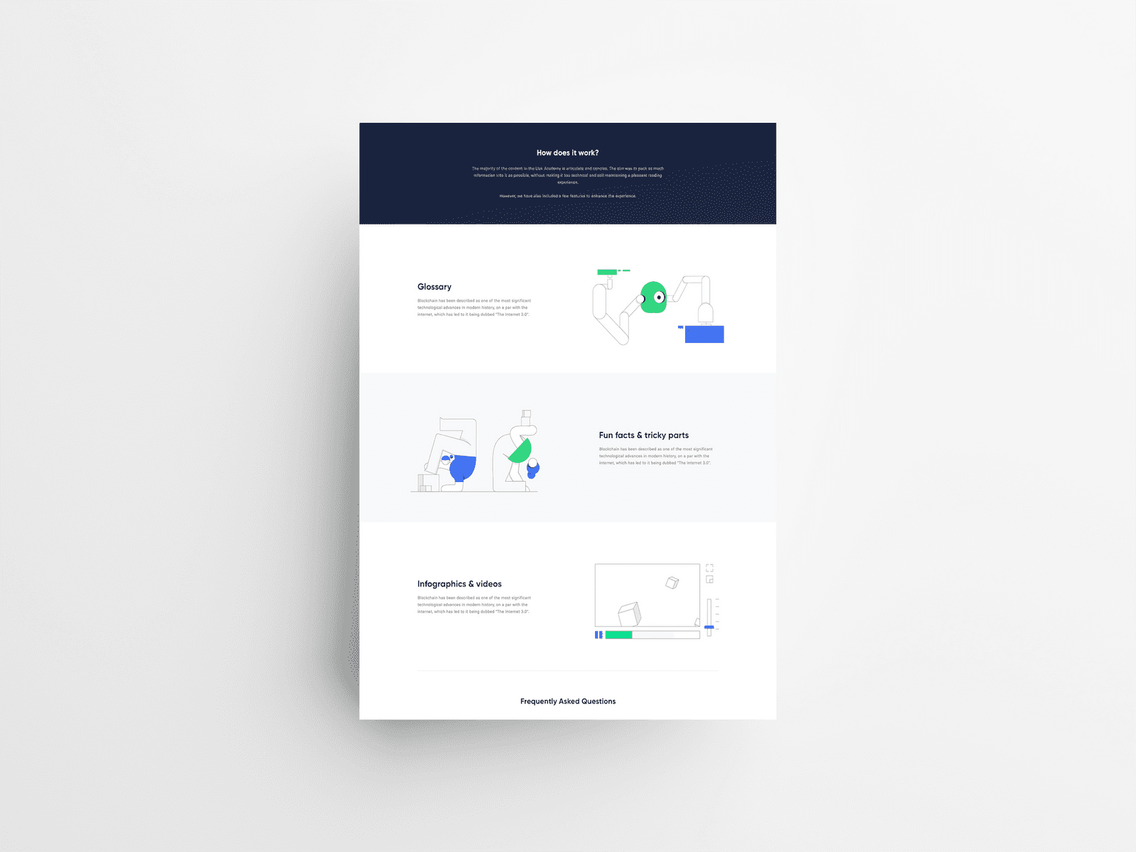
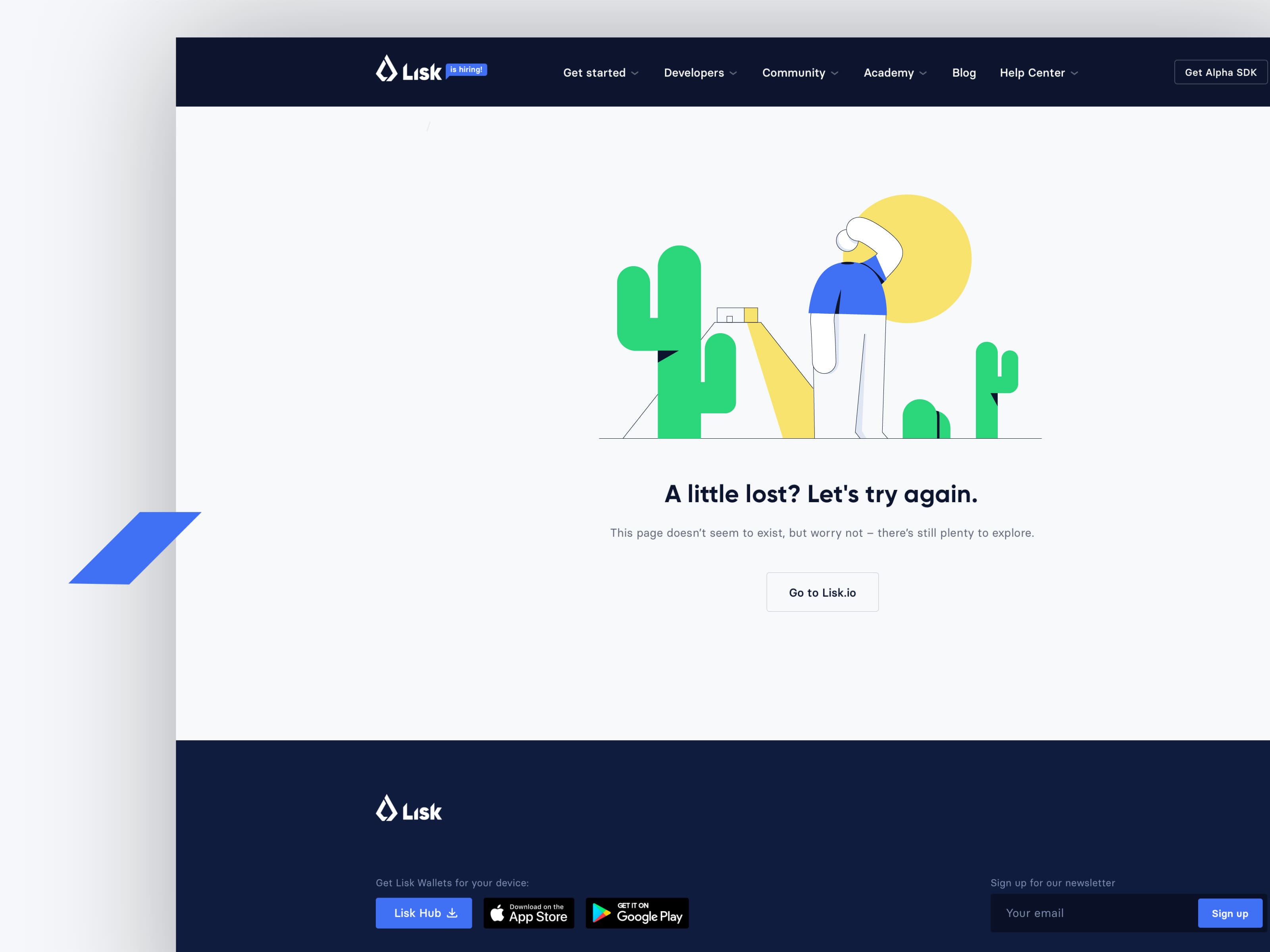
The Lisk website was used as the primary marketing channel, acting as the central hub for communicating Lisk's vision and offerings. Within this digital landscape, the illustrations and iconography were thoughtfully integrated with the accompanying content, adhering to a content-first approach. This design philosophy placed emphasis on the importance of presenting information in a clear, engaging, and visually harmonious manner.
In order to achieve this balance, we meticulously crafted illustrations and iconography that would not only enhance the overall aesthetic of the website but also help guide users through the content. By employing design principles such as visual hierarchy, contrast, and unity, the website's visual elements seamlessly coexisted with the text, ensuring that users could effortlessly digest the information presented, and that the imagery was tailored specifically to the different user flows.
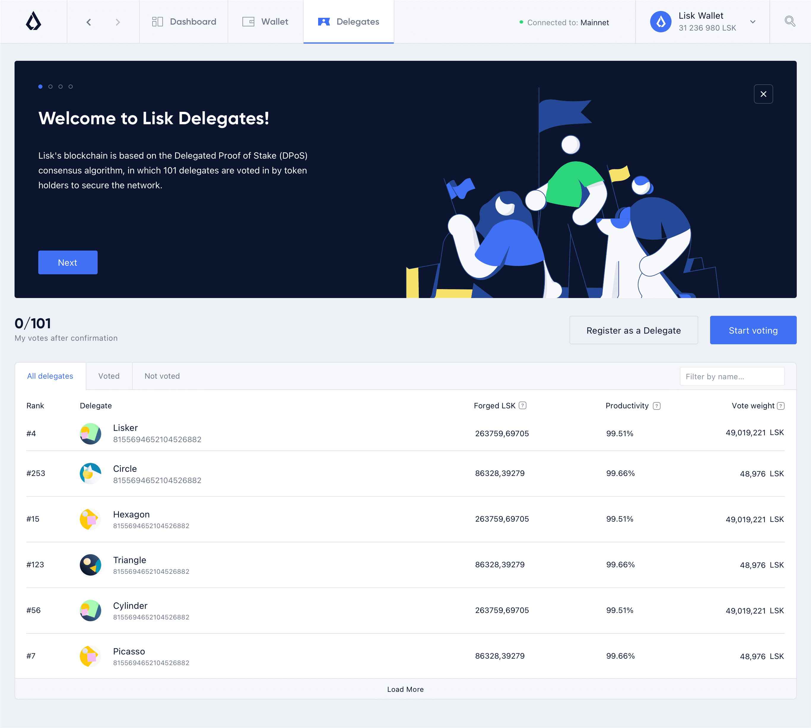
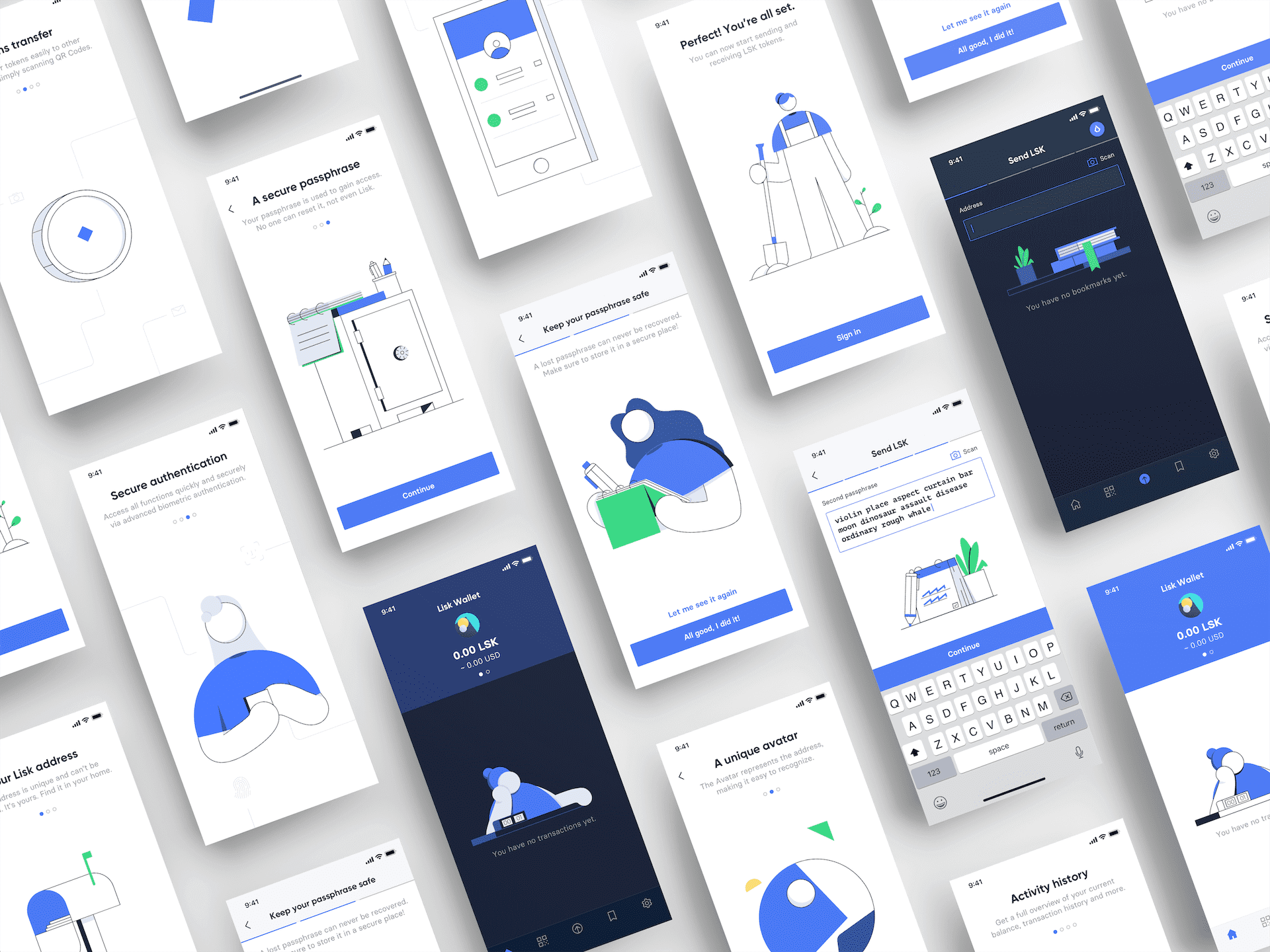
Illustrations and branded elements were crucial in creating engaging user experiences and making blockchain technology accessible to a diverse audience, both technical and non-technical, in Lisk's two main applications, Lisk Hub and Lisk Mobile.
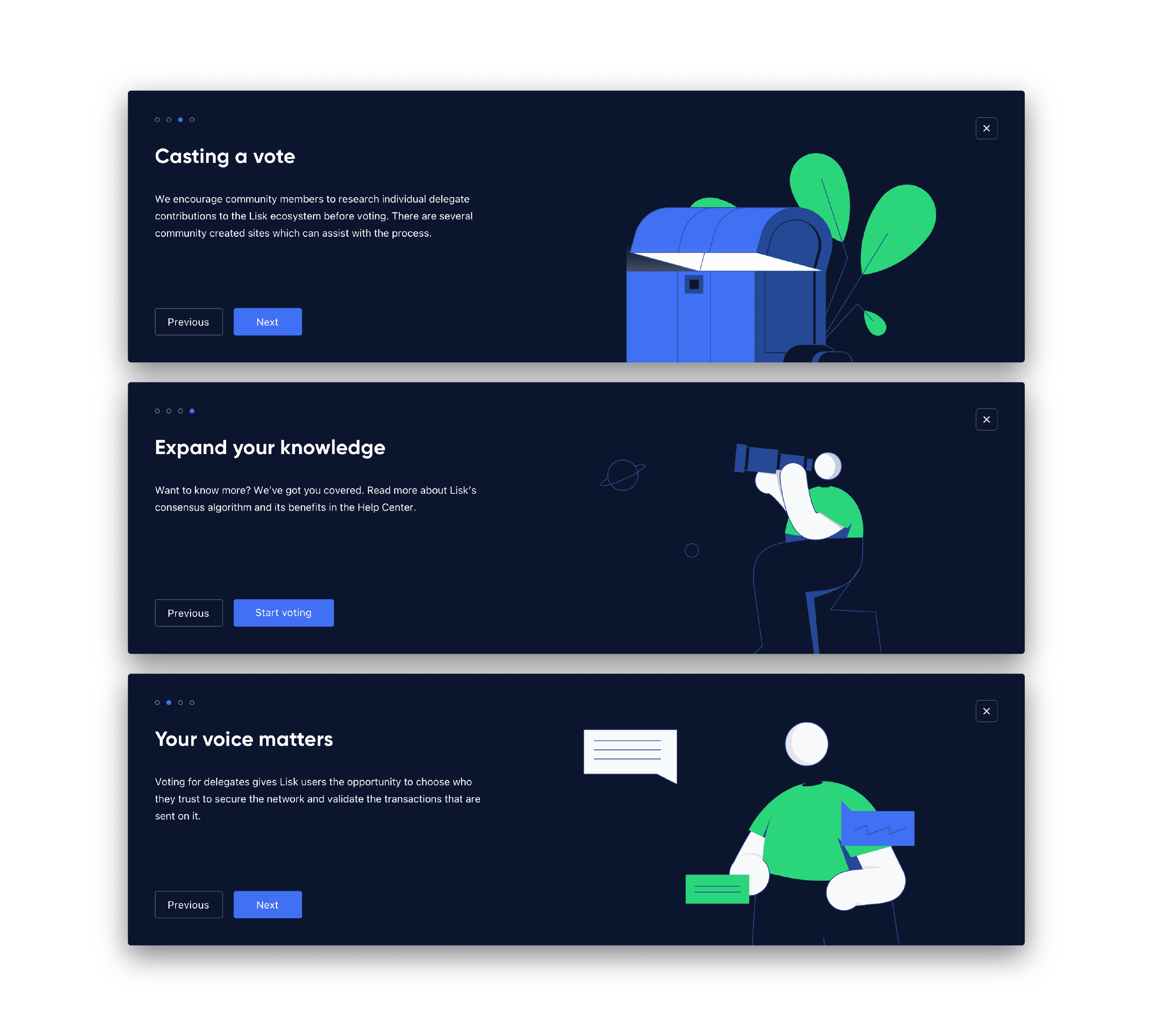
Lisk Hub showcased a variety of illustrations within the user interface, particularly in the onboarding modules. These illustrations were thoughtfully designed to align with the accompanying content and varied for each slide. The primary goal was to establish a fun and approachable onboarding experience, ensuring a satisfying user journey for all audience types.
Lisk Mobile integrated illustrations throughout the application, customizing each illustration to enhance the specific content it accompanied. Due to mobile constraints, such as limited screen size and resolution, the illustrations were designed to be simple and clean. Designers refrained from incorporating repetitive elements within the same frame, striking a balance between visual engagement and ease of comprehension.
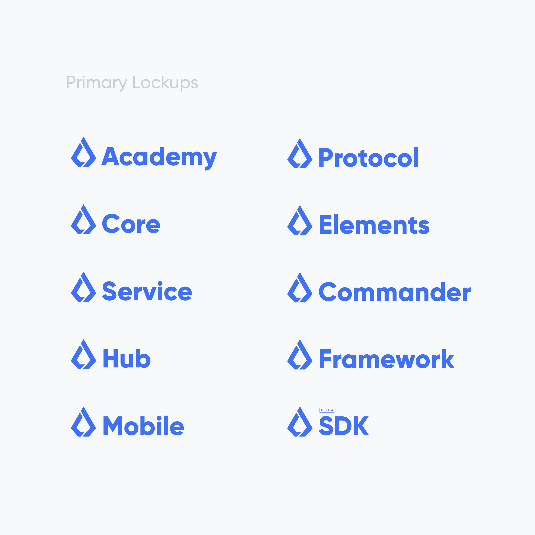
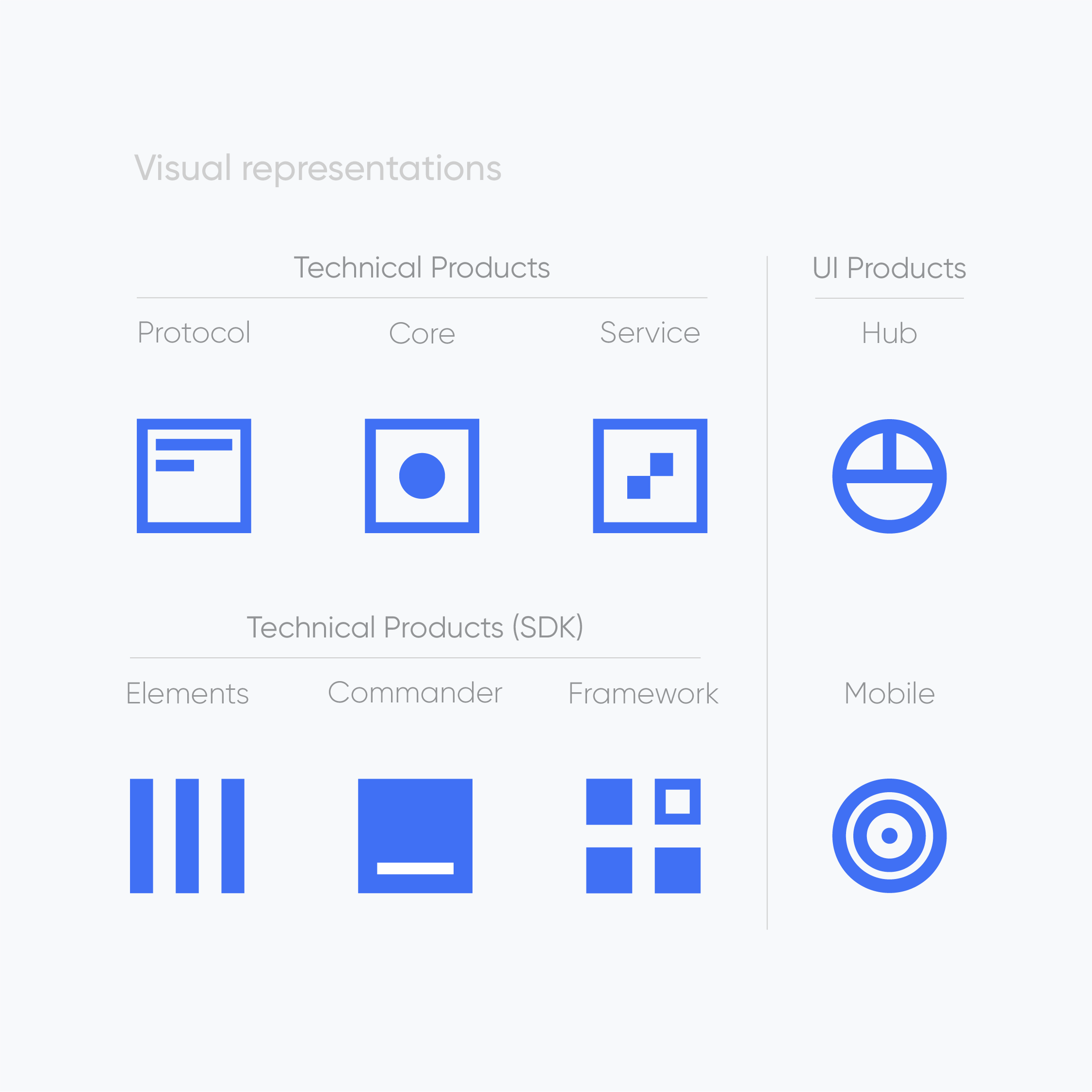
Product branding is an essential part of the Lisk brand system, playing a key role in shaping the look and feel for its wide range of products and applications. To find the right balance between unique and unified design, a flexible branding strategy was developed, including a primary lockup and a secondary visual representation for each product.
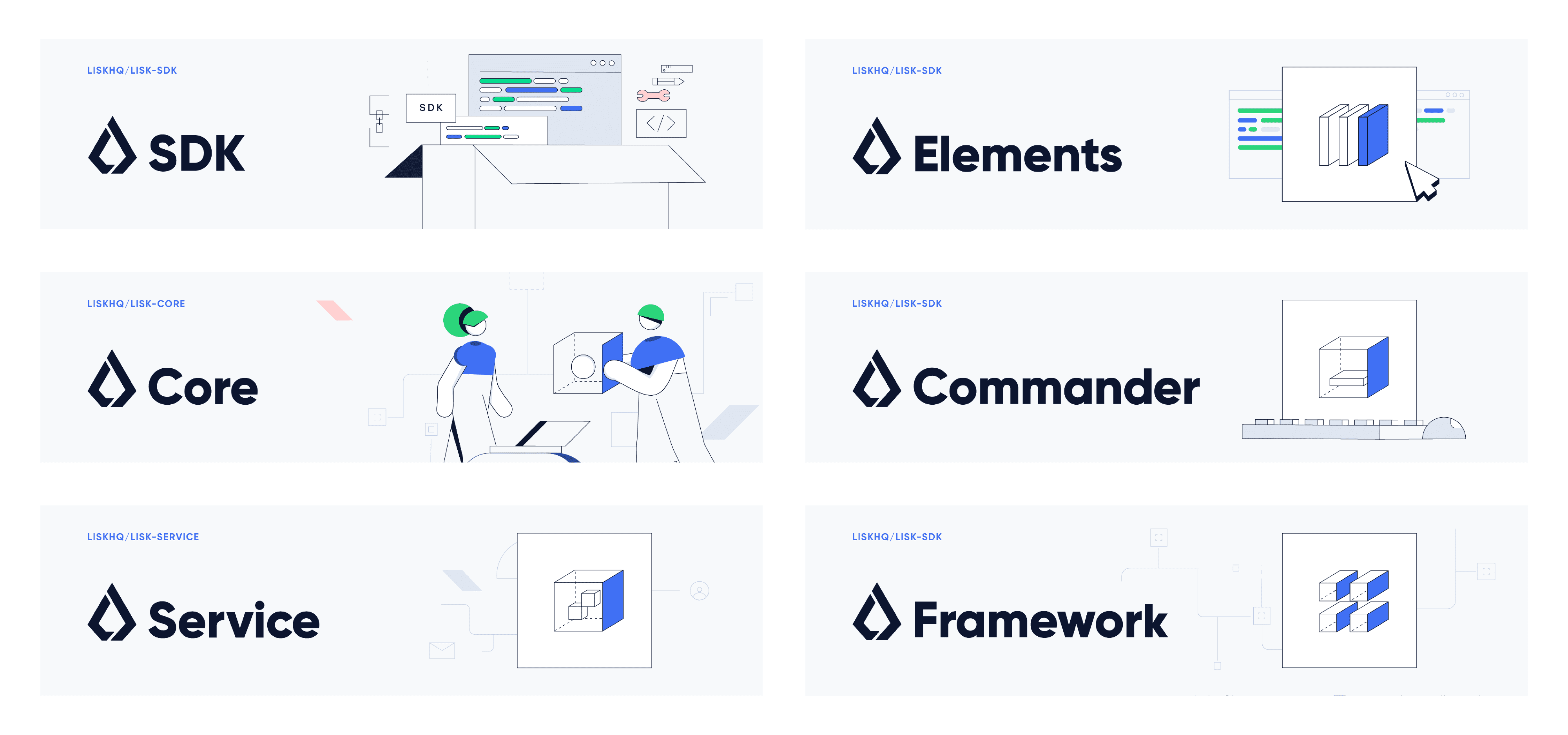
The primary lockup combined the logomark with the product name, using Gilroy, the main typeface, to create a consistent look throughout the brand. Secondary visual representations helped to create more detailed and engaging images for each product. This approach established a clear visual language for every product, making them easy to recognize and tell apart.
These visual representations were used in various materials, such as banners and Github readme headings, to make the overall experience more engaging and accessible. By making product visuals more appealing, complex information and ideas were turned into eye-catching and easy-to-understand formats, making blockchain technology more accessible to a broader audience. This creative approach to product branding reinforced Lisk's commitment to promoting accessibility and engagement within the blockchain world.
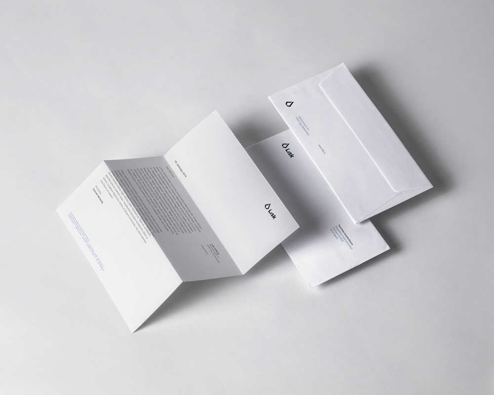
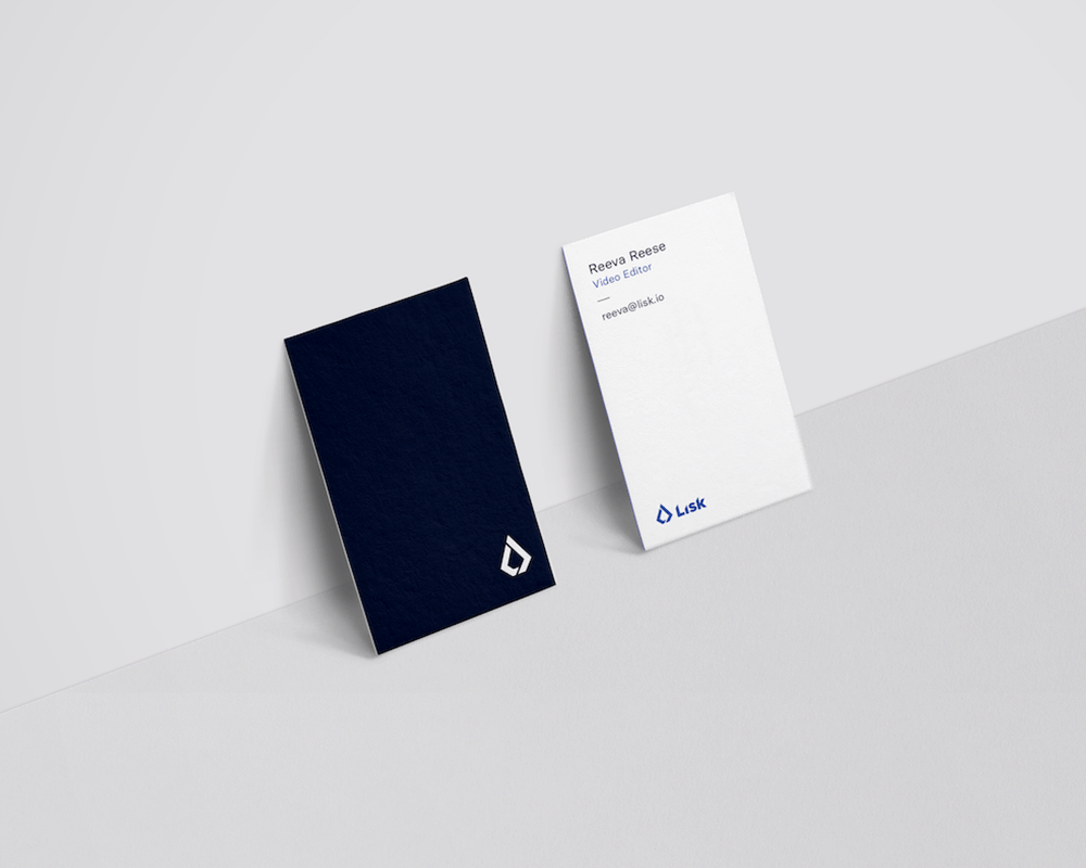
Lisk's stationery and promotional merchandise were designed to ensure a consistent and professional image that reflected the brand's core values and identity.
Following the principles of the brand identity in clean and modern layouts, these items conveyed a sense of sophistication and innovation, not only serving as practical tools for communication but also as a means of reinforcing the Lisk brand identity.

