Block Stories

Block Stories is a series of short films produced by Chainlink that digs beneath the code to uncover the origin stories of the most successful Web3 protocols. From next-generation insurance alternatives to NFTs and the emerging metaverse, Block Stories aims to reveal the principles, people, and technologies driving the biggest Web3 innovations.

As Chainlink’s Creative Director, I was in charge of defining the art direction for the digital presence of Block Stories.

COMPANY
Chainlink
YEAR
2022/2023
TYPE
Brand, Motion, Web

Key challenges

Crafting an independent sub-brand.

Block Stories was envisioned as a standalone product under the Chainlink umbrella, necessitating the development of its unique visual language and identity that would set it apart while still maintaining its connection to the parent brand.

Ensuring high production value.

Both the production of the series and its media pack demanded a level of quality that could rival broadcast series. The primary goal was to deliver a premium audiovisual product that would captivate audiences and leave a lasting impression.

Designing for scalability.

The visual identity and media pack needed to be adaptable and versatile enough to accommodate an undetermined number of episodes, each exploring distinct use cases within the blockchain ecosystem.

Catering to a broad audience.

The series was targeted at both technical and non-technical audiences, posing a challenge in striking the right balance between catering to diverse interests and maintaining the series' core essence.

Distributed async workload.

The series was filmed and post-produced by external contractors, which determined a streamlined and thorough approach to templating for a seamless handover to maintain consistency across assets over time.

Solution

In-depth research.

A comprehensive research study was conducted to establish a baseline on existing technical and non-technical broadcast products. This process enabled the identification of best practices and potential pitfalls, laying a solid foundation for the development of Block Stories' visual identity.

Defining scope.

Prior to any creative exploration, the scope of the digital presence was meticulously determined to optimize the brand for real-life touchpoints. This foresight ensured the visual identity would effectively translate across various platforms and channels.

Balancing the core.

Given the diverse audience, the decision was made to focus on the nature of the content of the series – technological topics narrated through a human voice. The identity carefully intertwines digital techniques, such as data glitches, with analogue traces, such as noise textures and cut transitions, to strike a delicate balance between the human and technological profiles.

Creating templates.

Once the assets were finalized and approved, detailed custom templates and documentation were created for all the motion graphics and static files. This approach facilitated easy navigation and customization, ultimately streamlining the process with the external contractor and contributing to consistent output over time.

Brand & applications

The brand identity for Block Stories had as its primary goal to harmoniously blend human and technological narratives within its art direction. Finding the right fusion between humanity and technology was key to captivate audiences by showcasing the essence of the people behind the highly-complex code. The primary scope of the brand encompassed the logotype, motion graphics for the media pack, promotional material, and web applications.

Logotype

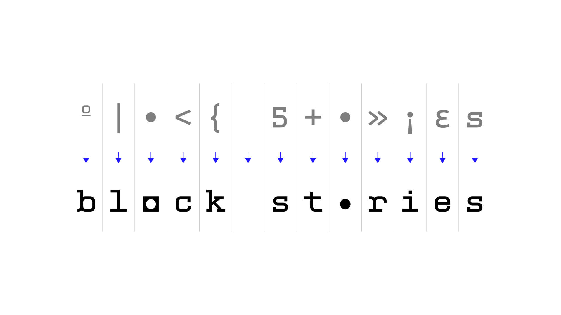
The Block Stories logo was designed to capture the soul of the branding, marrying the technological and human dimensions. Drawing inspiration from a developer-esque monotype font, we added an editorial twist by transforming the 'o's in the wordmark into a striking symbol, signifying contrasting yet connected forces. These symbols could be merged to create a distinct editorial isotype.

Animations

To craft the animations, we initially concentrated on key kinetic typography components, blending digital and analog techniques to reinforce the brand's core concept. Glitches, data aberrations, typing, and organic motion were uniquely combined to generate the animation for the main logo, chapter numbers, and protagonist names.

For the opener, each character was mapped to a specific special character or glyph, determining the progression sequence while maintaining a harmonious transition across the vertical sections of the wordmark. After animating the initial progression, digital ornaments were added to yield a dynamic and distinctive piece.

Block Stories logo introduction animation
Block Stories | Logo opener animation

While the same fundamental concepts were applied to the chapter and name animations, the overall pacing of the animation was reduced for these pieces, to create contrast with the opener and favor readability.

Block Stories chapter divider animation
Block Stories interviewee name animation
Block Stories | Chapter & name animations

Ultimately, we developed the backgrounds, consisting of flying cubes. These background elements were also used in the web application, bringing consistency across all channels. A gritty, noisy texture was chosen to add an analog touch to the primary sequences.

Block Stories | Final animations

Posters

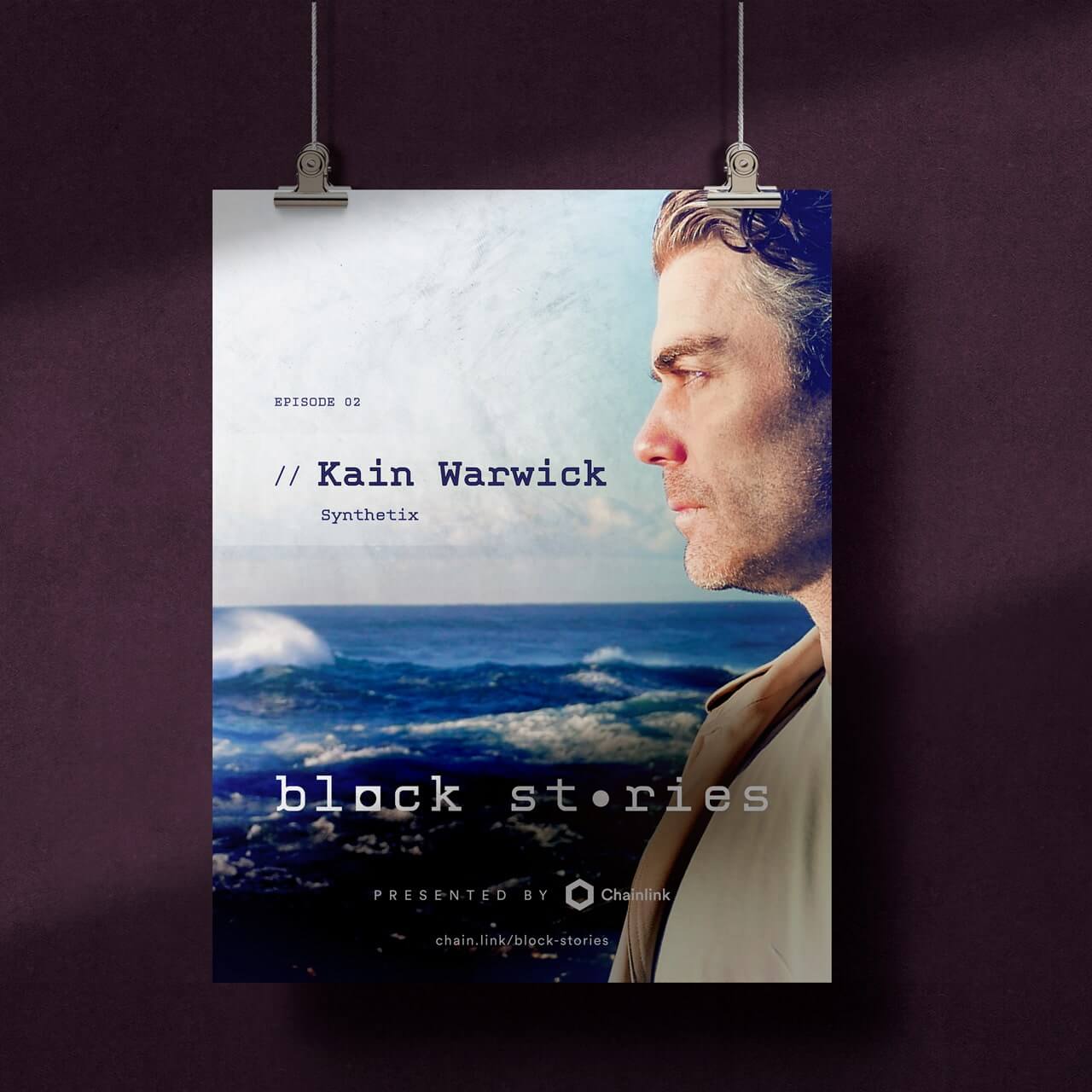
As an element of the digital collateral, we designed a layout for posters primarily used as promotional assets. By focusing on the episode's protagonist rather than the company or industry vertical, we aimed to bring the human story to the forefront, creating an emotional connection with the audience.

Web

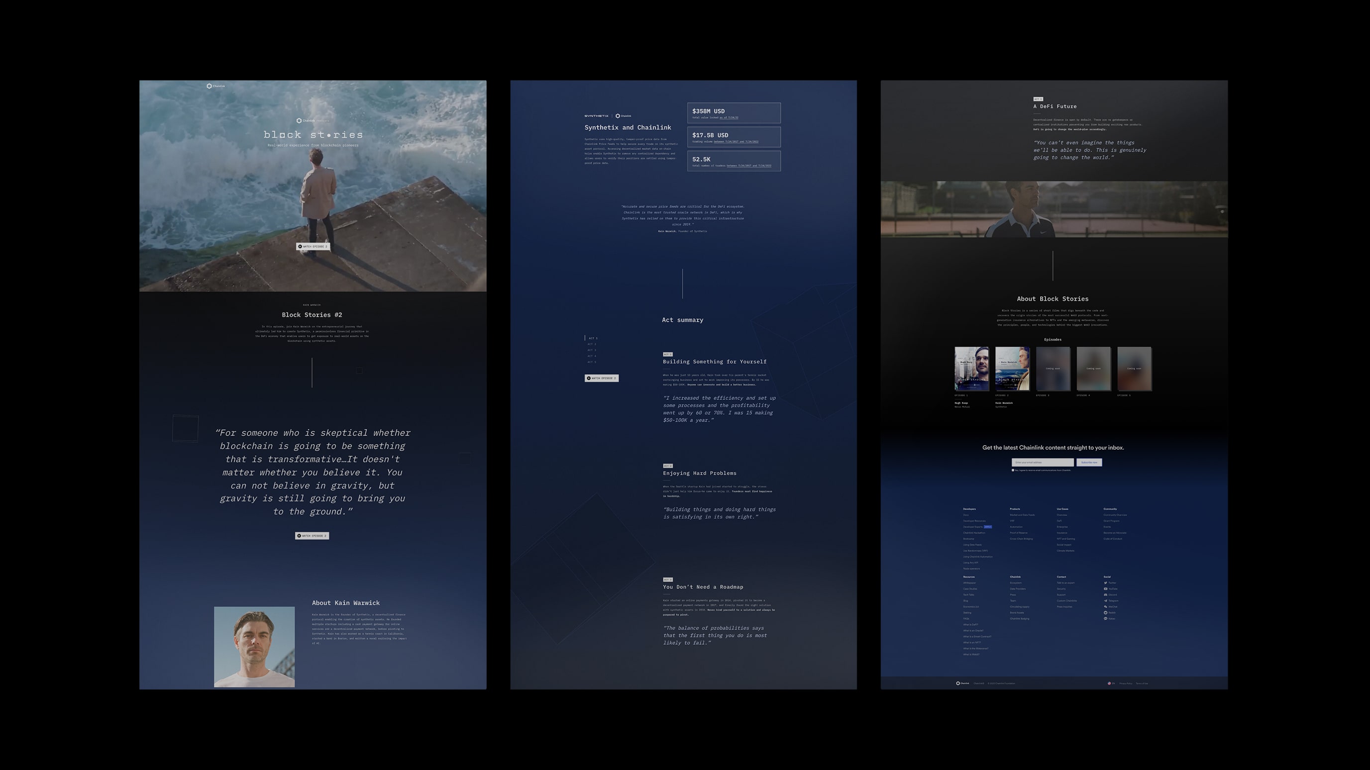
The web application encapsulates the entirety of the brand's artistic decisions. A dark mode was chosen to distinguish it from Chainlink and resemble most streaming interfaces. The layout adopts an editorial style, merging full-width sections with cropped containers, resulting in irregular layouts akin to a magazine or a stylized landing page. The information architecture was deliberately structured to initially concentrate on the project before gradually transitioning to the connection with Chainlink. The background color shifts from dark gray to dark blue, accentuating this content progression.

During implementation, significant emphasis was placed on interactions and web animations. Although the web application wasn't the main outlet of the series, we were aware that a large portion of the audience would discover these episodes through the web, and as a result, we aimed to deliver a captivating experience across all touchpoints.

Block Stories | Web interactions

Outcome

The Block Stories series has been well-received by both the Chainlink community and the wider tech world, attracting a lot of interest and encouraging conversations about the innovative Web3 protocols and the talented people behind them.

The creative concept effectively connected  with both technical and non-technical audiences, and its carefully crafted execution has raised the Block Stories brand to a high production standard, similar to top broadcast series. This has increased its credibility and appeal, inviting a broader audience to explore and enjoy the fascinating stories of innovation within the blockchain industry.

More projects