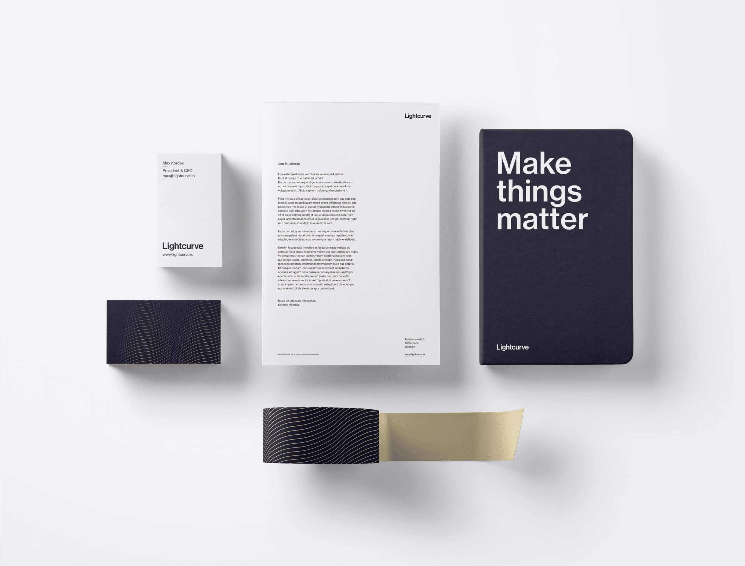
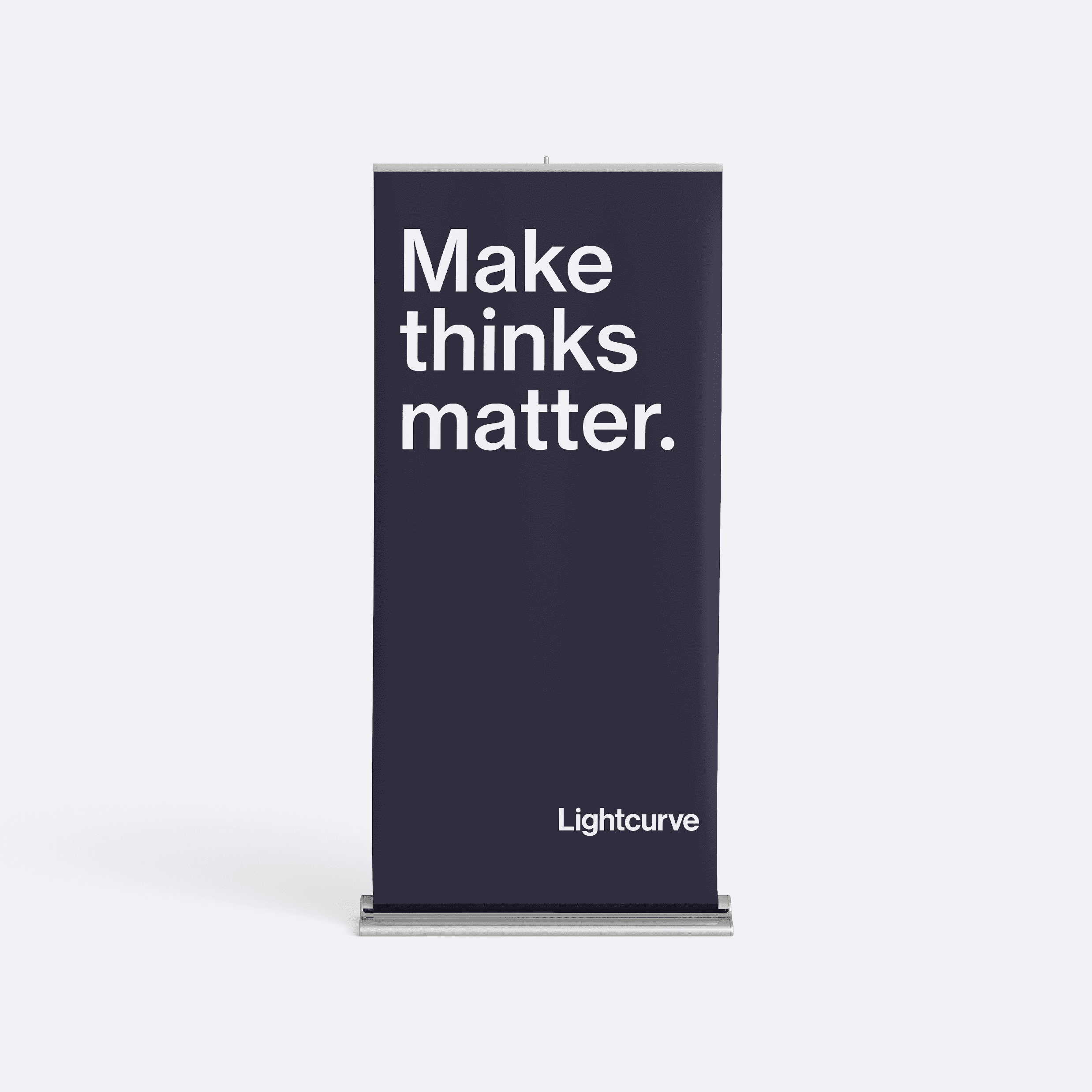
Collaborating closely with the DEPT agency, early in the process we embarked on a mission to redefine Lightcurve's mission and tone of voice. After a series of insightful workshops, we determined the strategic objective to be "become a benchmark in the world of blockchain" while positioning Lightcurve as "the ideal partner for Lisk-based innovations." Our guiding principle became "Make things matter," which formed the foundation for the brand system's development.
Following an in-depth exploration of various potential directions, we ultimately chose an art direction that struck the perfect balance between professionalism and playfulness. The style combined clean and modern design elements with dynamic and colorful accents, creating a visually engaging and memorable identity living within rather classic layout grids. This approach enabled Lightcurve to cultivate a strong and reputable presence, while simultaneously setting itself apart from the Lisk brand.
Our team meticulously crafted a comprehensive guideline containing all brand documentation, explaining the rationale behind our creative decisions and providing specific instructions for implementation. This detailed guide ensured that every aspect of the brand's visual identity remained cohesive and consistent, solidifying Lightcurve's position as a leader in the blockchain industry.
In addition to the guidelines, we produced an engaging brand video, which was shared internally during the onboarding process. This invaluable resource facilitated a seamless transition for all employees across various brands, empowering each individual to become a champion for brand consistency and a driving force behind Lightcurve's success.
The logotype was crafted utilizing the brand's primary typography for the company name. This decision ensured a functional and easily legible design, adaptable across various applications and contexts. The simplicity of the logotype reflects the brand's commitment to clarity and efficiency, while showcasing a strong visual identity.
The logotype was crafted utilizing the brand's primary typography for the company name. This decision ensured a functional and easily legible design, adaptable across various applications and contexts. The simplicity of the logotype reflects the brand's commitment to clarity and efficiency, while showcasing a strong visual identity.
To maintain optimal legibility and visual impact, we established predefined protection areas and minimum dimensions for the logo. This consideration was particularly crucial for print applications, where clear and uncluttered logo placement is essential for preserving the brand's identity.
Lastly, we developed a logo animation, incorporating motion as a key aspect of the brand's visual language. The circle within the animation symbolizes a source of light, representing the company's vision and creative spirit. Initially, indistinct paths form a curve resembling a light curve, which are, in fact, segments of the letters G and H, signifying the company's structure and in-house talent. This curve propels the circle (vision) in the right direction (atop the letter i), triggering a transformative change in the animation. The frame becomes illuminated, revealing hidden components and highlighting the brand's ability to unveil new possibilities and insights.
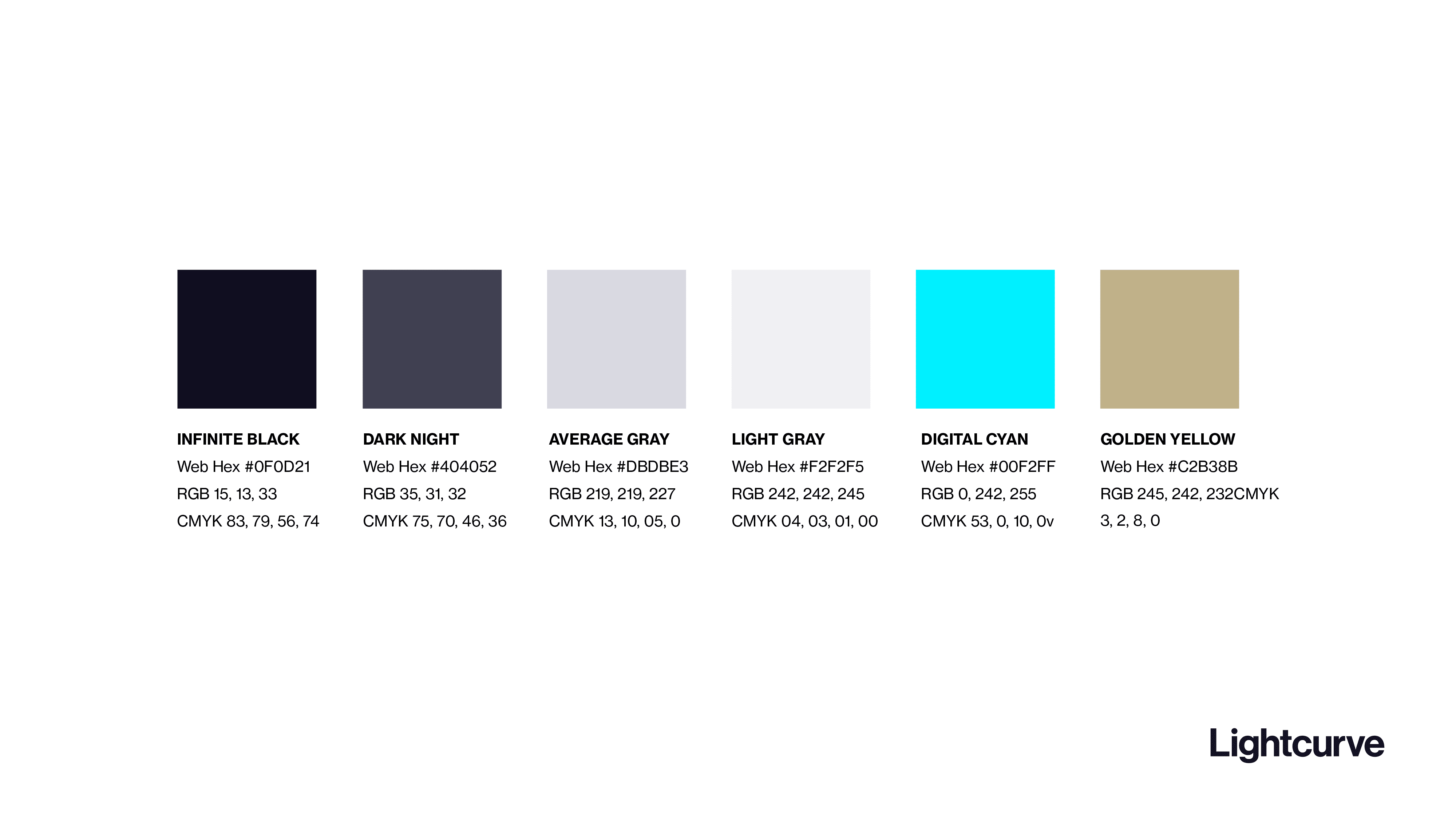
The meticulously curated color palette for this brand combined a harmonious blend of shades that evoked a sense of sophistication, innovation, and modernity. Each color was chosen to convey specific emotions and meanings.
Infinite Black and Dark Night were deep, rich black tones that exuded elegance and authority while anchoring the brand's visual identity with a timeless and versatile hue. They brought depth and sophistication to the palette and added a touch of mystery while conveying a sense of professionalism, making them ideal choices for backgrounds or typography.
Two different shades of gray offered balance and stability within the palette and served to create different levels of contrast against the darker shades, which allowed us to add visual interest and hierarchy to the design elements.
Digital Cyan was chosen as a vibrant, electric shade of cyan that infused the palette with energy and innovation. This bold color symbolized technology and progress, capturing the brand's forward-thinking ethos and commitment to digital solutions.
A warm Golden Yellow was chosen as an inviting color that added an element of brightness and optimism to the palette. This rich color conveyed a sense of success and achievement, highlighting the brand's ambitions and aspirations.
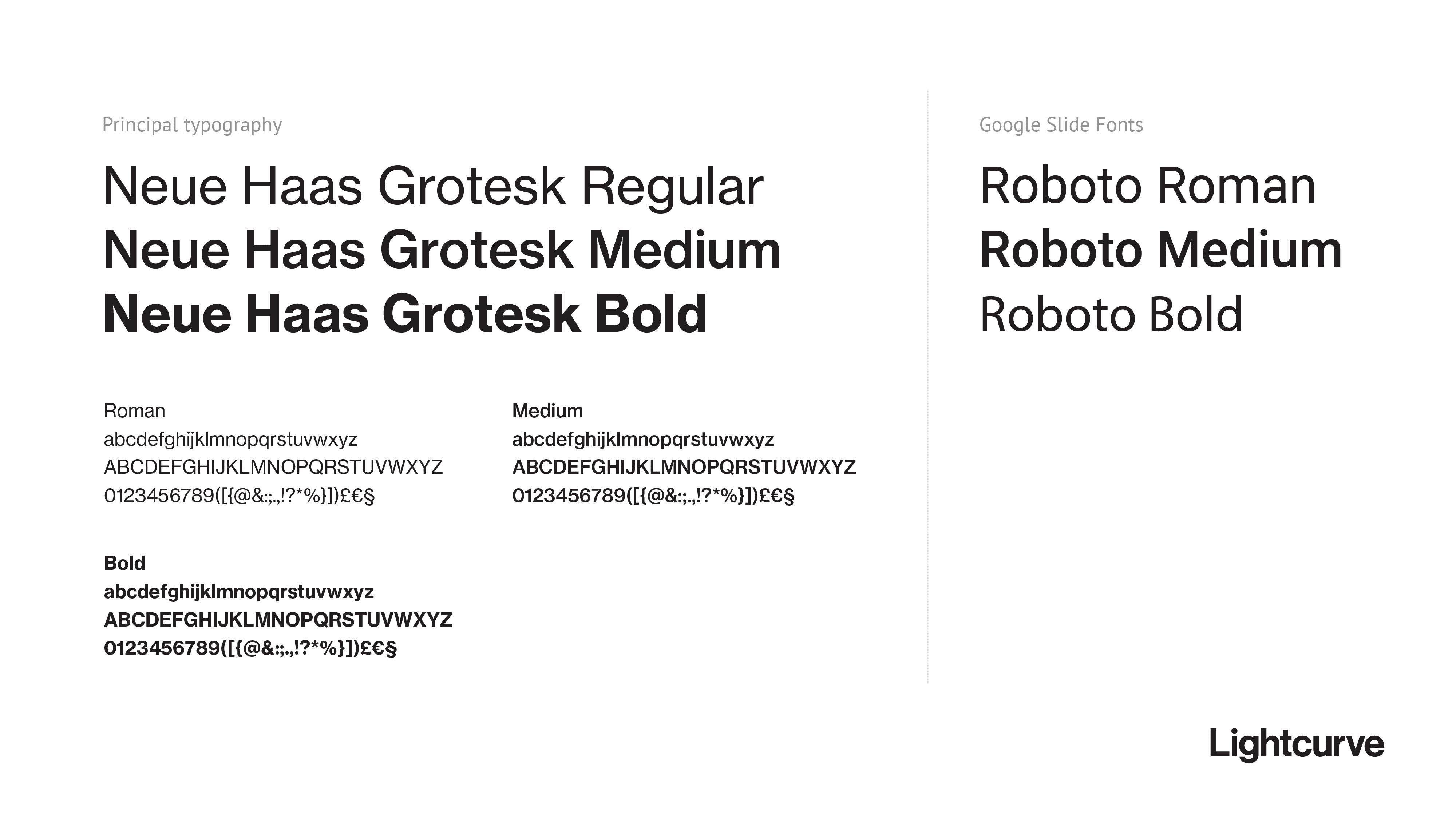
Neue Haas Grotesk Regular was selected as the brand typography due to its versatile, timeless, and highly legible qualities. As a refined and modern interpretation of the classic grotesque typeface, it seamlessly blends traditional and contemporary design elements, perfectly aligning with the brand's ethos of innovation and sophistication and overall art direction.
The typeface's clean and balanced letterforms convey a sense of stability and reliability, while its subtle nuances and unique character details add personality and warmth. Furthermore, Neue Haas Grotesk Regular's exceptional readability across various sizes and mediums makes it a practical and consistent choice for both print and digital applications.
For those applications where custom fonts aren't available, Roboto was selected as an open-source alternative, providing a similar aesthetic and maintaining a consistent visual experience across all platforms.
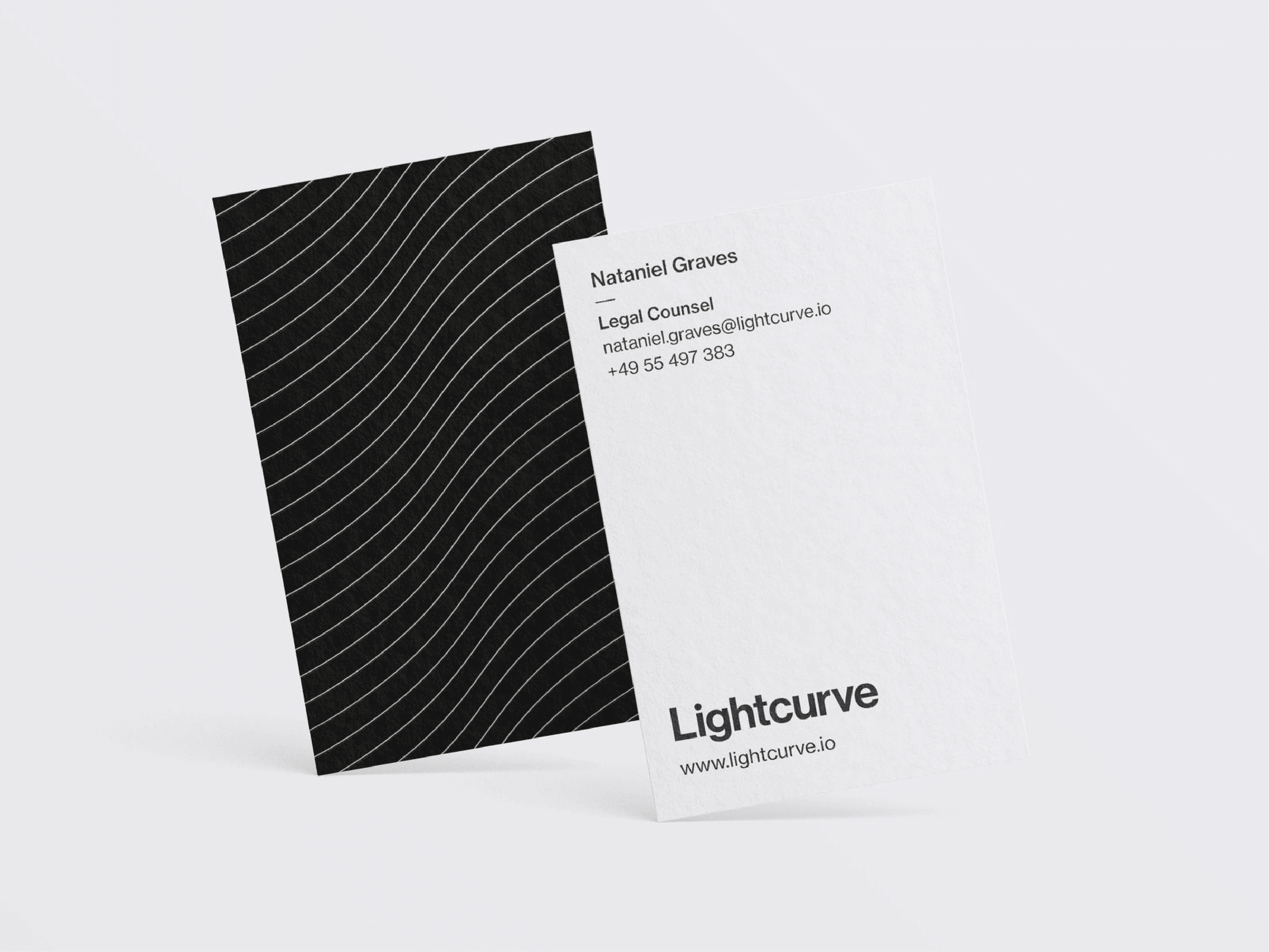
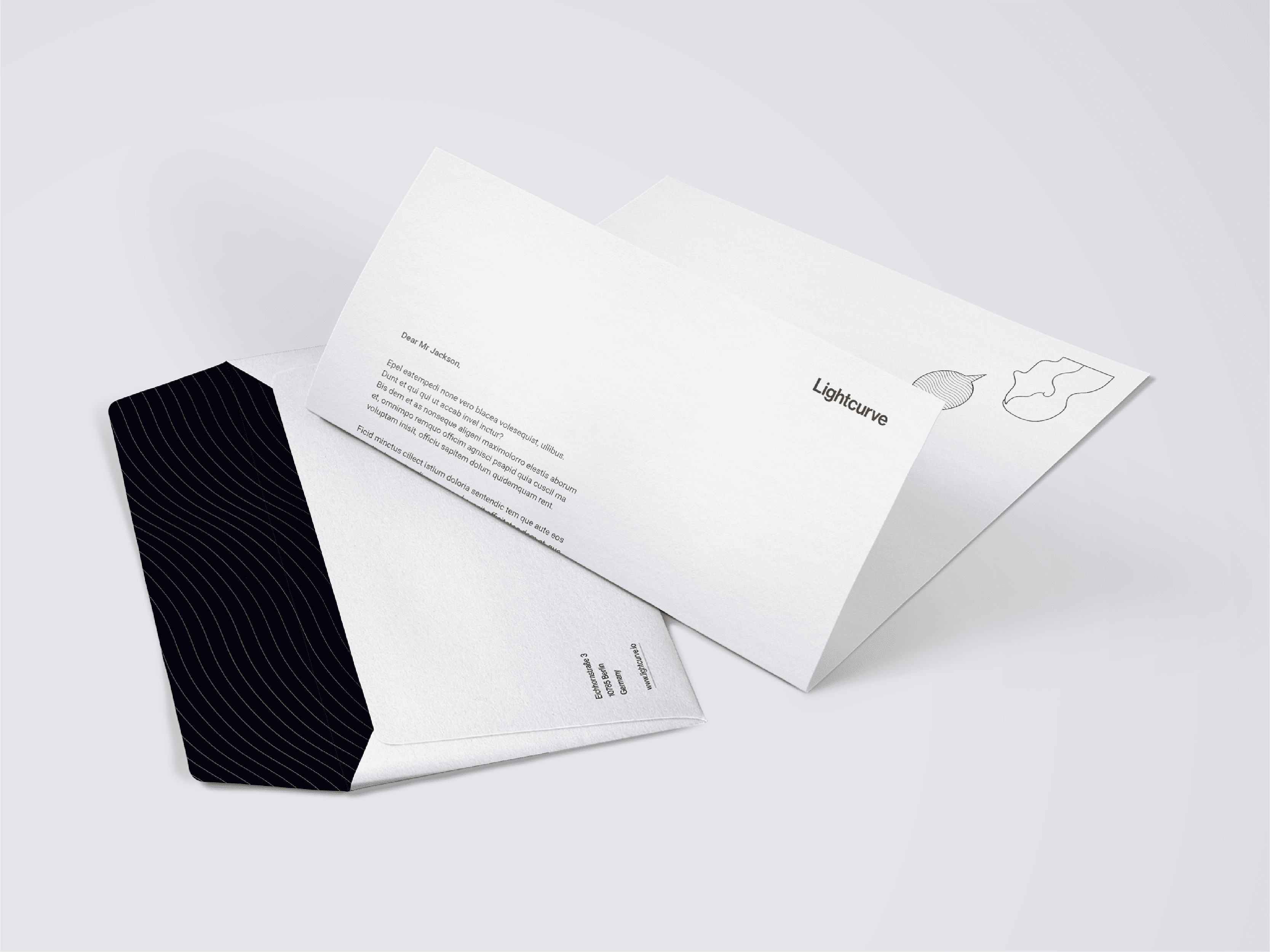
One of the key visual elements of the brand was a dynamic wave pattern, which served as a unifying and distinctive design element across various touchpoints. The wave pattern not only captured the essence of fluidity and movement, reflecting the brand's adaptable and innovative nature, but it also embodied a sense of harmony and balance, symbolizing the seamless integration of technology and human creativity.
The wave pattern's organic and flowing form made it a versatile design element that could be effectively utilized in both digital and physical applications. In digital contexts, the pattern added depth, visual interest, and a touch of energy to web and app interfaces, while in physical spaces such as office environments, the wave pattern was used as a subtle yet impactful design feature on walls, signage, or other branded materials, enhancing the overall atmosphere and reinforcing the brand identity.
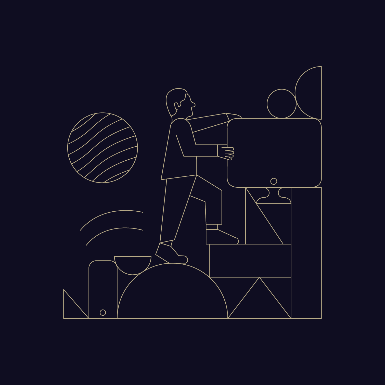
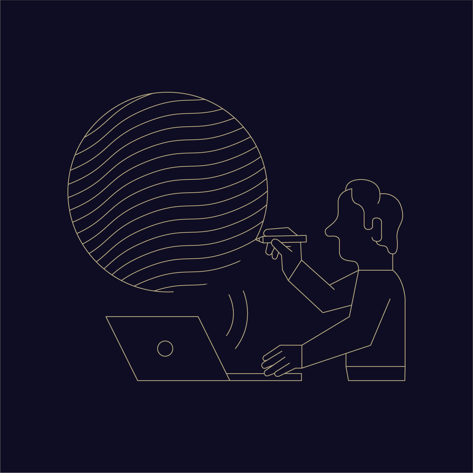
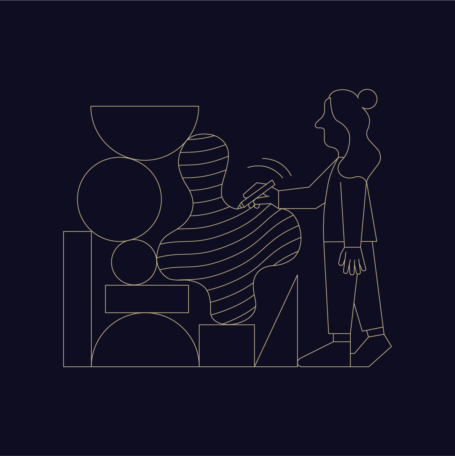
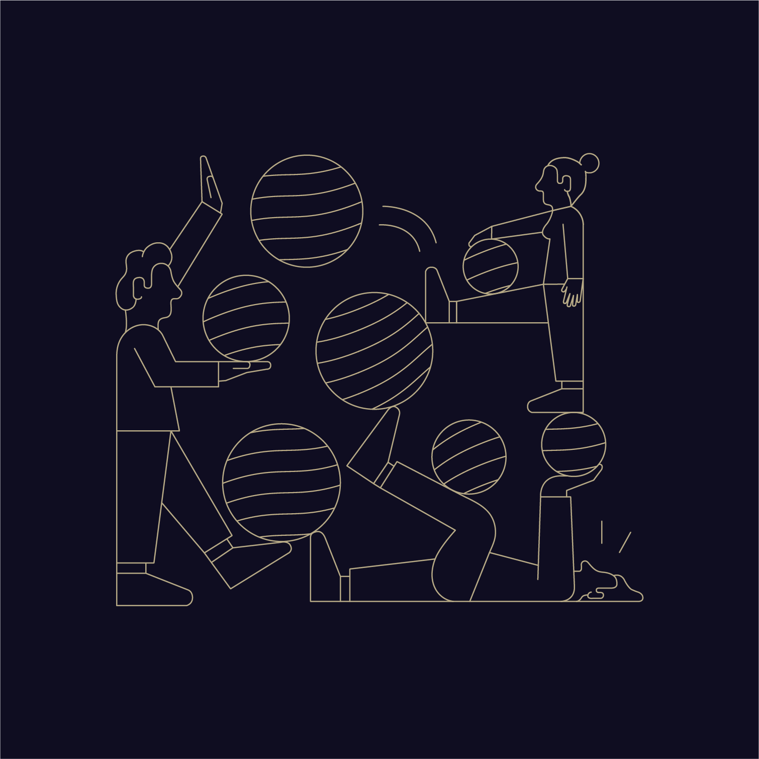
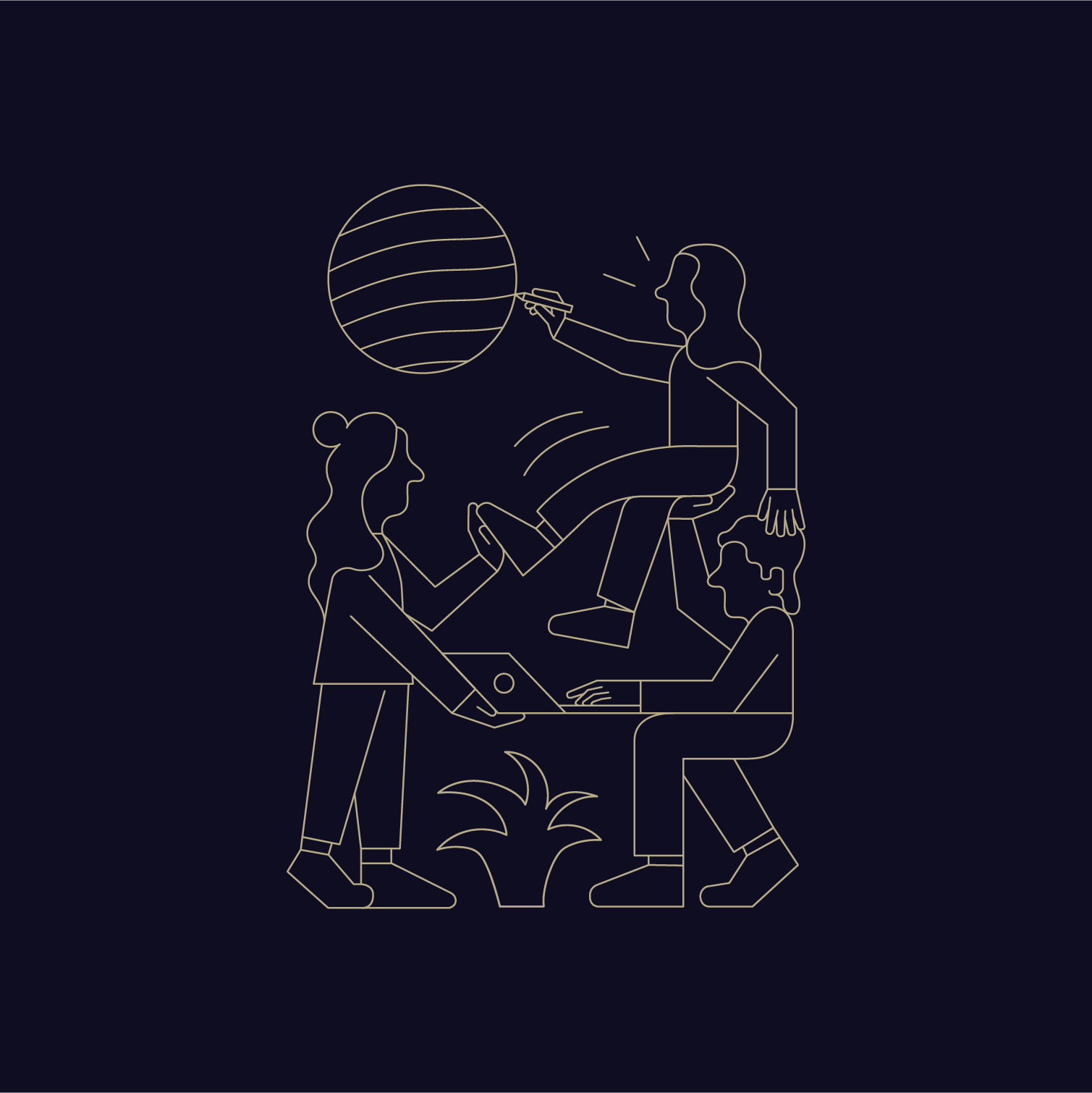
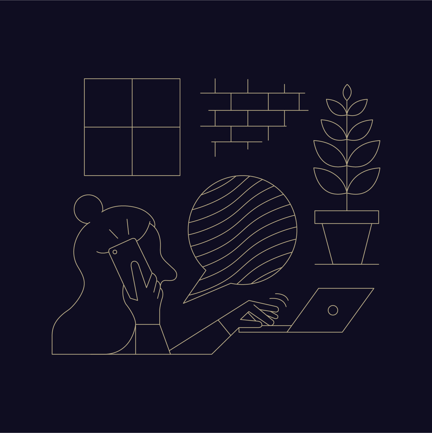
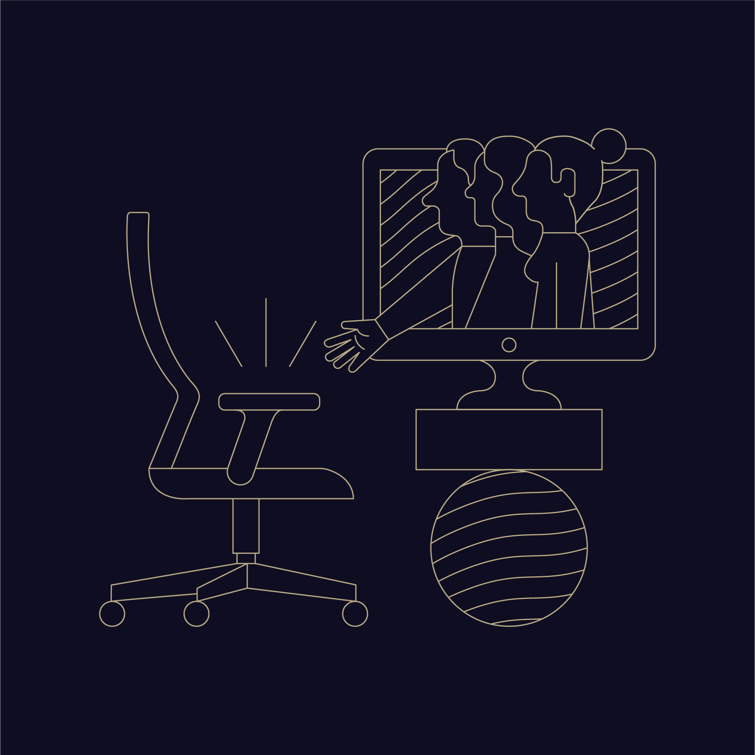
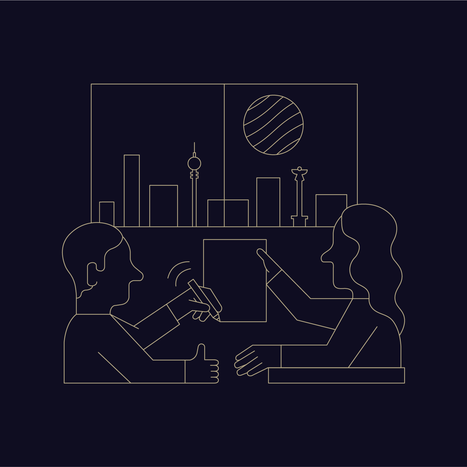
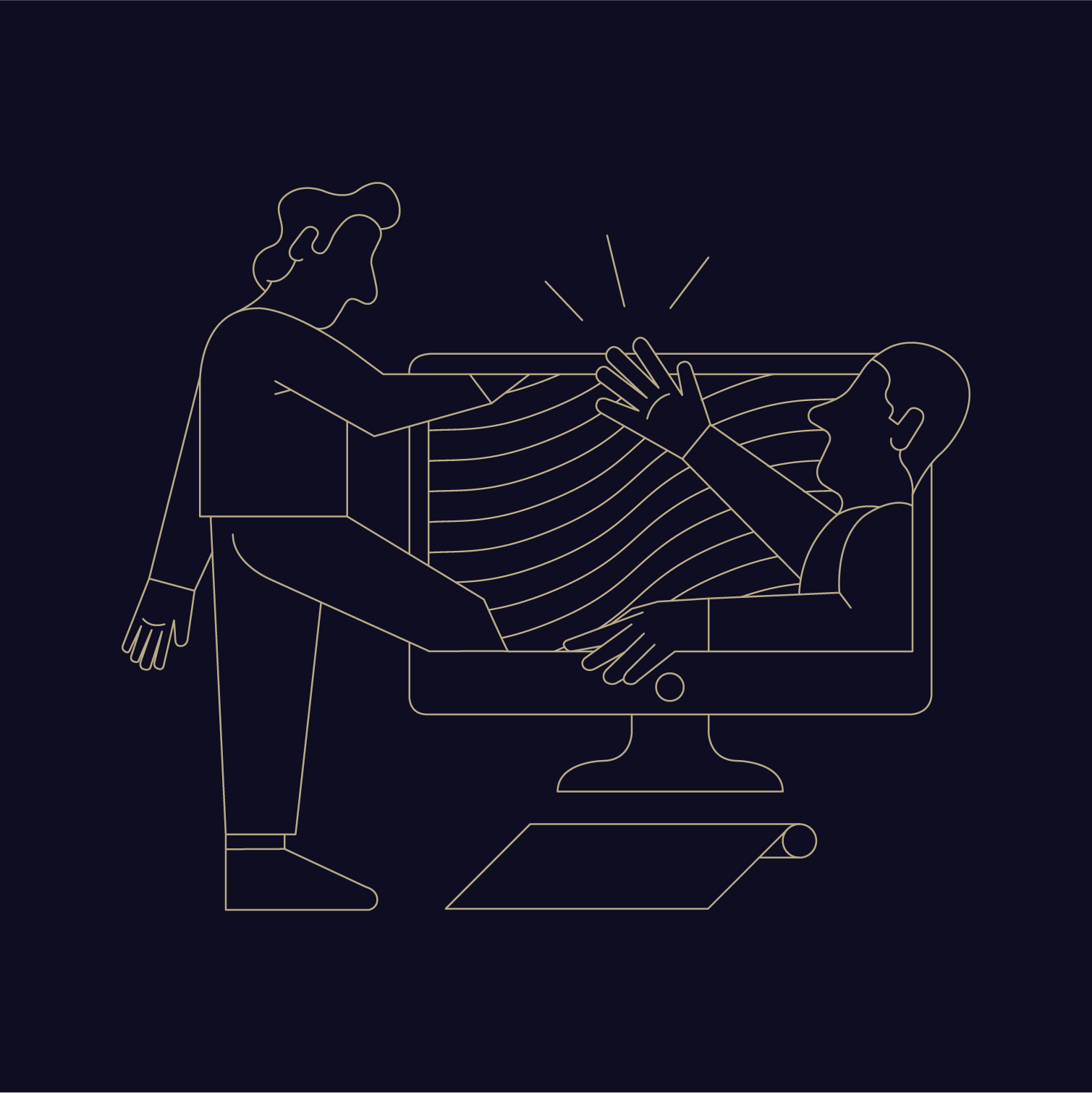
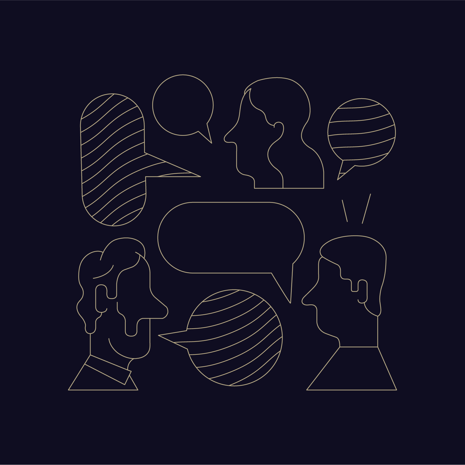
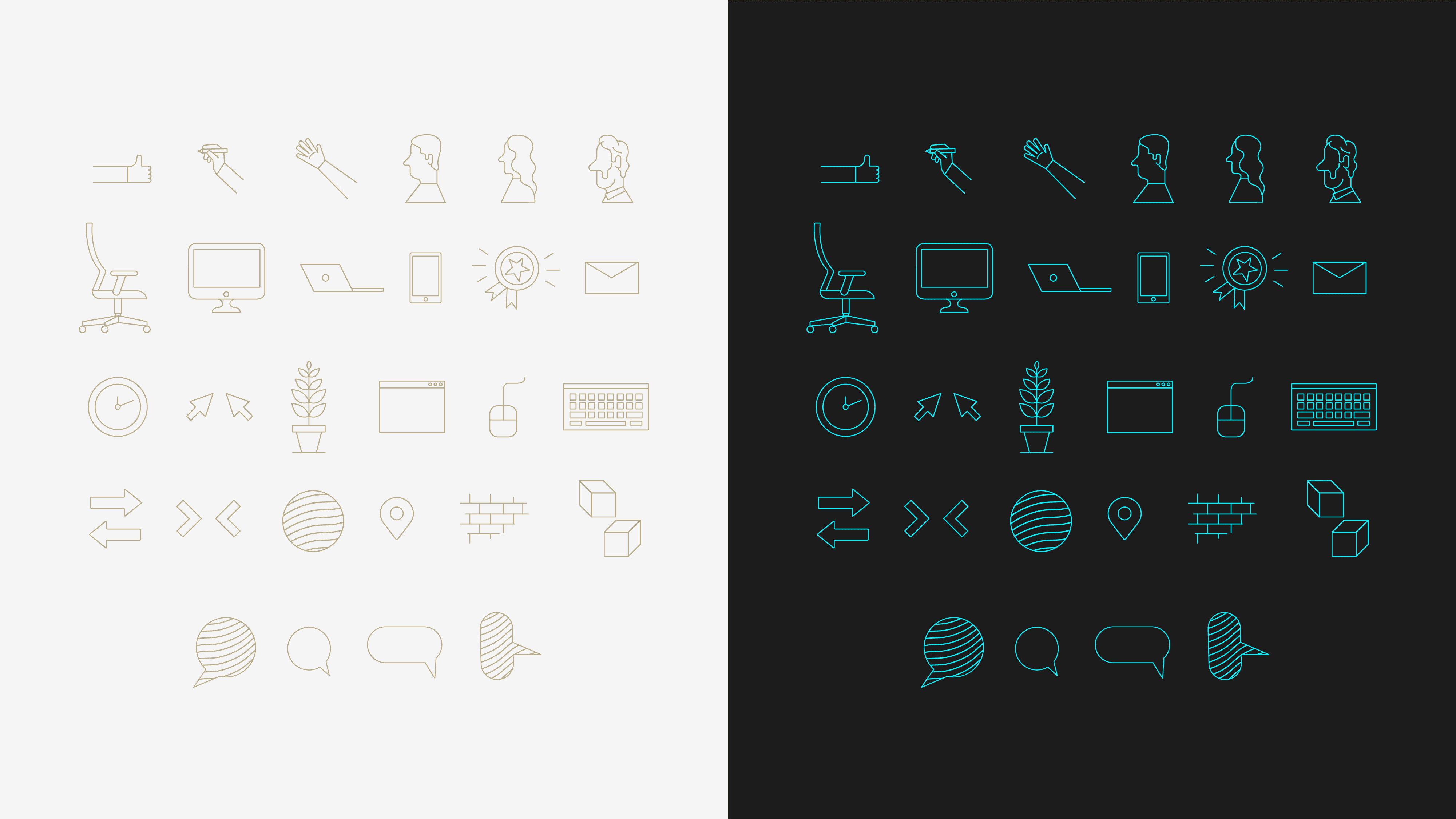
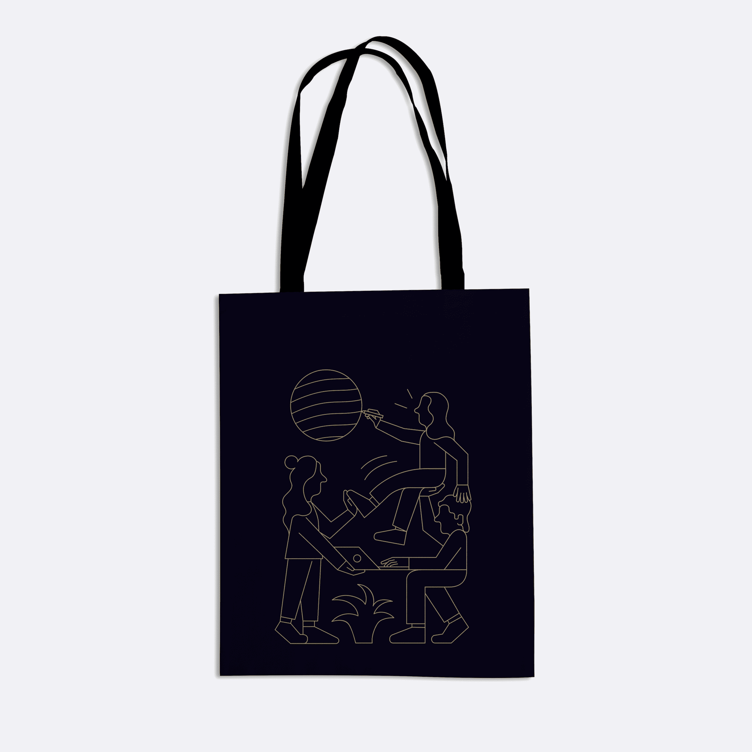
The brand's visual language was further enriched by the inclusion of captivating outlined illustrations, masterfully designed by Gino Hoiting, a talented illustrator from the Netherlands. These illustrations seamlessly blended figurative elements, such as humans or office objects, with abstract symbols and shapes, resulting in a visually engaging and thought-provoking art style that perfectly aligned with the overall brand direction.
This unique illustration style effectively captured and communicated Lightcurve's values, embodying the fusion of creativity, innovation, and technology that lay at the core of the brand. The outlined illustrations served as conceptual portraits, encapsulating the essence of the company's ethos while offering a visually striking and memorable visual element.
The brand's iconography followed the same visual language as the illustrations, ensuring a cohesive and harmonious aesthetic throughout all design elements. Crafted with a linear, thin, and easily readable style, these icons embodied the brand's commitment to clarity and simplicity while maintaining a visually captivating appearance.
In our quest to create a comprehensive and engaging brand experience, we developed a custom media pack that encompassed a variety of audiovisual elements. Alongside the animated components previously mentioned, we also designed logo stings and lower thirds specifically tailored for employer branding videos.
These additional elements helped to further elevate the brand's visual identity, ensuring a consistent and polished aesthetic across all media formats and platforms.
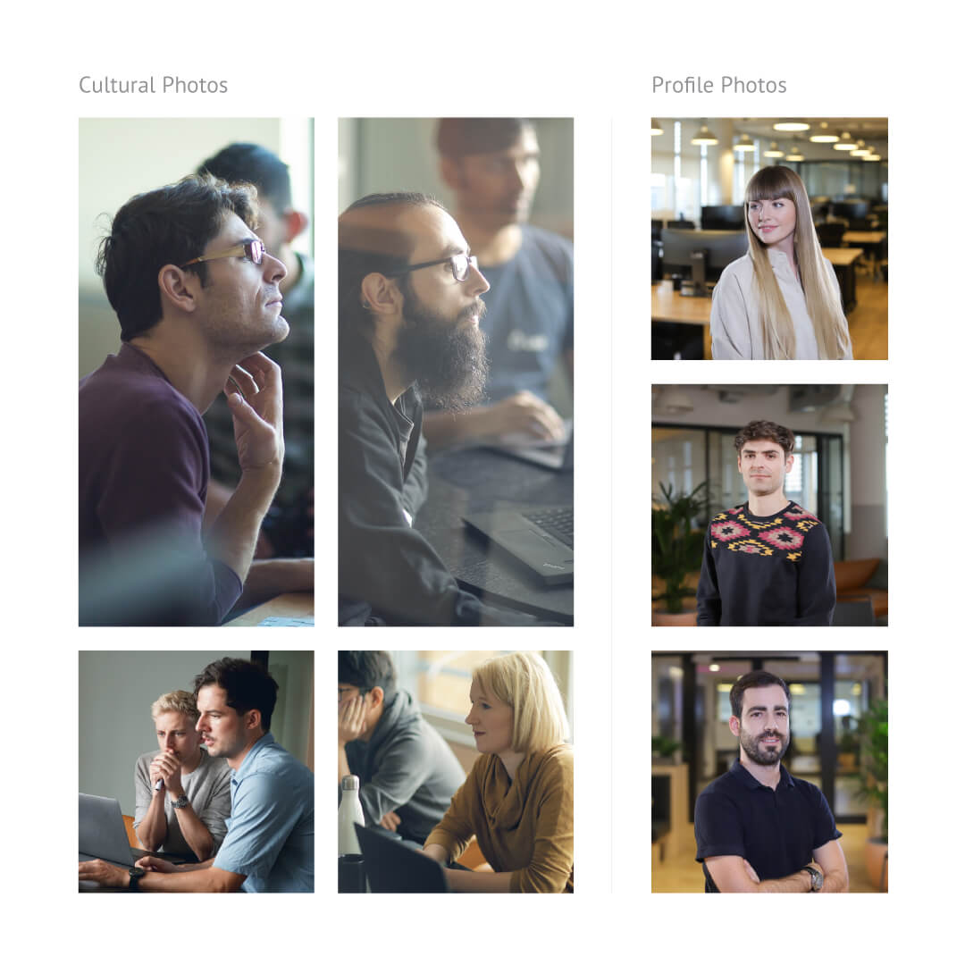
The brand's photographic style incorporated a sense of depth with blurred backgrounds, placing emphasis on the subject while creating a visually appealing aesthetic. Natural lighting was preferred over studio lights, enhancing the authenticity and warmth of the images.
The photographs were colorfully retouched, with key hues saturated to imbue the visuals with vibrancy and energy. Furthermore, the photographic style was characterized by its casual nature, avoiding posed shots in favor of candid moments that captured genuine expressions and interactions.
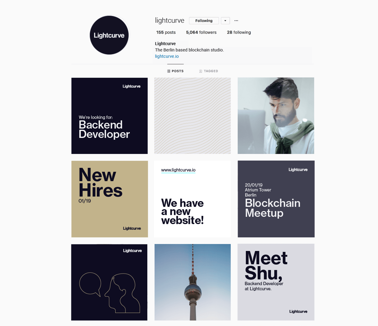
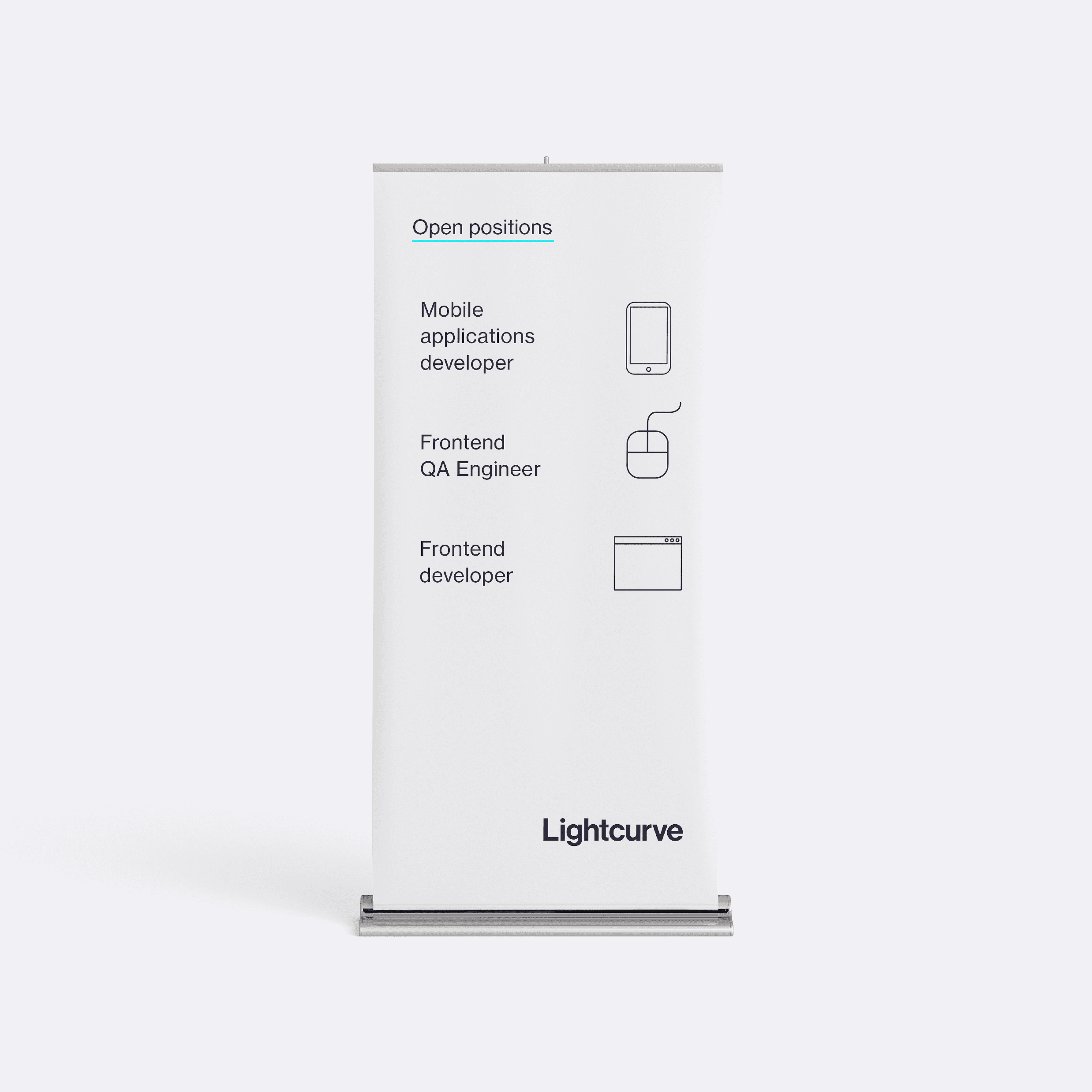
Additionally, we developed an extensive range of applications that spanned various platforms and mediums. These included striking digital banners, elegant stationery, vibrant social media visuals, standout rollups, and distinctive promotional merchandise, amongst others.