Chainlink Labs Brand Exploration

In 2021, the Brand Design team at Chainlink Labs embarked on an exploratory exercise to propose a potential evolution of the company's brand identity. As the Creative Director, I had the opportunity to lead this internal initiative, which aimed to develop a comprehensive and scalable system that would cater to all validated applications and prioritize employer branding.

The primary goal of this exploration was to examine the possibilities for refreshing Chainlink Labs' main brand. It is important to note that this exercise was purely exploratory and part of our internal design activities to foster creativity and innovation within the team.

COMPANY
Chainlink Labs
YEAR
2021
TYPE
Brand

Key challenges

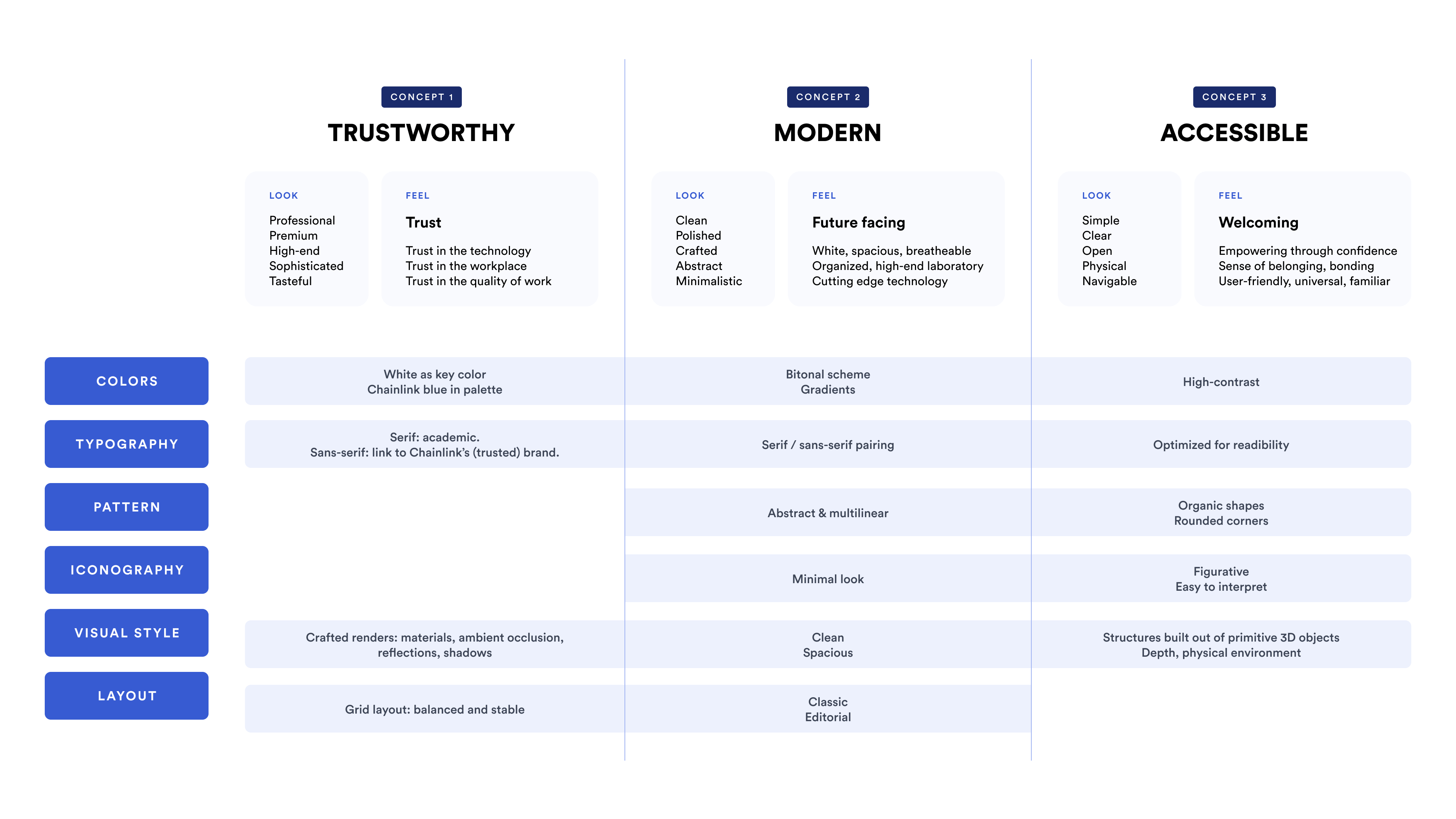
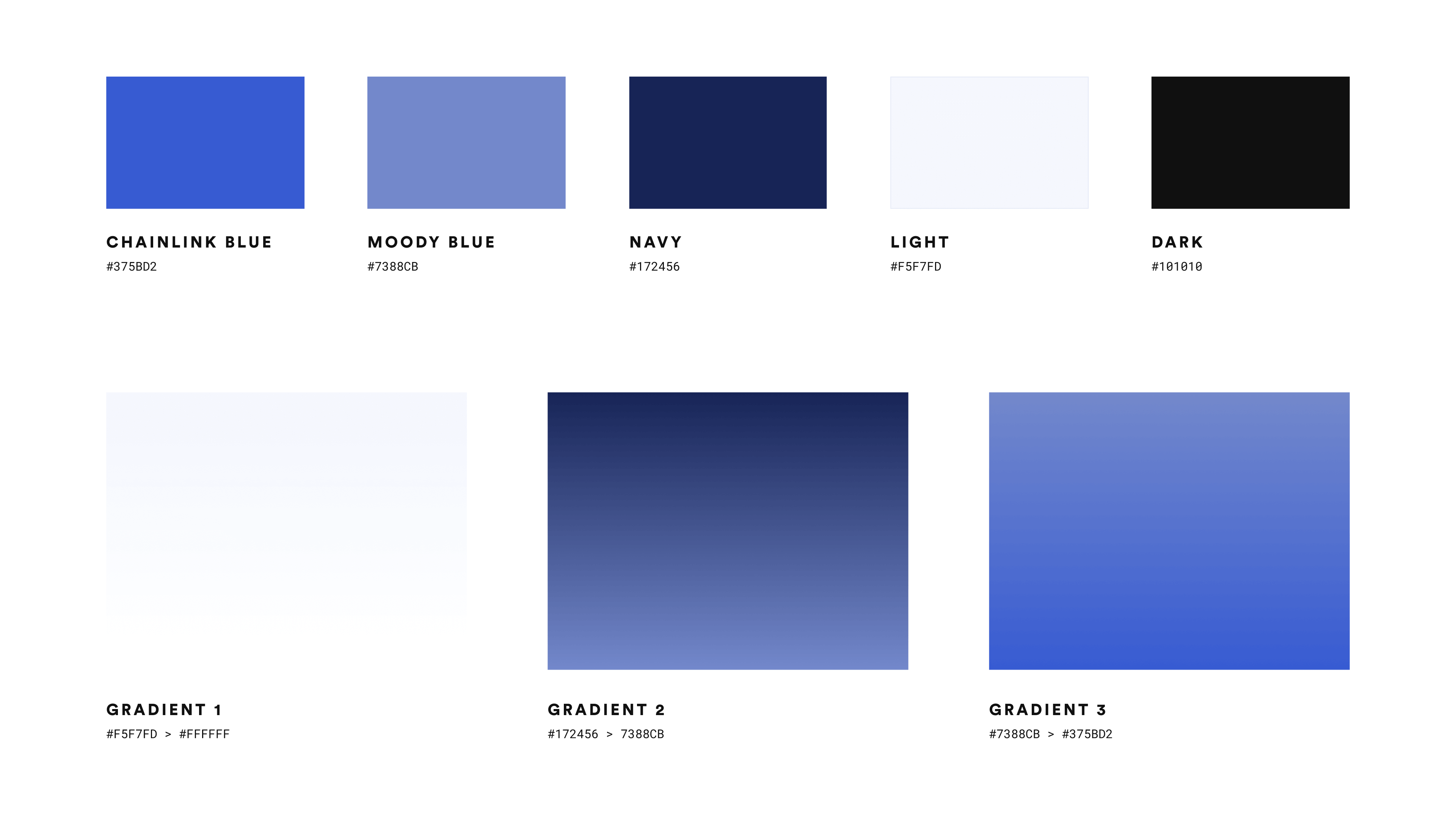
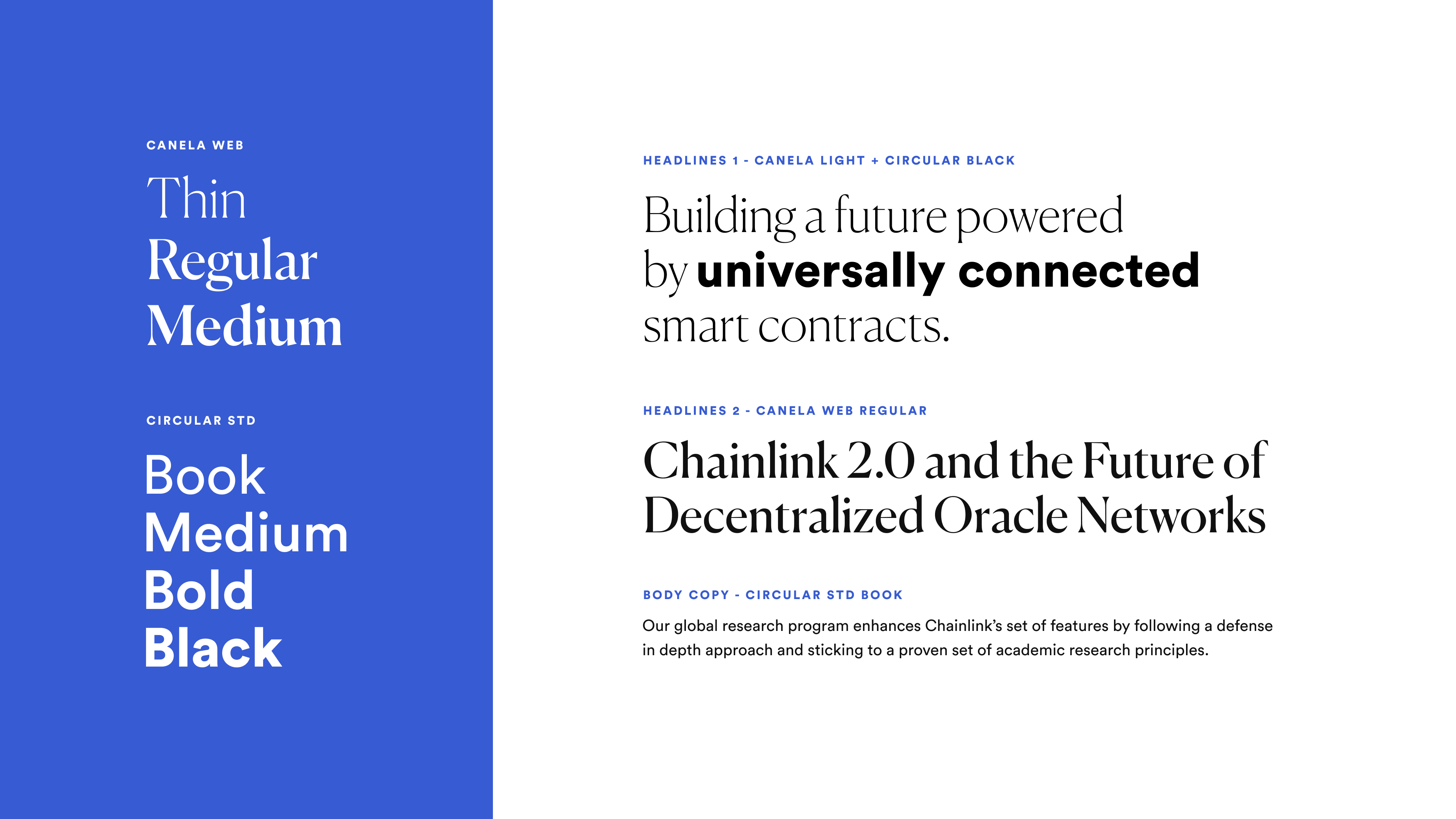
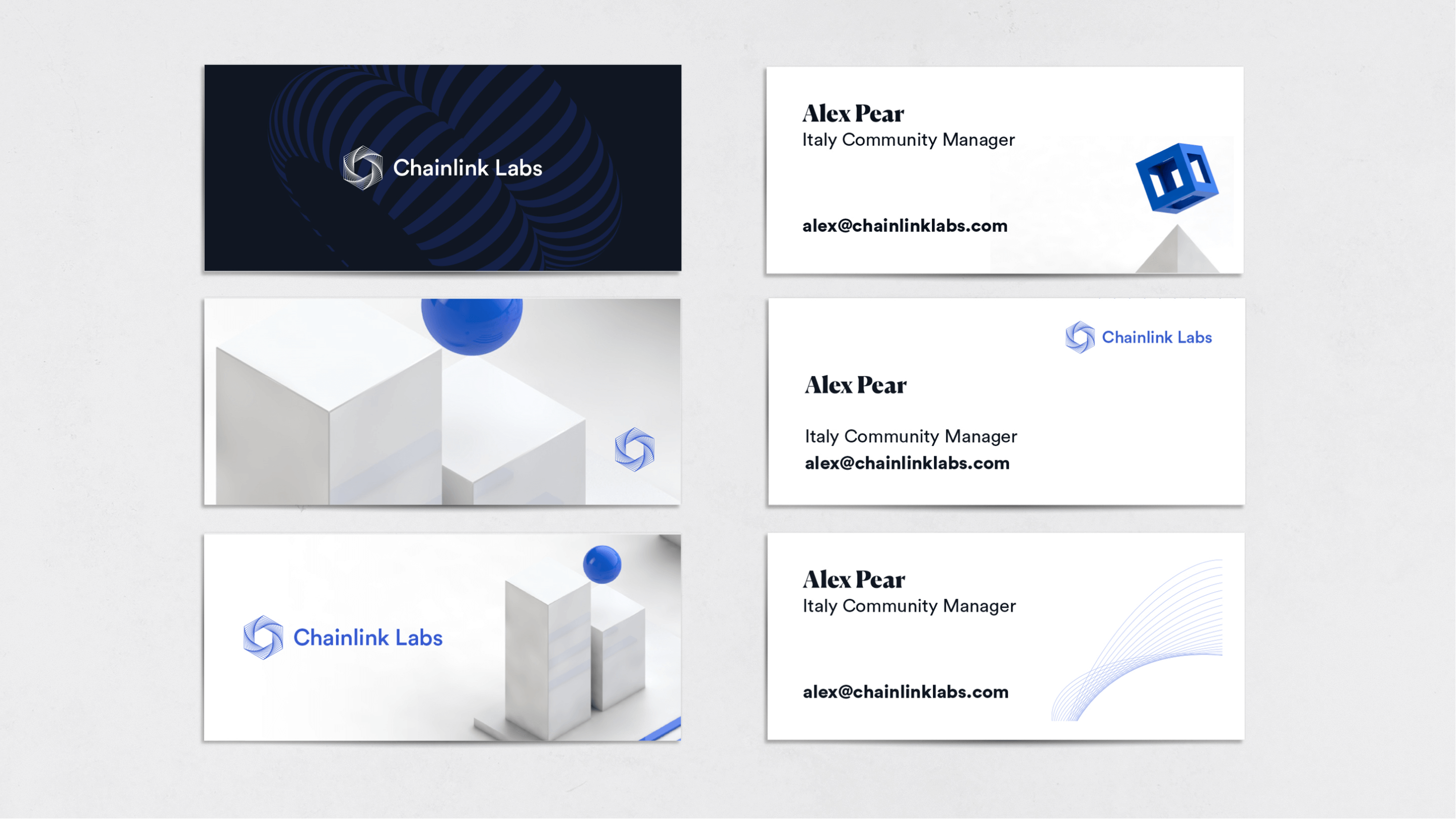
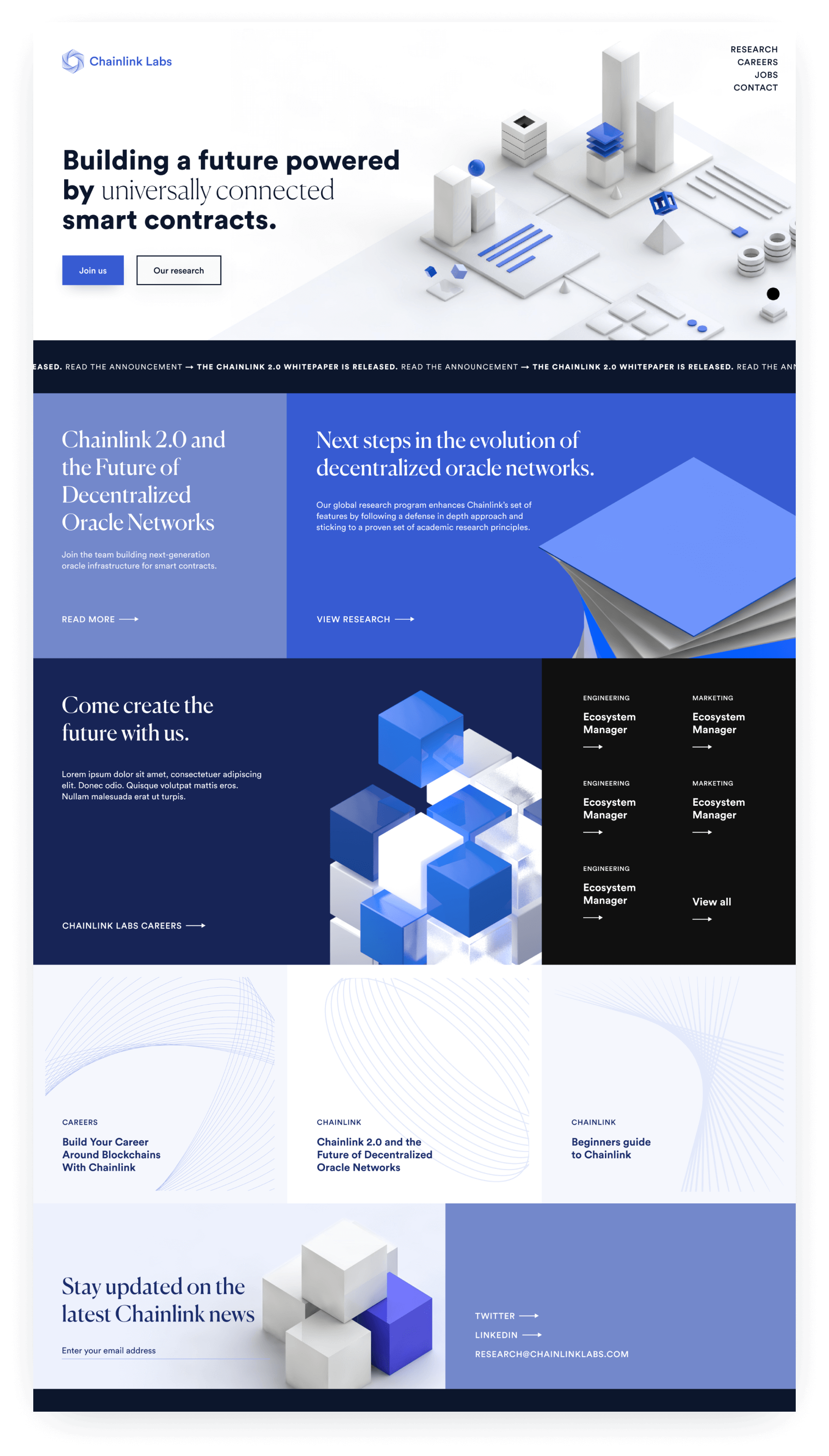
Leveraging the legacy.

To maximize the impact of Chainlink Labs' branding, the brand needed to establish a clear and strategic connection to its parent brand. By tapping into the existing brand awareness and recognition of Chainlink, we could create a powerful synergy that would amplify the effectiveness of Chainlink Labs' brand identity and reinforce the strong foundation upon which the company is built.

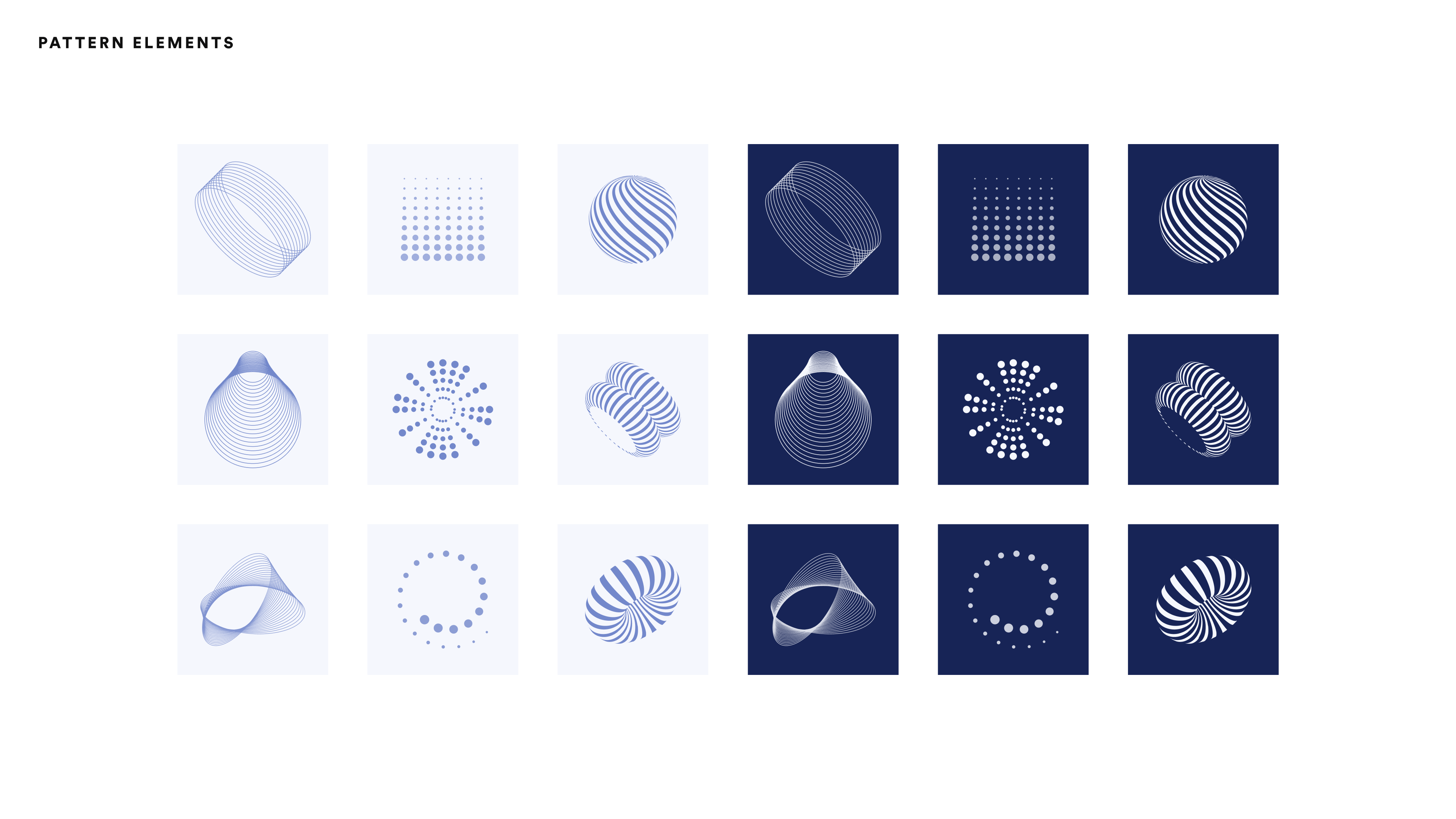
Breaking boundaries with style.

Our objective was to infuse the Chainlink Labs brand with a unique, modern look that would resonate with the target audience. By experimenting with unconventional design techniques and incorporating them into the existing brand framework in a controlled environment, we aimed to create a distinctive yet relatable visual experience that would captivate viewers.

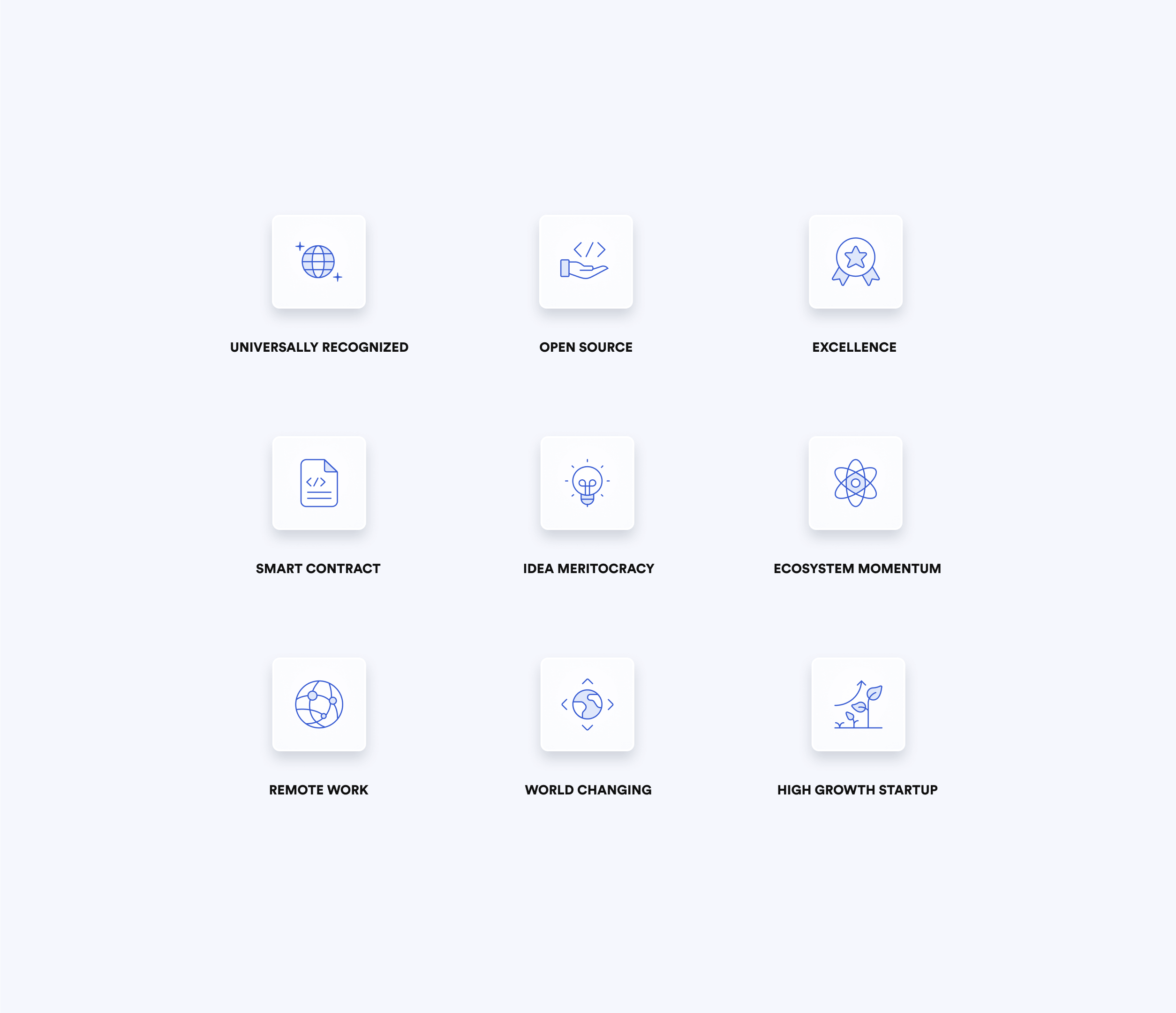
An employer brand powerhouse.

Chainlink Labs is an industry leader and a top employer of choice, and the brand strategy needed to reflect this. We based our experimentation on  the company's values and culture in a way that would inspire trust and appeal to A-class talent.

Pushing creative boundaries.

Reflecting the cutting-edge aspect of Chainlink Labs' technology was crucial in our branding exploration. To achieve this, we embraced a "think outside the box" mentality that encouraged our team to push the creative boundaries and develop daring, innovative design concepts. This approach would not only help to capture the essence of Chainlink Labs' technological prowess but also serve to differentiate the brand from its competitors in the market.

The process

Brand analysis.

Our first step was to thoroughly analyze the existing Chainlink Labs brand. This involved understanding its core values, target audience, core applications, and visual language. This process allowed us to identify areas where the brand could be improved or updated to better align with the company's strategic objectives.

Brainstorming & concept development.

Next, we initiated brainstorming sessions and concept development workshops to generate innovative ideas for the new brand direction. We focused on identifying keywords and concepts that embodied the essence of Chainlink Labs and its unique offerings in the industry.

Mapping elements to concepts.

Once we had a clear set of keywords and concepts, we proceeded to map each element of the proposed brand system to these guiding principles. This approach ensured that every component of the brand, from typography to color schemes, was tied to a central theme that resonated with Chainlink Labs' mission and values.

Scalability & employer branding.

Throughout the exploration, we placed a strong emphasis on creating a brand system that would seamlessly scale to accommodate all validated applications. At this stage, we stretched the brand system to different types of publications, with a strong focus on employer branding, as the ultimate goal was to position Chainlink Labs as an industry leader and an employer of choice for a-class talent.

The exploration

Logotype & mark: preserving the foundation

In this brand exploration, the logotype was not part of the scope, and as a result, it remained unchanged. Nevertheless, the logo's shape inspired various aspects of the brand, such as the pattern elements, which contributed to creating a cohesive experience throughout the visual identity.

Chainlink Labs redesign, logo secondaryChainlink Labs redesign, logo primary

Color: evolving the palette

To maintain a strong connection with Chainlink's visual style and leverage its brand awareness, the color palette was based on the parent brand. However, strategic modifications were made to align the colors with Chainlink Labs' brand traits, resulting in a bitonal scheme with toned-down hues. Gradients were also introduced to replicate the various shades present in the 3D visual style, specifically in shadows and illumination, bringing depth to flat layouts.

Typography: balancing recognition and innovation

The key Chainlink font was retained as a secondary paragraph font to strengthen the link to the parent brand and leverage its recognition. To give Chainlink Labs a distinct identity, a stylized Serif font was chosen for headings, reflecting the organization's cutting-edge technological nature and giving it an academic appearance. The team also experimented with combining these fonts for headings, challenging conventional typography practices in corporate branding.

Furthermore, the team experimented with the combination of these fonts for headings, which is an innovative approach that challenges the usual way of treating typography in corporate brands.

Patterns: crafting complexity

The patterns were crafted based on two primary principles: organic and multilinear. This fusion led to a visually intricate yet approachable element that conveys a technological vibe while enhancing the brand's accessibility characteristic. Moreover, this style can be effortlessly scaled, potentially enabling the team to develop a diverse brand without allocating excessive resources to achieve it.

Visual Language: Embracing the real world

Chainlink Labs' fresh visual elements consist of custom 3D rendered abstract depictions representing various constituents and collaborators within the Chainlink network and ecosystem, including smart contracts, data providers, nodes, and node operators. This distinctive style establishes a sophisticated and invigorating tone for Chainlink Labs, mirroring the multifaceted team of researchers, engineers, designers, marketers, and contributors collaborating to expand the network. Additionally, it grounds the organization in the tangible world, a feat that can occasionally be demanding due to the highly intricate nature of the technology.

Close-up renderings of larger scenes allow the visual style to quickly scale up additional assets for marketing collateral and website use, as needed.

Chainlink Labs redesign, 3d visual style, smart contract close-up with blue coneChainlink Labs redesign, 3d visual style, smart contract close-up with blue ball and data pipeChainlink Labs redesign, 3d visual style, smart contract close-up with layers in blueChainlink Labs redesign, 3d visual style, nodes close-upChainlink Labs redesign, 3d visual style, smart contract close-upChainlink Labs redesign, 3d visual style, cube on top of pyramid

Iconography: Simplified and Contrasting

The iconography was designed to be minimalistic, bitonal, and figurative, complementing the abstract components of the visual language. The highly contrasted and easy-to-read icons support content without overshadowing it, ensuring a harmonious balance within the brand's visual identity.

Applications

Upon concluding the exploration, the refreshed Chainlink Labs brand was extended across a diverse range of applications. This process showcased the brand's adaptability and scalability, demonstrating its ability to maintain a consistent and engaging visual identity across various channels and touchpoints.

Stationary & prints

Web application: intuitive design

The landing page design for the web application focuses on delivering a user-friendly experience, featuring simple and straightforward content blocks arranged in a grid layout for effortless navigation and concise presentation. Eliminating long scrolls, the design provides users with a clear guide to access the information they seek, initially emphasizing careers and open positions.

The modular layout allows for seamless adaptation, making it easy to switch focus to promote events, showcase milestones, and highlight other relevant content as needed, effectively catering to the dynamic nature of the brand and its audience.

Outcome

The brand exploration exercise proved to be a positive and enriching experience for the Brand Design team. It fostered innovation, creativity, and collaboration, leading to the development of unique design elements and visual languageWhile this exercise was primarily exploratory, some aspects of our creative findings directly informed the Chainlink Labs brand in production.

These contributions helped to shape a more cohesive and impactful visual identity, ultimately strengthening the brand's recognition and appeal within its industry.

More projects